Interiors · Blender + Cycles
Brick warehouse conversion: keeping the patina while selling the new
Adaptive reuse renders walk a tightrope. Too much grit and the client worries about decay. Too much polish and the original architecture disappears. Here is how to keep both in the frame.
 INTERIORS
Adaptive reuse is the most interesting brief in arch viz because the building already has a story. Your job is not to invent atmosphere; it is to keep the existing atmosphere alive while making the new insertions feel inevitable. The trap is over polishing. If every brick is clean and every steel beam is freshly painted, you have not converted a warehouse. You have built a fake warehouse inside a new shell.
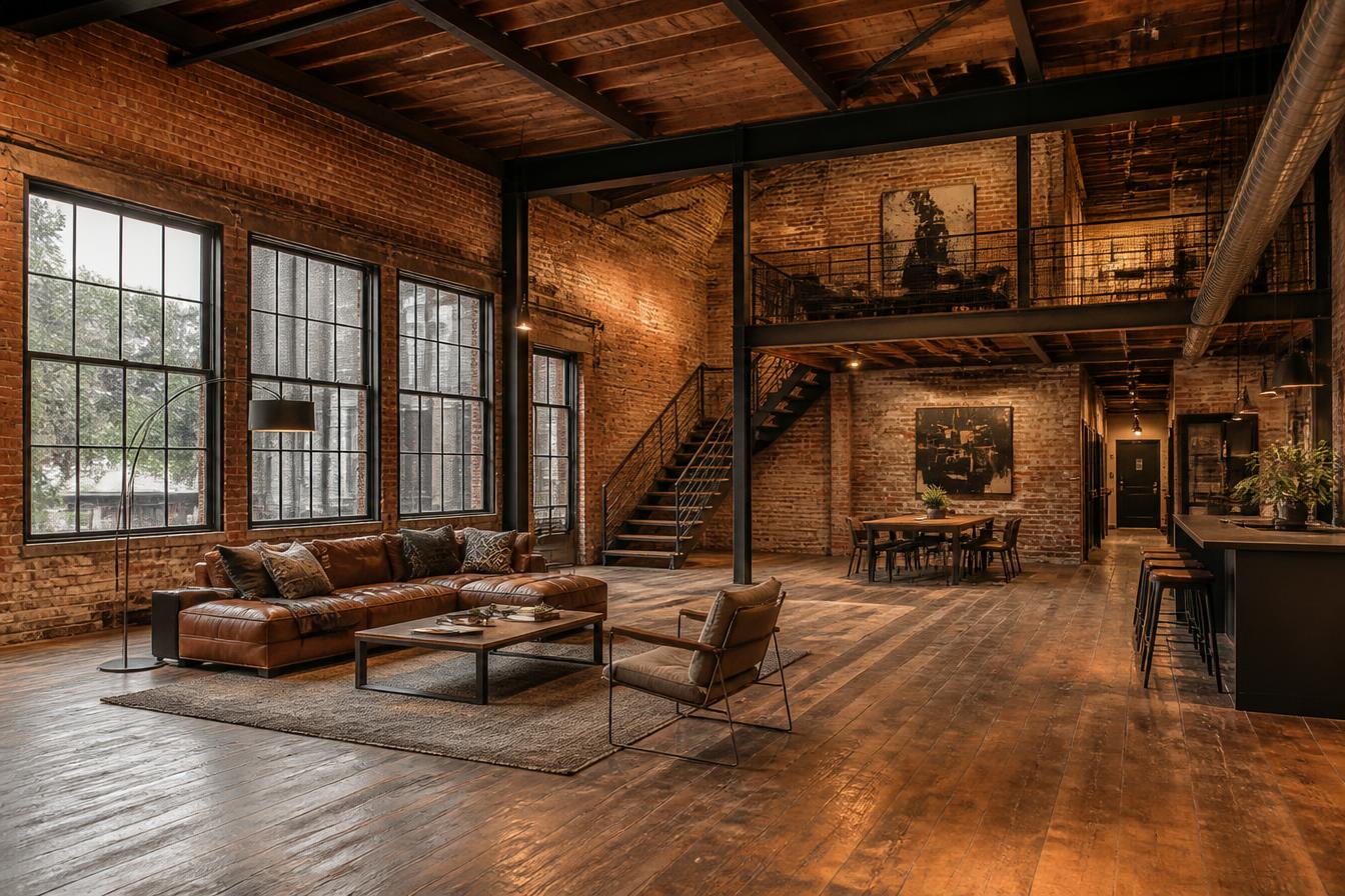
This scene is a 1920s brick warehouse in a former industrial district, converted into a live work loft. The original brick walls are 70 percent intact, the timber roof structure is exposed, the steel columns carry the old loading marks, and a new mezzanine hovers over the kitchen. The brief was to show that the space is rough enough to feel authentic but finished enough to live in. That is the whole conversion in one sentence.
The brick material is where the image lives or dies. We built it in Blender with three layers: a base color map with a mix of red, brown, and soot stains, a displacement map at 3 millimeters, and a roughness map that varies wildly between 0.4 and 0.95. The roughness variation is what sells age. Some bricks are glazed from a hundred years of soot, others are porous and matte. Uniform roughness is the fastest way to make a warehouse look like a cinema set.
We kept the original factory windows. They are steel framed, single glazed, with slightly wavy glass and a few cracked panes. The light comes through them in thick, uneven beams because the glass is not perfect. In Cycles, we modeled the panes as separate planes with a noise normal map at low intensity. That subtle waviness is what makes the shadows feel photographic instead of CG clean. New windows would have killed the room.
Lighting is a mix of daylight and warm interior sources. The daylight is a cool, overcast HDRI at 6500K, which is realistic for a northern latitude. The interior lights, including a floor lamp, kitchen pendants, and a few concealed cove washes, are all at 3599K. That warm cool contrast is the palette of every successful warehouse conversion. Warmth inside, cool grey outside, old brick in between.
The new insertions are deliberately quiet. The kitchen is black steel and oiled oak, the mezzanine is open steel grating, and the bathroom is a simple box clad in white tiles. We avoided trendy furniture. The leather sofa is worn, the coffee table is reclaimed timber, the rug is faded Persian. The message is that someone with taste moved in and let the building be the star. The furniture is the supporting cast.
Mezzanines are tricky to render. Too low and the space feels cramped. Too high and you lose the vertical drama of the warehouse. We set the mezzanine floor at 3.2 meters above the ground, leaving the roof structure well above it. The railing is a simple steel mesh rather than glass, so it does not catch reflections and disappear. The underside of the mezzanine is painted black, which visually recesses it and keeps the focus on the brick.
In post, we resisted the urge to make everything pop. The brick got a slight saturation reduction to keep it from reading as new. The steel got a cool shadow tint. The interior lights got a warm glow. We added a very small amount of haze to the daylight beams to suggest dust in the air, which is almost always present in old industrial buildings. No lens flare, no heavy vignette, no color grading that screams look at me.
The final image feels lived in, not decorated. The patina is still there. The new life is obvious. That is the balance every adaptive reuse project needs, and it is the balance that makes this kind of render worth studying. The building has history. Your job is to make sure the render does not erase it.