Interiors · Corona
Terrazzo in renders: aggregate scale, seam layout, and the polish that sells it
Terrazzo almost never fails in a render because of the colour. It fails because the chips are the wrong size for the camera, the seams are missing, and the polish reflects nothing. How to build a terrazzo floor that reads as poured, ground and polished rather than printed.
 INTERIORS
Terrazzo is one of the few materials that a client will recognise instantly and evaluate without knowing why. Anyone who has stood on one in a station, a museum or a lobby knows how it looks underfoot, and a render that gets it wrong feels cheap even when the rest of the image is excellent. The failure is almost never the colour palette. It is scale, seams, and the way the surface reflects.
Start with the honest definition, because it drives every setting. Terrazzo is aggregate set in a matrix, then ground flat and polished. The matrix is either cementitious, which gives a softer, slightly porous, satin surface, or epoxy resin, which is glossier, denser, and shows crisper chip edges. The chips are marble, quartz, glass or granite, and their size is specified: fine is roughly 3 to 6 millimetres, standard is 6 to 12, and large aggregate runs 20 millimetres and up. A specification sheet states the mix, and the render should match it.
The single most common error is aggregate that is far too big for the camera. Renderers build a texture patch, then tile it, and the patch was authored for a close-up, so at floor scale every chip becomes the size of a coin. The check is simple and it costs nothing: look at a strip of floor that is genuinely three metres wide in the frame and count the chips along it. If you cannot count them, or if the chips look like gravel rather than a designed aggregate, the tiling scale is wrong. Work at 1:1 on a floor plane and set the texture so a real one metre square contains the number of chips the specification says it should.
Repetition is the second error, and it is the one that gives the material away at a glance. A small seamless tile repeated across a large floor produces a diagonal rhythm that the eye picks up immediately, even when the chips themselves are convincing. Use a scan or authored map that covers at least a metre or more, and where the floor is a hero surface, break the pattern with a genuine second sample rather than a mirrored tile. Mirroring hides seams but creates a visible symmetry, and symmetrical aggregate is not how a poured floor behaves.
Chips need depth. A flat colour map with a specular layer on top reads as a printed vinyl floor because the light has nowhere to go. The fix is a thin, clear, slightly rough surface layer over the aggregate, so that highlights land on the top of the polish and chips catch light individually. Add a bump or normal built from the aggregate height, subtle, since a ground terrazzo floor is nearly flat, but the micro relief at the chip edges is what stops the surface looking like a sticker. Keep the bump amplitude small enough that it disappears at grazing angles, otherwise the floor starts to look like asphalt.
Roughness sets the family. A polished cementitious floor sits around 0.15 to 0.30 with gentle variation, a honed floor around 0.35 to 0.50, and a resin floor lower and more even. Whatever the number, keep it varied: real floors carry foot traffic, cleaning chemistry and a lifetime of micro scratching, and a perfectly uniform roughness produces a hard, even reflection that no floor in service has ever had. A slow, low contrast roughness map across the floor is enough and it makes the reflection feel physical.
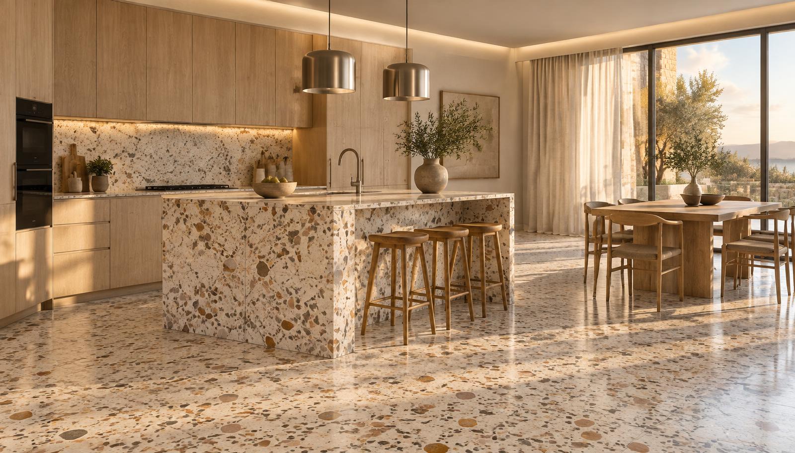
The reflection is the tell that most people miss. Polished terrazzo reflects the room, and the reason a real terrazzo floor looks luxurious is that it carries a soft, slightly blurred image of the windows, the cabinetry and the ceiling. If your floor reflects nothing but the sky or a flat grey, the roughness is too high or the reflection depth is being cut off. Check that the floor actually mirrors the objects behind the camera, and that the reflection is dimmer and softer than a mirror, not absent.
Now the seams, because without them terrazzo reads as a print. Terrazzo is poured in fields, and those fields are divided by metal strips, usually brass, zinc or aluminium, set on a layout drawn by the specifier. Divider strips typically fall on a grid of one to two metres, they line up with door thresholds and changes of material, and there is always a perimeter boundary strip where the floor meets a wall. Modelling these strips as thin recessed lines, with a slightly different material and a hair of shadow, does more for credibility than any amount of texture work.
Bookmatching is a separate discipline and it is worth getting right when the design calls for it. A bookmatched terrazzo island or backsplash mirrors the pattern across a single joint, so you need two slab-like surfaces that share one seam and nothing else. Mirroring across three seams in a row is not bookmatching, it is tiling, and the result looks like wallpaper. Where the design genuinely calls for a continuous flow across a floor and an island base, model that continuity explicitly rather than letting a tile do it by accident.
Lighting behaviour matters more here than for most materials. Terrazzo is a ground surface, which means it has a real micro texture that only shows under raking light. A frontally lit floor flattens the aggregate and the polish becomes invisible, while a low sun or a grazed cove light along one wall brings out the chip relief and the sheen in a way that instantly reads as stone. If the terrazzo is the reason the client chose the material, light it so the material can be seen.
Weathering should be logical rather than decorative. A residential floor stays clean and shows polish in the middle of the room with slightly duller edges near the perimeter where furniture and cleaning have not reached. A commercial entrance shows a wear path along the main flow, dulling where the traffic is heaviest, and a little dirt accumulated in the matrix near the door where grit is tracked in. None of this needs to be heavy handed. A single low contrast roughness and darkness map keyed to circulation is enough to make the floor look maintained rather than installed.
On cost and render time, terrazzo is cheap if you keep it honest. A colour map, a bump or normal built from the same source, and a roughness map with a clearcoat layer is a complete material; displacement on the aggregate is almost never worth the memory, and a small crop render at high quality is the fastest way to confirm the chips are reading before committing to the full frame.
Run a short audit before you send anything. Is the chip size believable at the framing you have chosen? Can you count chips along a three metre run without them looking like coins? Is there at least one visible divider strip or perimeter detail? Does the floor reflect the room rather than a flat grey? Is the polish a satin or a gloss, and does that match the matrix in the specification? Five checks, a few minutes, and the material stops being the weak point of the image.
Terrazzo is a material with a long history in real buildings, and the reason it photographs well is that it is a floor that reflects a room back at you. Get the scale right, give it seams, and let a low light graze it, and the render does the rest.