Interiors · Corona
Polished concrete floors: getting the sheen without the plastic look
Polished concrete lives or dies on roughness variation. A flat mirror gloss reads as resin and a flat matte reads as MDF. How real slabs behave under light, and how to build that behaviour into a material that survives a close up.
 INTERIORS
Polished concrete has become the default floor specification for galleries, loft conversions, retail fitouts, and a certain kind of minimalist house. Clients love it because photographs of real polished floors look expensive. Renders often fail to reproduce that, and the reason is almost always the same: the material is treated as a texture problem when it is a roughness problem.
Start with what polished concrete actually is. It is not concrete with a glossy sealer painted on top. The slab is ground with progressively finer diamond tooling until the surface pores close and the material itself takes on sheen. The finish is specified in gloss levels, from a matte grind through satin to a high gloss, and each level changes how the floor behaves under light.
That distinction matters for one practical reason: because the sheen comes from the ground surface rather than a coating, it is never perfectly uniform. Grinder passes overlap. Densifier soaks in unevenly. Aggregate density shifts across the pour. A slab with a single constant roughness value across its entire surface reads as epoxy resin or laminate, not concrete.
The first fix is variation. Drive both diffuse colour and roughness with large scale noise, low contrast, and slow changes. You are not making the floor dirty, you are simulating the fact that a slab is a natural material ground by a machine operated by a person. Panel to panel differences are also real: concrete is often poured in phases, and adjacent pours rarely match exactly.
Roughness numbers give you a starting point. A matte ground finish sits around 0.5 to 0.65. A satin finish, the most common commercial specification, sits around 0.3 to 0.45. A high gloss polish drops to roughly 0.1 to 0.2. Below 0.1 you are entering mirror territory that real floors rarely reach outside epoxy coatings, and renderers start producing the slow, glassy reflections that give CGI floors their artificial reputation.
Aggregate is the second checkpoint. High gloss dry polishes expose small stones across the surface. If the brief calls for an exposed aggregate finish, build a sparse speckle into the diffuse map, slightly darker and lighter than the base paste, and let it also modulate roughness very slightly. Cream finishes hide aggregate almost entirely, and adding it there is a common tell that the texture was downloaded rather than specified.
Saw cuts and control joints are the detail that sells the slab. Real slabs are cut every three to five metres to control cracking, leaving grooves a few millimetres wide. These quiet grid lines do more to make a floor read as concrete than any texture map, because they carry scale. Model them rather than baking them into the diffuse map, so they catch grazing light and hold their own reflections.
Edge conditions come next. Where the floor meets a wall you need either a skirting, a shadow gap, or a visible slab edge. Exposed edges show the pour layers, and that horizontal banding is a free authenticity cue. Slab thickness in this kind of work is typically 100 to 150mm, and showing even part of it helps.
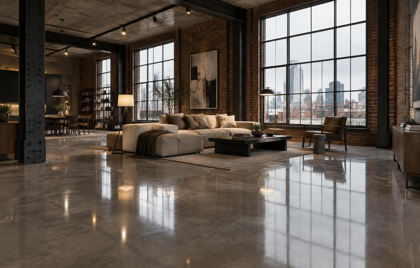
Reflections are the entire point of a polished floor, so give the surface something to reflect. The sheen only registers when there is contrast: bright windows against a darker interior, warm practical lamps against cool daylight. In overcast flat lighting the same material looks like grey stone. Interior practicals in the warm 3599K range produce the amber streaks that photographs of real polished floors are full of.
Camera angle controls everything. From standing height, the reflection of a window compresses into a shallow band and the floor reads mostly matte. From a low hero angle near floor level, the gloss dominates. When reviewing your own render, check both: if the material convinces from the low angle and stays quiet from standing height, it will behave in every view in between.
Dark polished floors in dark scenes are the classic failure. A glossy dark grey floor with nothing bright to reflect renders as a black hole, and the temptation is to raise the light levels. Often the better fix is to raise roughness slightly and let the diffuse colour carry more of the image, or to place a practical inside the frame to give the surface something to catch.
Age and traffic are part of the specification conversation. A floor in a finished retail fitout is not the same material as the floor on handover day. Traffic polishes walk lines smoother and scuffs corners rougher. In commercial work, a subtle roughness map following the main circulation lines, slightly glossier down the centre of a corridor and slightly hazier at the edges, is the kind of detail nobody consciously notices and everybody would miss.
Be careful with performance. Glossy dielectric surfaces below roughly 0.1 roughness are expensive for every renderer and generate fireflies in corners where reflections have nothing defined to hit. Corona and V-Ray both have clamping and denoising strategies that tame this, but it is cheaper to keep high gloss floors at 0.12 or above and spend the saved samples where they are visible.
When a review note says the floor looks too shiny, the instinct is to lower the reflection strength. Usually the correct response is the opposite order of operations: raise roughness first, add variation second, and only touch reflection strength last. Strength changes dim the reflections globally, which flattens the window streaks, while roughness changes blur them, which is what the note actually asked for.
Before building the material, ask three questions. What gloss level is specified, if any? Is the floor new or in use? Is aggregate exposed or is this a cream finish? The answers change the diffuse map, the roughness range, and the texture work. Ten minutes with the specification saves a full revision round.
Polished concrete rewards the same discipline as every good architectural material: study what the real surface does under the lighting you are planning, build variation into roughness before anything else, and keep the texture work quiet. The floor should look like a slab that was poured, cured, ground, and walked on, and the sheen should look like a consequence of that process rather than a setting in a material editor.