Interiors · Corona
Kitchen renders that sell the room: pendants, backsplash and the details clients actually look at
The kitchen is the room that decides whether a residential scheme gets approved. How to light pendants honestly, make a backsplash read as handmade, and spend your polygon budget where the client's eye actually goes.
 INTERIORS
Why the kitchen carries the whole set
Ask a residential client which image made them approve the scheme and the answer is almost always the kitchen. It is the room they can price, the room they use every day, and the room where the most expensive finishes sit within one metre of each other. That concentration is exactly why kitchen renders fail more visibly than any other interior: a living room can hide a weak material behind a wide shot, but in a kitchen the worktop, the splashback, the tap and the pendant are all in the same frame at reading distance.
The practical consequence is that a kitchen view deserves a different working method from the rest of the set. You build it to survive a zoom, not just a glance, and you light it for the hour the client will actually use the room, which for most homes is evening. A kitchen rendered at flat midday tells the client nothing about the room they will stand in at seven o'clock.
Camera: eye level, straight verticals, one hero
Keep the camera at a real standing eye height, around 1.6 metres, with verticals vertical. The temptation in a kitchen is to go wide to get the island, the range and the window in one frame, and the result is a room that feels like a showroom photographed with a phone. A 28 to 35 millimetre equivalent from the room's natural entry point reads as the view you actually get when you walk in, and it lets the island sit large in the foreground where it belongs.
One hero per image. If the shot is about the island and its pendants, the range wall plays support and stays slightly softer in the light. If the shot is about the backsplash and the worktop, move in close and let the island fall out of frame. The sets that feel expensive are the ones where every image has a subject, and the ones that feel like estate agent photography are the ones where every image has everything.
Pendants: light sources, not props
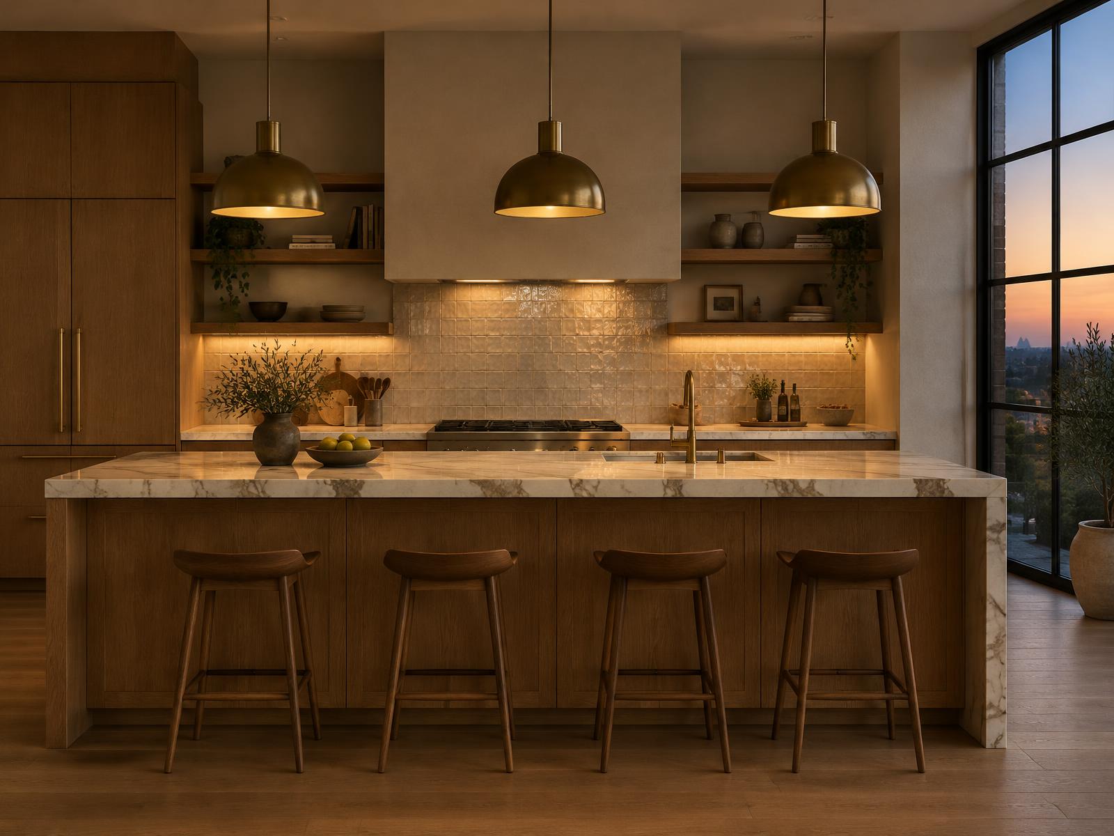
Pendant lights over an island are the single most mishandled element in kitchen visualization, because they are usually treated as geometry with a bulb inside rather than as the lighting design. A real pendant throws a pool of light onto the worktop below it and a soft wash upward onto its own shade. If your pendants are glowing but the worktop under them is evenly lit by the ambient rig, the image is lying, and clients feel it even when they cannot name it.
Build each pendant as a genuine light source with a plausible output, give the shade an interior surface that can catch that light, and let the pools on the worktop overlap the way three real fittings would. Keep the colour temperature consistent with the rest of the room's artificial light, around 3599K for a warm residential scheme, and resist the urge to make the pendants the brightest thing in the frame. They should read as lit objects, not as special effects.
The backsplash is a close-up material
A handmade-look backsplash, zellige, handmade subway, tumbled stone, is a close-up material and has to be built like one. The tell of a fake one is perfect regularity: identical tiles, identical grout, identical sheen. Real handmade tile varies in three ways at once, in face angle, in glaze thickness and in colour, and it is the face angle variation that does the most work, because it makes each tile catch the under-cabinet light at a slightly different moment.
The efficient way to get there is geometry variation rather than a heavier texture. Slight per-tile rotation and offset, a bump map with genuine relief rather than a printed pattern, and a grout line that is recessed and slightly rougher than the tile face. Then light it from a shallow angle, which is what under-cabinet lighting does naturally, because raking light is what turns surface variation into sparkle. A flat-lit handmade tile looks like a printed texture no matter how good the map is.
Worktops: veining scale and edge profile
Veined stone worktops fail on scale more than on anything else. A marble texture tiled at the wrong size reads as Formica instantly, and the fix is unglamorous: measure the real slab, map the texture at true scale, and let the veining run continuously across the island's waterfall edge if the design calls for it. The edge profile matters as much as the face, because a mitred edge with the vein continuing around the corner is the detail that tells a fabricator's eye the image was made by someone who has seen a real kitchen.
Reflection on a polished worktop should be present but broken. A mirror-flat polish across three metres of island looks like liquid glass, so keep a whisper of roughness variation across the surface and let the pendant reflections stretch and soften. Satin and honed finishes are easier to believe and currently more common in high-end work, so when the brief does not specify, honed is the safer default.
Styling: less, but real
Kitchen styling follows the same rule as the materials: less, but real. A cutting board, a bowl of fruit, a kettle, one plant. The mistake is the catalogue kitchen, where every shelf carries a styled vignette and the worktop carries nothing, which is the opposite of how kitchens are used. Put the objects where hands actually go, near the hob, near the sink, at the end of the island, and leave the rest of the surface empty enough that a real person could cook on it.
Open shelving deserves a warning of its own. It is the highest-effort styling surface in the room, because every object on it is at eye level and fully lit, and a shelf of random props reads as clutter rather than character. If the design has open shelves, style them with a tight palette of ceramics and glass and leave breathing room, or crop them out of the hero shot and show them in a detail frame instead.
Mixing daylight and artificial light
The evening kitchen is a mixed-lighting problem, and the balance that reads as expensive is artificial light doing the work while daylight provides the context. Set the exterior to a dim blue dusk, let the pendants and under-cabinet strips carry the room, and keep the colour temperatures separated: warm inside, cool outside. The mistake is matching them, because a warm dusk sky behind a warm interior flattens the window into a wall.
Under-cabinet lighting is the layer most often forgotten and the one that does the most for the backsplash. A continuous warm strip washing down the tile gives you the raking light that makes the surface variation read, and it separates the worktop plane from the wall plane in a way no amount of ambient light will. Model it as a real linear source, not a glow texture, so it actually lights the counter.
The details clients zoom into
These are the things a client zooms into on a call, in rough order: the tap, the handle detail on the island, the grout lines, the edge of the worktop, the inside of the pendant shade, and whatever is on the shelves. Every one of those is a small piece of geometry or a small material decision, and every one is cheaper to get right than to explain. The tap especially: a low-poly tap with a chrome preset is the fastest way to make an expensive kitchen look like a developer brochure.
Appliances are the other zoom target. A built-in oven with a generic black glass front is fine in a wide shot and embarrassing in a close one, so either use a proper manufacturer model or keep appliances out of the close frames. Handles, hinges and the gap lines between cabinet fronts should all be modelled, because in a kitchen the shadow gaps are the drawing, and a cabinet wall with no reveals reads as a single extruded box.
Common kitchen render failures
The failure list for kitchen renders is consistent across studios. Pendants that glow but do not light. A backsplash with a printed texture and no relief. Veining at the wrong scale. A mirror-polished worktop. Styling that fills every shelf and no worktop. A midday exterior behind an evening interior. And a camera so wide the room reads as a furniture showroom.
None of these are rendering-engine problems. They are decisions about where the client's eye goes, and the kitchen is simply the room where that eye is best trained. Get the pendants honest, the backsplash handmade, the stone at true scale and the light at the right hour, and the kitchen image will carry the whole presentation, the way it always does.