Interiors · Corona
Rendering CLT interiors: what makes mass timber read as real
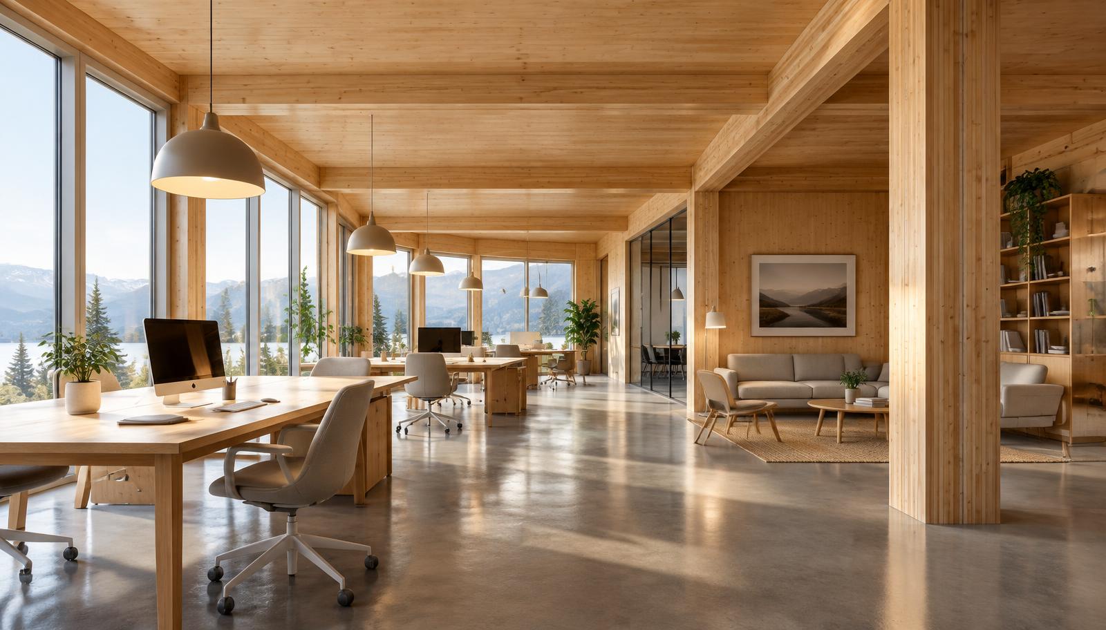
Exposed cross-laminated timber is now a headline feature in offices, schools, and housing. The panel joints, lamella grain, and warm bounce are what separate a convincing CLT render from a room wrapped in a generic wood texture.
 INTERIORS
Mass timber has crossed over. A decade ago an exposed CLT interior was a novelty featured in the trade press; now offices, schools, libraries, and housing blocks are specified with exposed panels as the interior finish, and clients arrive at the visualization stage expecting the timber to be the hero of the imagery. Rendering it well has become a mainstream skill rather than a specialty.
The problem is that most 3D libraries treat timber as one material. Spruce cladding, oak flooring, and CLT panels are all filed under wood, and a scene built from library wood reads as a room wrapped in furniture. Real CLT has a specific visual identity: layered panel construction, a grid of joints, pale spruce lamellas with fine grain, and a matte, dry surface. Capture those and the building reads as an engineered timber structure. Miss them and it reads as a sauna.
Start with the panel grid, because it is the strongest single cue. CLT panels arrive on site in units typically 2.4 to 3 metres wide, and the joints between them are visible: either a fine shadow gap, a butt joint, or a connecting spline depending on the system. These lines establish scale and construction logic at a glance. Model them rather than painting them into a texture, so grazing light and reflections do the work.
Within each panel, the lamellas matter. CLT is made of boards stacked crosswise in layers, and on the visible face you see the edges and faces of individual boards, each with slightly different tone and grain direction. A common mistake is one repeating wood texture across the whole ceiling. Instead, break the surface into per-panel or per-lamella variation: subtle hue shifts, slight brightness differences between boards, and grain that runs consistently along each board.
Screw and fastener lines come next. Panels are fixed with visible screws, often in regular rows near the joints, and connection hardware appears where panels meet beams. In the foreground of a close view, a few modelled screws with slight recess shadows are worth more than any texture map. In wide views, a subtle darkened dot pattern in the diffuse map at the correct spacing is enough.
Get the colour right by looking at real projects rather than wood swatches. Fresh spruce is pale, almost blond, with a warm edge. Interior timber that has aged under daylight shifts toward a honey tone, and most clients specifying mass timber want that warm, light look. Keep it clean: exposed structural timber inside a building does not weather like exterior cladding, so no grey silvering unless the brief genuinely calls for it.
Roughness is where a lot of timber renders go wrong. Visible structural softwood is matte. It is rarely varnished in exposed applications, and where a fire retardant coating or translucent glaze is specified, it only adds a faint sheen. Keep roughness in the 0.6 to 0.8 range with slight variation between boards. A glossy timber ceiling is an instant tell that the material came from a generic library.
The reward for getting the surface right is the bounce. Pale timber acts as a giant soft reflector with a warm tint, and a daylit CLT interior needs noticeably less artificial fill than the same space in concrete. This is also the case where colour bleeding is a feature rather than a fault: warm secondary light off the timber is what makes white walls feel soft and the space feel calm. Keep GI saturation at or near its default in these scenes and let the material do the lighting.
Artificial light needs care against all that warm surface. Lamps in the warm 3599K range blend naturally with spruce, because their colour sits close to the timber's reflected tone. Cool 4000K office lighting fights the material, making the timber look dingy by comparison. When a project mixes the two, use the warmer lamps in timber dominant zones and reserve cooler light for services heavy back of house areas.
Ceilings deserve specific attention because they occupy most of the frame in interior shots. Perforated acoustic panels and timber battens are often combined with exposed CLT, and both read at grazing angles. A perforated panel is cheap to fake with an alpha map as long as the holes are dark inside, and battens give you a free rhythm of highlights and shadows that adds depth to wide shots.
Glulam sits alongside CLT in most of these buildings and behaves slightly differently. Laminations in glulam are more visible and run along the length of the member, curved beams are common, and the surfaces are planed smoother than panels. Keep the two materials distinct rather than sharing one timber shader, and let the frame's rhythm of columns and beams carry the composition in wide office and hall shots.
Scale cues decide whether the structure impresses. Exposed timber reads best when people, furniture, and doorways establish the span. A long span glulam frame with no human figure reads as an abstract pattern; the same frame with two people walking under it reads as architecture. Populate these scenes properly.
Reference discipline is the cheapest quality multiplier available. Construction photography of real CLT buildings is widely published, and the details that matter, joint rhythm, fastener spacing, tone under daylight, are all in those photographs. An hour collecting references before building the materials prevents the most common failure, which is a technically clean render that nonetheless looks like a hotel lobby wearing a timber costume.
Mass timber clients are usually architects who chose the material for its environmental story and its visual warmth. Your render has to deliver both: the engineered precision of the panel grid, and the soft, warm, matte quality of the surface under daylight. Get the construction logic right and the warmth follows naturally, because in real CLT buildings that is exactly where it comes from.