Interiors · V-Ray
Limewash and clay plaster: rendering walls with depth instead of flat paint
Perfectly flat walls are the quiet reason renders feel synthetic. Limewash and clay plaster get specified more every year, and they behave nothing like emulsion. The texture, sheen, and application variation that make soft walls read as material rather than as default shader grey.
 INTERIORS
Ask a group of non designers why a render feels synthetic and they will rarely say the walls, but the walls are usually guilty. A default material with flat diffuse colour and uniform response to light is the least physical surface in any scene, and it occupies the most pixels. Limewash, clay plaster, and troweled finishes have moved from niche specification to mainstream precisely because they solve this, and rendering them well is now a baseline skill.
Understand what the material is before shading it. Limewash is mineral paint absorbed into the substrate in thin coats, and each pass overlaps the last, so the finish is a record of application: clouding, lap marks, and subtle shifts in opacity. Clay and lime plasters are applied by trowel in layers, compressed and burnished, leaving movement, ridges, and occasionally small voids. The common thread is that the surface varies at two or three scales at once, and no single flat colour can represent it.
The first layer of variation is large and slow. Across any real plaster wall, the pigment density drifts: slightly darker where the applicator loaded more material, slightly lighter where the coat ran thin, clouded patches where passes overlapped. Drive the diffuse map with a low contrast noise at a scale of roughly one to two metres. The variation should be almost subliminal; if a viewer can name the blotches, the map is too strong.
The second layer is the sheen, and it is what makes these finishes come alive. Burnished plasters polish where the trowel pressed hardest, so the surface has patches of lower roughness that catch window reflections and lamp glow. Limewash stays matte but its absorbency varies, giving a gentle satin mottle. Map roughness with a similar large scale pattern to the diffuse but not identical to it, keeping values in a matte to eggshell band, roughly 0.55 to 0.8, with polished plaster dropping locally to 0.35 in burnished zones.
Micro relief is the third layer and the one to be most careful with. Troweled plaster carries fine ridges and trowel arcs, and a small bump or normal map captures this, but the strength should sit at the edge of perception. Overdone micro bump is the classic failure that turns plaster into sandpaper, and it is most visible in grazing light, which is exactly the light that makes the material look its best.
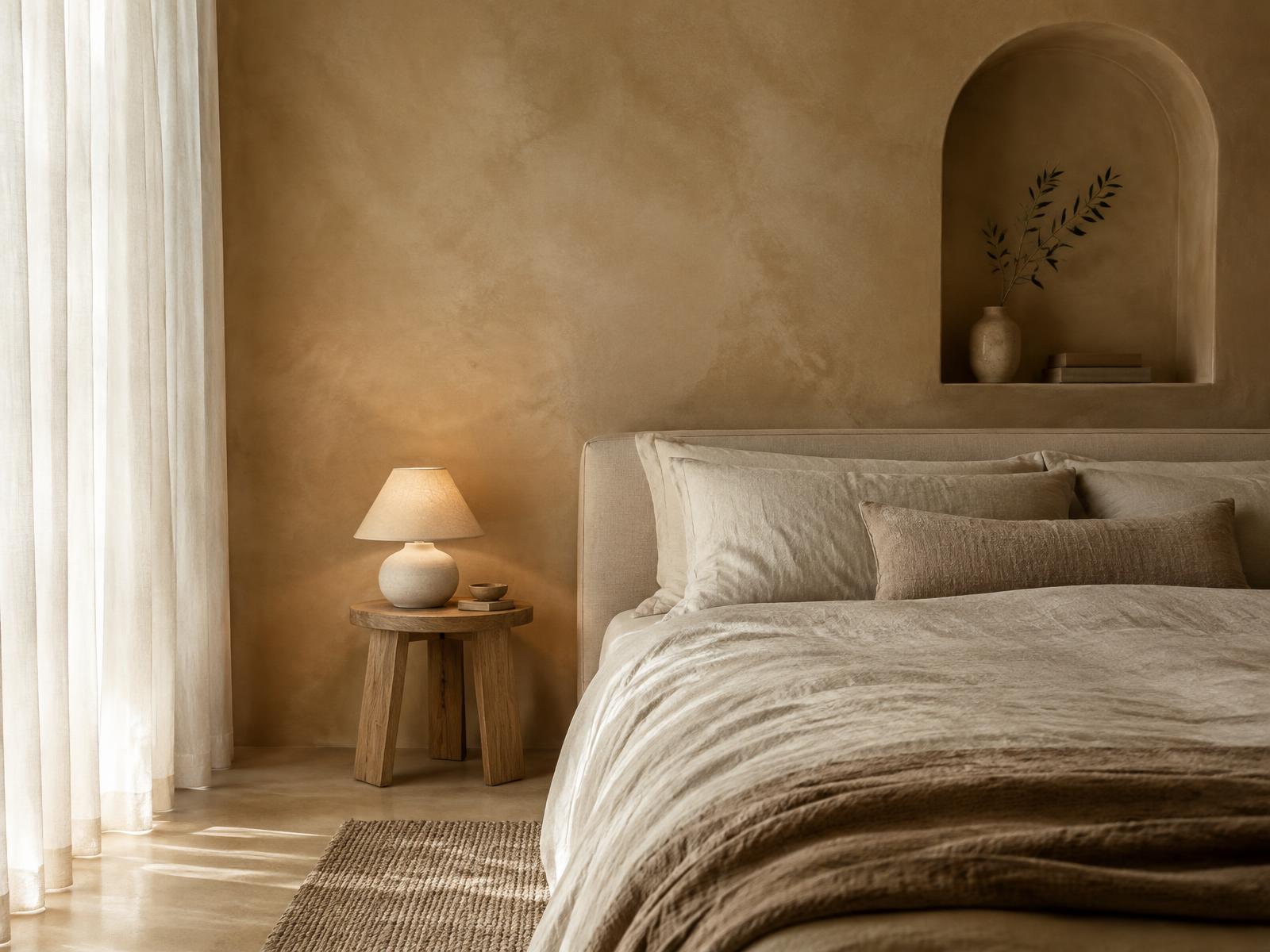
That grazing light is the whole point of the specification, and the render should stage it. Morning or late afternoon sun raking across a plaster wall reveals the clouding and the trowel movement; flat on light hides all of it. In the reference image, soft daylight from the left plus a warm 3599K ceramic lamp beside the bed gives the wall two light stories: a broad cool wash and a warm local pool. The plaster earns its texture from both.
Corners and edges behave differently. Applicators cut in by hand at edges, so external corners often carry slightly heavier material and internal corners slightly thinner, and both pick up different amounts of burnish. A subtle darkening toward internal corners mimics how these walls actually age and also adds the soft occlusion that makes rooms feel built. Keep it gentle; heavy corner shading reads as an AO map, not a wall.
Scale discipline matters more here than with tiled materials. Plaster texture libraries usually tile at one or two metres, which produces visible repetition on any wall wider than three. Use the largest seamless map available, or better, randomise UV offset and rotation across wall segments, and keep the large scale clouding in its own map so it never tiles at all. A visible texture repeat on a hero wall is the most common limewash failure in submitted work.
Colour is a conversation with the client, not a guess. Limewash and clay plaster manufacturers publish named palettes, and these finishes shift noticeably between wet, dry, and lit states: a clay tone that looks soft and pink in afternoon sun goes grey beige under north light. If the project specifies a real product, sample its published photography under both daylight and warm artificial light before committing, because the paint chip on the mood board is not what the wall will do.
Pair the walls with the materials that justify them. Limewash reads as a deliberate, tactile, slightly artisanal choice next to linen, oak, unglazed ceramics, and honed stone, and it reads as a trendy flat wall next to high gloss laminates. In the reference image, the plaster, linen bedding, oak stool, and ceramic lamp form one material family, and that coherence is why the room feels resolved rather than styled.
Be honest about the specification. If the wall is actually painted plasterboard with standard emulsion, do not render it as limewash, however tempting the depth. The client will receive a room that the painter cannot reproduce, and the discrepancy surfaces at handover with you in the middle. When the finish is unspecified, ask; when it is emulsion, the correct render is a very slightly non uniform matte surface, with variation in the tenths of a percent, not a plaster texture.
Performance is forgiving with these materials, which makes them cheap insurance for the whole scene. Large scale diffuse and roughness maps cost almost nothing, moderate bump strength is cheap, and unlike glossy floors or metals the material generates no fireflies. A well built plaster shader costs minutes and lifts every surface it touches, which is a better ratio than almost any other material work in an interior.
The audit for plaster walls is quick. View the wall in grazing light: does the clouding show without announcing itself? View it in shadow: does it still separate from a flat colour, or does it go dead? Are there visible texture repeats? Is the micro bump invisible at arm's length and present at two metres? Does the sheen respond to both the daylight and the practicals? Four views, two minutes, and the most photographed surfaces in the image stop being the flattest.
Soft wall finishes reward the same discipline as every material in this journal: study how the real product is applied, express the application rather than the brochure, and let light reveal the variation instead of forcing it in texture. A wall with honest depth quietly removes the synthetic feel from an entire render, and nobody will be able to say why, which is exactly how the best material work should land.