Interiors · V-Ray
Bookmatched stone in CGI: the veining detail luxury clients notice first
A mirrored marble wall is the signature move of high end interiors, and the one most renders quietly get wrong. How to build bookmatched slabs that survive a close look.
 INTERIORS
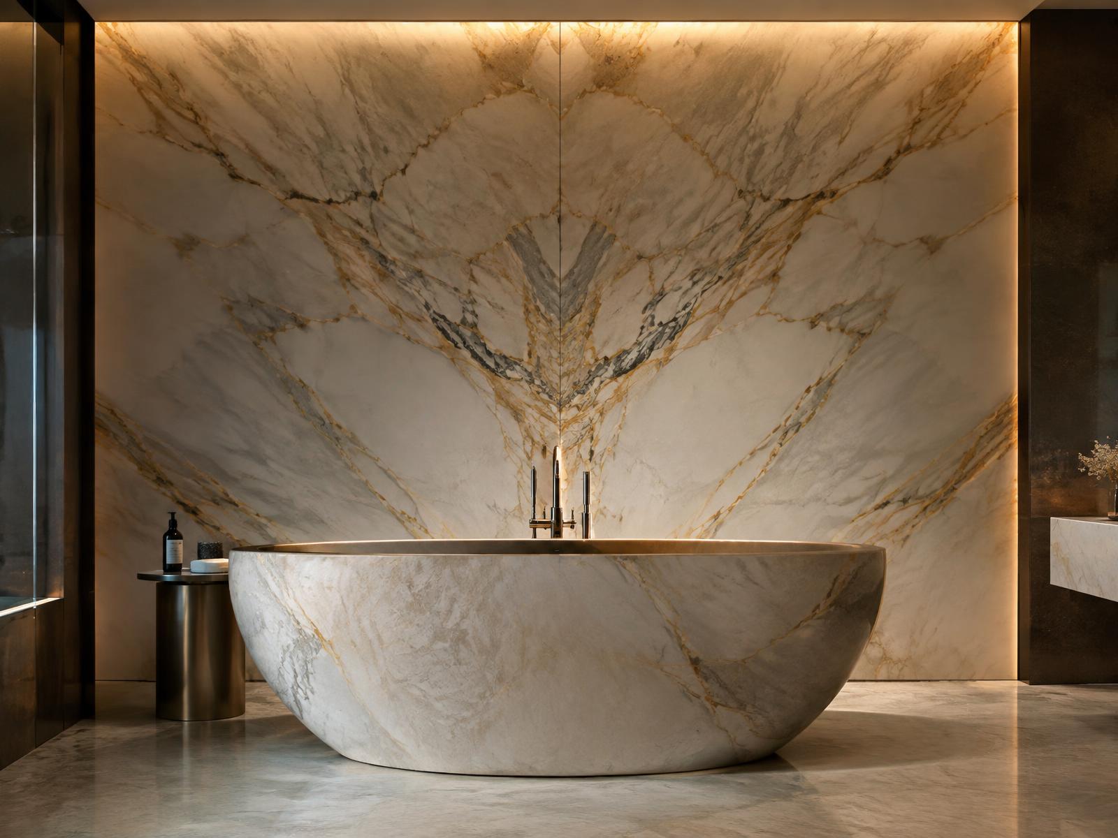
Walk into any high end bathroom or hotel lobby and the money is on the walls. Bookmatched stone, two consecutive slabs opened like a book so the veining mirrors across the seam, is the move architects reach for when a project needs to signal budget. It is also the detail that separates a considered interior render from a textured box, because real bookmatching follows rules that a tiled texture never will.
The first rule is that the mirror happens across a single, deliberate seam. In the real world, consecutive slabs are cut from the same block and polished on opposite faces, so the figure at the join is symmetrical and the symmetry weakens as you move away from it. Most CGI versions fail because the artist mirrors the whole texture across every seam, producing a kaleidoscope effect that no quarry could produce. Build the wall as two large slabs meeting at one vertical or horizontal centre line, mirror only across that line, and let the outer edges of each slab run free.
Slab size is the second tell. Real marble slabs top out around three metres by two, and Calacatta with strong veining is often smaller. If your texture repeats across a six metre wall with no joint, the render is lying. Model the joints. A two millimetre shadow gap with a hairline of darker material reads correctly at any camera distance and gives the wall its scale. When a client or architect looks at your render, the joint pattern is one of the things they are subconsciously checking against the drawings.
The material itself needs less gloss than instinct suggests. Polished marble has a clear coat like reflection response, so a sharp reflection at low roughness is right for the polish, but the stone beneath scatters light softly over a few millimetres. A small amount of subsurface scattering, even a cheap translucency approximation, warms the veins and stops the surface reading as printed glass. In V-Ray a FastSSS2 blend at low weight, or a slight diffuse falloff toward the normals, gets you most of the way without touching render times.
Lighting is what sells or kills stone, and it is where warm interior sources earn their place. A grazing cove at 3599K running along the top of the slab rakes across the polish and makes the veins cast micro shadows in the honed areas. Flat frontal light, the default of so many bathroom renders, erases all of it. Place the grazing light first, then add fill. If the veining disappears when you raise the fill, the fill is too strong.
Vein scale deserves a pass of its own. Calacatta veins are measured in centimetres, Statuario runs broader, and cheap porcelain imitations run smaller and more frequent. If you are matching a specified stone, get the actual slab photograph from the supplier; most stone yards publish them, and the architect will notice if the render shows a different stone from the one in the specification. Real world mapping keeps the vein scale honest across every surface the material touches.
The freestanding bath in front of the wall is not decoration for its own sake. Stone on stone, with the bath in a quieter grade of the same family, is how real projects handle the pairing. Give the bath a honed finish, slightly higher roughness than the polished wall, so the two surfaces separate under the same lighting. Matching gloss levels across both makes the room read as one continuous plastic shell.
Finally, accept the imperfections. Real bookmatching never mirrors perfectly because the saw kerf removes a few millimetres of material between the faces. Offsetting one slab's texture by a few centimetres before mirroring introduces exactly that mismatch, and it is the kind of detail nobody can name but everybody registers. Perfection in CGI reads as artificial; controlled imperfection reads as budget.