Workflow · V-Ray
Clay renders and white models: how to make an unpainted image look deliberate
A clay render is an argument about form, light and proportion, not a finish pass that failed. How to pick the clay material, light the scene so shape reads, and present the image so a client trusts it.
 WORKFLOW
What a clay render is actually for
A clay render is the image a studio makes when it wants a client to look at the building instead of the finishes. Every solid surface carries the same matte neutral material, there are no textures and no patterned props, and what is left to judge is form, proportion, massing, circulation and light. Done well it is one of the most useful images in a design development package. Done badly it looks like the render collapsed on the way to the finish pass, and clients read that as a warning about the project.
The reason it so often reads as unfinished is that it is usually produced as a default rather than as a decision. Someone duplicates the final scene, swaps in a grey material, hits render and sends the result. The lighting was designed for the textured version, the camera was framed for the textured version, and the exposure was balanced for the textured version. A clay render needs its own lighting, its own camera and its own exposure, and that is the whole difference between a design tool and an accident.
The material: not white
Start with the material, because the most common mistake is also the most expensive one. Pure white is not a clay material. A diffuse reflectance of 1.0 clips highlights, destroys the shading gradient that tells you a wall is curving, and forces the exposure down until everything else in the frame turns to mud. Real plaster, foam board and museum card sit somewhere between 0.5 and 0.75 in reflectance, and that headroom is exactly what lets a bright wall still show a shadow on it.
A practical starting point is a diffuse or principled shader at around 0.6 grey, roughness high enough that nothing mirrors, and a very faint roughness variation so large flat walls are not perfectly even. Perfectly even surfaces are the second giveaway of a lazy clay setup: a wall with no variation reads as a render, while a wall with a whisper of noise in its roughness reads as a material. Keep the variation in roughness rather than in colour, because colour noise makes the model look dirty.
Three materials, not one
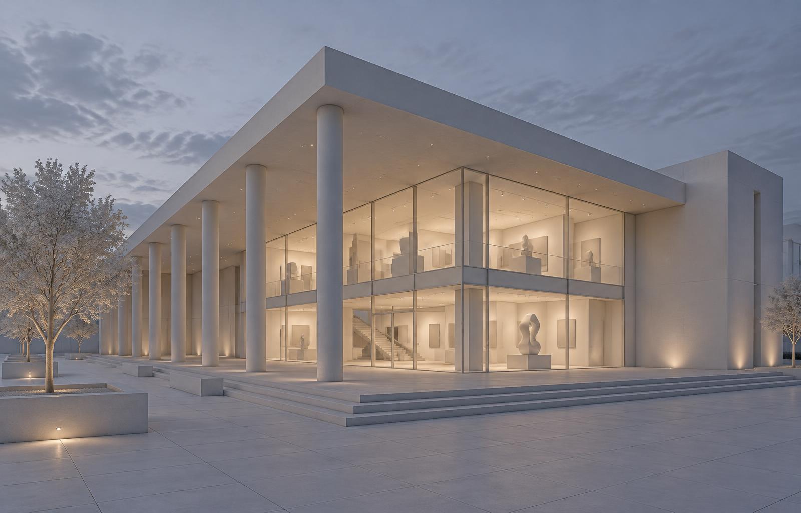
One material for everything is the other mistake worth naming. Glazing has to stay distinct, because a reader who cannot tell where the glass is has lost the most important information in a design development image. Give the glass its own shader with real transmission and a visible reflection, and let the frames keep the clay material. Floors benefit from a third, slightly darker and slightly smoother material, which anchors the model and gives the eye a base plane to read the section off.
That is the entire palette: clay for the solid masses, glass for the openings, a darker material for the floor. Some studios add a fourth, a slightly warmer or lighter tone for whatever the image is meant to highlight, such as a feature stair or a lobby volume. Use that sparingly, because a clay image draws its authority from restraint, and the moment three surfaces are flagged none of them is.
Light is the whole image
With no texture, no colour and no pattern, lighting is the only thing left doing narrative work, so it deserves far more attention than it usually gets. A flat ambient dome produces a clay render that looks like a screenshot: pleasant, soft, and completely unable to tell you what the building is doing. Direction is what makes shape legible, and one strong sun plus a graded sky will always beat a soft even rig for explaining massing.
The sun should rake rather than flood. A low to mid elevation, roughly forty five degrees off the camera axis, throws the colonnade, the reveals and the roof edge into shadow and shows you the depth of the building in one glance. Light from dead ahead flattens a facade into an elevation drawing, and light from behind the camera removes every shadow that would have explained the geometry. If the scene has a courtyard, a soffit or a deep reveal, those are the elements to light for, and the camera should sit where they read in both shadow and light.
Dusk is the most flattering condition for a clay exterior and it is underused. A cool blue sky dome gives the model soft, even, modelling light, and warm interior light at around 3599K behind the glazing tells the viewer the building is occupied without a single prop. That pairing does two jobs at once: the ambient light explains the massing and the glass explains the plan, which is the information a client most often cannot extract from a daytime clay render.
Edges carry the picture when texture does not
In a textured image a joint or a shadow gap does its work invisibly. In a clay render it is one of the few things the eye can hold on to, which means the model has to be built properly. Real fabricators do not produce zero radius corners. A one or two millimetre chamfer on a metal edge, a shadow gap at a plaster line, a reveal under a roof edge, and a visible thickness at a glass pane are the difference between a model that reads as built and one that reads as a solid from a game engine.
Contact shadows deserve their own note. Ambient occlusion supplies the definition that texture would otherwise carry, so a clay render usually benefits from a little extra, but the moment it starts darkening whole rooms it has stopped being a contact effect and become a dirt map. Keep the radius small enough that it only touches corners and junctions, and check the image at thumbnail size, because occlusion that looks subtle at full scale reads as grime at a quarter scale.
Camera choice: axonometric, wide interior, or eye level
Clay images and orthographic views are natural partners. An axonometric or a true isometric with no convergence shows the same information a clay model on a table shows, and it is often the right choice for massing, stacking and site relationships. For interiors, a wide but honest lens at eye level with verticals kept straight reads as a walk through a room rather than as a fisheye trick. What fails is a dramatic three-point perspective with a tilted camera: the distortion competes with the geometry, and the reason the image was made clay was to let the geometry speak.
Framing discipline matters more here than in a finished image, because there is nothing in the frame to hide behind. A clay render cropped at the roof line looks like a mistake rather than a choice. Give the building air, show the ground plane it sits on, and if the site matters, model the neighbour context in the same clay material so the reader is not left guessing which parts are proposal. If that distinction needs to be explicit, use a slightly lighter or darker tone for the existing mass and say so in the caption.
How much detail to model
The question every studio gets asked is whether a clay render can be cheap. The honest answer is that it can be cheap in shader work and expensive in modeling, because clay exposes missing detail instead of hiding it. A sofa with no fabric still has to be a sofa with the right proportions. A stair needs its balustrade, its tread depth and its landing. A handrail at the wrong height is glaringly obvious in a grey room and completely invisible once someone puts a rug and a print on the wall.
A sensible rule is to model everything that affects proportion or circulation and to leave out everything that only affects surface. Furniture as masses with correct heights and clearances. Trees as volumes with plausible canopy shapes rather than as species studies. People as simple figures or as nothing at all, because a grey crowd of untextured mannequins tends to look unsettled rather than neutral, and a clay image with no people can still communicate scale through a door height or a handrail.
Presenting the clay set
A clay render is almost never the only image in a package, and how it sits next to the others changes what it means. Put it beside a materiality study from the same camera and the reader understands instantly that the second image is the first one dressed. Keep the camera identical between them, because a clay view from one angle and a finished view from another reads as two buildings. Label the hour and the light condition on the frame, and if the set covers several hours, keep the clay material identical across all of them so the only variable is the light.
For planning and design review work, a clay or semi-clay set is often the more defensible image, because it makes no claim about finishes that might still change. That is a genuine advantage worth stating in the submission: the image communicates massing, shadow and relationship to context without implying a specification. Say what the image is in the caption so nobody mistakes it for a finished view.
Where clay renders go wrong
The failure list is short and consistent. Albedo at pure white. A flat dome with no direction. Glass that cannot be told apart from wall. Occlusion cranked until the corners are black. A tilted wide-angle camera that makes the building look like it is falling backwards. A scene lit for the textured version and then stripped. And finally, sending a clay render as the only image to a client who was promised a finished view, which is a communication failure rather than a rendering one.
None of those are hard to fix, and the fix is always the same habit: treat the clay image as a deliverable with its own lighting, its own camera and its own exposure, and decide in advance what question it is answering. If it answers the question you actually had, nobody asks where the colours went.