Tutorial · Blender
Dollhouse and cutaway renders: showing the whole plan in one frame
The dollhouse view sells a floor plan the way no camera tour can: every room, both floors, one image. How to model for the cut, choose the tilt, light rooms that have lost their ceilings, and keep the result elegant rather than toy-like.
 TUTORIAL
One frame, the whole plan
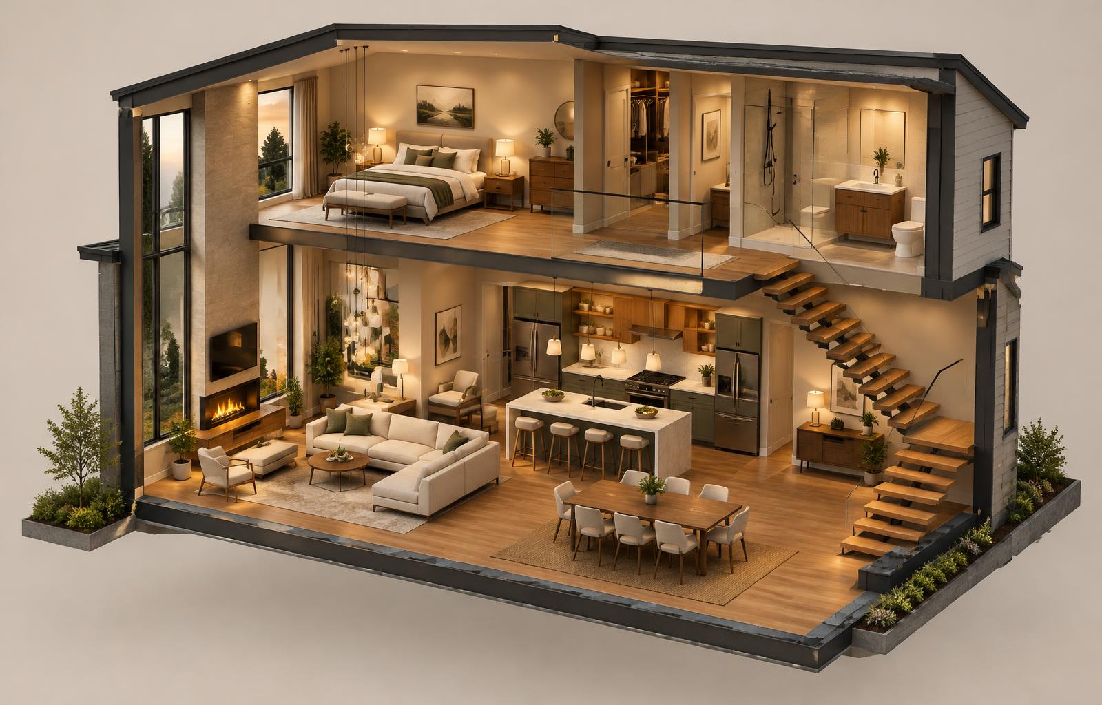
The dollhouse view is the only image type that shows an entire floor plan as space rather than as drawing. A camera tour shows rooms one at a time; a plan shows relationships but no volume; the cutaway shows both at once, the kitchen beside the living room, the staircase connecting the levels, the bedroom window aligned with the courtyard below. For buyers who cannot read plans, which is most of them, and for clients who want to understand circulation at a glance, the dollhouse is the single most communicative image in the set, and it is also the one most often left to the end of the schedule when the budget for care has run out.
The view earns its place in specific briefs. Residential marketing is the classic: compact homes, townhouses and apartments where the plan is a selling point and the rooms are small enough to read whole. Renovation and fit-out proposals use it to show what changes between existing and proposed. Multi-unit developments use a repeated cutaway to compare unit types side by side, where the consistency of the view is the point. Where it does not belong is large-spatial briefs, museums, landscapes, urban projects, where the plan's scale defeats the frame and a conventional camera or an aerial does the job honestly.
When a cutaway beats a camera tour
Modeling for a cutaway is a modeling discipline, not a rendering trick, and the decisions happen weeks before the render. The cut is made by hiding geometry, which means every object on the cut side must be hideable: roof, upper storey walls, facade cladding and the window frames on the removed face. What the cut exposes must be finished, because the interior faces of far walls and the floor slab now become visible surfaces in the render, and any model that was never meant to be seen from inside shows its construction: single-sided walls, missing backfaces, untextured slab edges. Cap every cut edge with a realistic thickness, because a zero-thickness wall seen in section reads as paper.
The camera is where dollhouse views are won or lost, and the key decision is tilt. A straight-on elevation-style view flattens the space back into a drawing. A tilt between roughly 30 and 45 degrees above horizontal gives the volume its depth while keeping every floor readable, and it should be held consistent across a set of images. The second decision is projection: a true perspective at moderate distance reads most naturally, while a near-orthographic view reads as illustration and suits technical audiences. What almost never works is a wide-angle close perspective, which makes the near rooms balloon and the far rooms shrink and turns the house into a fisheye diagram.
Model for the cut you will make
Lighting is the cutaway's special problem, because the view removes the very surfaces that bounce light in a normal interior. Rooms have lost their ceilings and often a full wall, so physically correct daylight does almost nothing and physically correct interiors go dark. The production answer is to cheat with intent: emissive planes where the removed ceiling was, portals at the open face, and a modest ambient fill that the eye accepts as daylight. Keep the interior practicals warm, in the 3599K interior family, and let them define each room's centre the way real evening interiors do. The image should read as a lit model, not as a spaceship of unexplained glow, which is a distinction the viewer feels before they can name it.
Styling a dollhouse is styling a model at a scale where every object is visible and none is dominant. The decluttering rule reverses: normal interior renders hide detail in darkness and bokeh, so the cutaway needs fewer, cleaner, better-arranged objects, each reading clearly at small size. Furniture defines the program of each room, so a study that reads as a bedroom or a dining area that reads as an office is a labeling failure, not a furniture shortage. Sightlines matter too: keep the vertical connections, the stair void, the double-height space, open enough that the eye can travel through the section, because that traversal is what makes the image feel like architecture rather than inventory.
Camera angle and tilt
Materials at cutaway scale need their texture density re-checked, because the same camera that sees every room sees every texture at a smaller screen size. Large-scale wood grain, oversized stone veining and heavy fabric weave that look correct in a room interior read as poster art at dollhouse scale, so pull texture scale down or swap to finer variants for the cutaway. The floor slab deserves special attention since it carries a third of the frame: give it a real material, a visible edge detail and consistent thickness, because it is the largest single surface in the image and the one every eye lands on between rooms.
One of the strongest variations is the per-floor treatment: render each storey as its own cutaway frame, same angle, same lighting recipe, presented as a numbered sequence. This gives the marketing set a rhythm, one frame per level, and it lets each floor be composited with its own labels and callouts. Where the brief includes a roof or a terrace, that level becomes its own frame with the floors below hidden, which keeps the terrace from being read as a floor plate. Labels and thin leader lines work in this format where they would clutter a hero render, and they double the image as a presentation drawing.
Lighting rooms with no ceilings
Real-time engines have changed what a cutaway can do, and the change is worth adopting where the budget allows. In Unreal or Twinmotion, the roof and wall groups become hideable sets, so one scene produces the dollhouse, the per-floor frames and, on request, a walkthrough where the client peels the house open themselves in the meeting. That interactive peel is a genuinely different pitch moment: instead of describing circulation, you remove the second storey in front of the client and show them the plan as space. The lighting recipe transfers, warm interiors under a soft ambient, and the render-time cost of the still is the same.
Presentation context separates an elegant cutaway from a toy. The neutral background does real work: a soft gradient or a pale studio floor, no sky, no site, so the model reads as the subject. A subtle contact shadow grounds the mass. Where the image accompanies plans, keep the cutaway's proportions honest to the drawing so the two can be compared; where it stands alone, resist the temptation to exaggerate room depth for drama, because the format's entire value is trust in the plan.
Materials and readability at small scale
The failures repeat across studios, and they are worth listing as a pre-flight check. Backfaces missing or untextured on interior faces, visible the moment the wall is hidden. Zero-thickness cut edges reading as paper. A wide-angle tilt that balloons the near rooms. Floors rendered too dark because the ceiling bounce was removed and nothing replaced it. Texture scale untouched from room-interior settings. Overfurnished rooms that read as clutter at small size. A toy-like saturation pushed to make the image cheerful when the palette itself, warm interiors on a neutral ground, was already doing that job.
Close on the format's real value: the dollhouse is an argument about the plan, delivered as an image, and it is persuasive precisely because it refuses to hide. A camera tour can conceal an awkward junction between two frames; the cutaway shows the whole relationship and either the plan works or it visibly does not. Studios that make cutaways well tend to be studios that understand plans, and clients sense that. Budget the frame properly, model for the cut, light with intent, and the image will do work that no single interior view can, from the first client meeting to the listing that finally sells the house.