Interiors · 3ds Max / Corona
Rendering small rooms that do not feel cramped
Home offices, studies, and box bedrooms are unforgiving. Lens choice, light placement, and a few staging habits that make tight spaces read generously without lying about the dimensions.
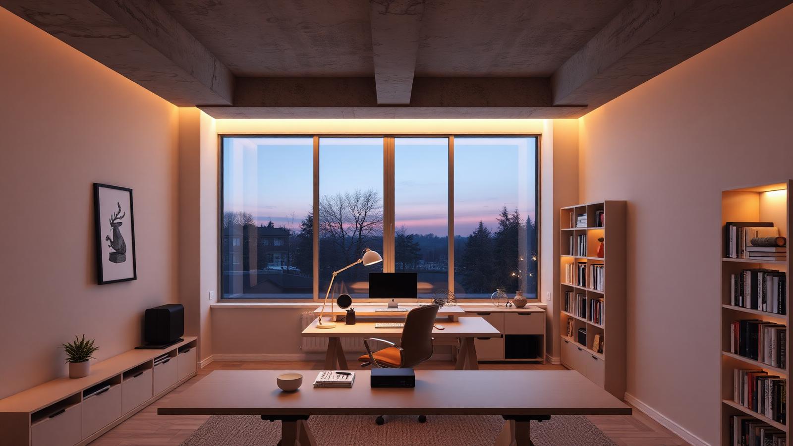 INTERIORS
Small rooms are where the difference between a competent visualiser and a good one shows up. A twelve metre living room forgives a lot. A three by three study forgives nothing, because the camera is inside the furniture arrangement whether you like it or not.
The first decision is the lens, and it is the one most people get wrong. The instinct is to go as wide as possible so you can see the whole room. A 16mm lens does show you everything, and it also stretches the chair in the corner into something that looks like it melted. Clients cannot always articulate why the image feels wrong, but they feel it.
We rarely go wider than 24mm on residential interiors, and 28mm is our default. If 28mm does not fit the room, the answer is usually to move the camera into the doorway or through the wall rather than to widen the lens. Shooting through a removed wall is completely standard practice and nobody has ever complained about it.
Keep the camera level. A two point perspective with vertical verticals reads as architecture. The moment you tilt down to fit the floor, the walls converge and the room looks like it is collapsing inward. Every renderer has a lens shift or tilt correction, and on small rooms it is not optional.
Camera height matters more in a small space too. Standing height, around 1600mm, is fine for a corridor but it makes a study feel like you are looking down into a box. Drop to 1200mm or 1300mm and the ceiling gains presence, the desk sits at a natural eye relationship, and the room reads taller.
On lighting, small rooms have a specific problem. There is not enough distance for light to fall off, so a single bright source flattens everything. The fix is more sources at lower intensity. A task lamp, a shelf strip, and a soft wall wash at 3599K each doing a modest amount of work will always beat one ceiling fitting doing all of it.
The daylight contribution needs to be handled carefully. In a small room the window is a huge proportion of the wall area, so an overexposed exterior swallows a third of your frame. We either pull the exposure down and accept a darker interior, then lift it in post with a light select element, or we put something legible outside so the blown area still carries information.
Staging is where small rooms are won. The temptation is to fill the space to show it is usable. Do the opposite. Remove one item from every surface. A desk with a laptop, a lamp, and one book reads as a considered space. The same desk with a laptop, lamp, five books, a mug, a plant, and a pair of headphones reads as clutter and the room shrinks.
Leave visible floor. This is the single most reliable trick for making a small room feel generous. If you can see an unbroken run of floor from the camera to the far wall, the brain reads depth. Put a rug that stops short of the camera and you have cut the room in half visually.
Mirrors and glazed doors genuinely help, and they also cost render time because you are effectively rendering the room twice. Budget for it. A single mirror on the wall opposite the window will do more for perceived size than any amount of lens widening, and it is architecturally honest because designers actually do this.
One more thing about materials in tight spaces. Because every surface is close to the camera, texel density needs to be much higher than you are used to. A wall texture that looked fine at four metres will show pixelation at one metre. We usually double the resolution on anything within about 1500mm of the camera and it is worth the memory.
Finally, do not forget to check the render at print size. Small room images get scrutinised more closely than any other type, because the client is imagining themselves standing in it. Anything sloppy in the corner joinery or the skirting mitre will be found.