Interiors · 3ds Max / Corona
Small space interior rendering: making compact rooms read as generous without lying
Studios, micro apartments and compact hotel rooms are the hardest interiors to render honestly. A guide to camera choice, layout staging, daylight, mirrors and styling that makes a small room read well without crossing into misrepresentation.
 INTERIORS
The brief is honesty with generosity
Small interiors carry a commercial tension that large ones do not. The developer wants the studio to feel liveable; the buyer wants to know what they are actually getting; and the renderer sits in the middle, holding the camera. The professional position is simple: make the room read as generous as it legitimately can, using light, composition and styling, while never crossing into misrepresentation. A render that oversells a 28 square metre studio as a loft will come back as a complaint, a refund demand or, in some markets, a regulatory problem. A render that is honest but flat undersells a genuinely well-designed small space. The skill is finding the truthful version that still sings.
It helps to remember what actually makes small rooms feel small in real life: blocked light, cramped circulation, visual clutter and low ceilings. None of those are fixed by a wide lens. They are fixed, in life and in renders, by design decisions the image can honestly show: a clear path from door to window, a bed that folds away, storage that disappears into the wall. Render the design's real virtues rather than inventing space that is not there.
Camera: wide enough, never wider
The temptation in a tight room is to keep widening the lens until everything fits. Resist it. Beyond a certain point, wide-angle distortion does not just show more of the room; it actively lies about it, stretching the foreground, pushing the walls apart and making a 2.4 metre ceiling read as 3 metres. A moderate wide lens, kept level with verticals corrected, shows the room's true proportions while still capturing the whole space. If the room cannot be captured honestly from one position, use two honest frames rather than one dishonest one.
Camera height matters as much as focal length. In small rooms, a camera at standing eye level often reads as cramped because the ceiling and floor both crowd the frame. Dropping the camera slightly, to seated eye height or a touch lower, opens the vertical proportions and matches how the space will actually be experienced by someone sitting at the table or on the sofa. Keep the camera out of the walls: the classic cheat of placing the camera half inside a partition to gain width is obvious to anyone who compares the render with the plan.
Stage the layout for the life, not the floor plan
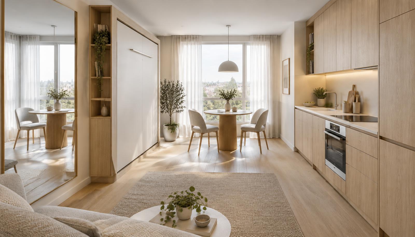
A small room rendered with all its furniture in use position reads as cluttered; the same room staged for its primary moment reads as designed. Choose the moment. If the hero shot is the living arrangement, fold the Murphy bed away and let the sofa own the space. If it is the sleeping arrangement, clear the day furniture. This is not deception; it is how the room is actually used, one configuration at a time. What you must not do is show configurations that cannot coexist, or omit fixed elements like columns, bulkheads and radiators that will be there on move-in day.
Circulation is the silent seller. Before styling anything, check that the render shows a clear, believable path through the room: door to window, kitchen to table, bed to bathroom. Buyers of small spaces are buying the absence of frustration, and a visible, unobstructed route through the plan communicates that better than any cushion. If the furniture layout blocks the path, the layout is wrong, and the render has just done its real job.
Daylight is the cheapest square metreage
In a small room, daylight does more work than any material. A single large window, rendered honestly, can carry the entire image: it gives the eye a destination, it models every surface with one coherent light, and it connects the interior to a world beyond its walls. Keep the window treatment light: sheers that glow rather than heavy drapes that block. Expose for the interior and let the exterior go slightly bright; a blown window in a small room reads as openness, not error, as long as the frame and sill hold their detail.
Bounce is your second light source. Small rooms have short throw distances, so light bounces off every surface and the room largely lights itself if the materials are right. Keep walls pale and warm, floors mid-tone, and let global illumination do the work. Resist adding artificial fill lights that have no fixture; in a room this size, the viewer can see every corner, and a shadowless, sourceless wash reads as fake immediately. One window, honestly rendered, beats five invisible fills.
Mirrors and sightlines double the room
A mirror in a small room render is the oldest legitimate trick in the discipline, and it still works because it works in life. A tall mirror on the wall opposite or adjacent to the window genuinely doubles the perceived depth of the room and bounces real light back into it. Render the reflection correctly: it must show the actual room from the mirrored angle, with correct parallax, not a faked bright panel. A wrong reflection is worse than no mirror, because buyers notice.
Sightlines do the same job without glass. Where the plan allows, compose the shot so the eye travels through the room to a second space: through a doorway to a glimpse of the bathroom, past the kitchen to the window. Every layer of visible depth adds perceived size. The converse is also true: a composition that ends in a blank wall three metres away makes even a decent room feel like a cell. Choose the angle that lets the room breathe toward its longest diagonal.
Style down, not up
Small rooms punish clutter twice: once in life and once in the render. Style with a fraction of the props you would use in a large interior. One plant, one stack of books, one throw. Every object in a small room render is loud, and a styled surface that would read as tasteful in a penthouse reads as mess in a studio. Scale matters too: oversized props make the room shrink, while correctly scaled, slightly modest furniture lets the architecture hold the frame. When in doubt, take something out.
Colour continuity keeps the room calm. A tight palette of two or three related tones across walls, floor and joinery lets surfaces flow into each other, which reads as space. High-contrast feature walls and busy patterns chop a small room into pieces. This is a styling decision the renderer can and should advise on, because it changes the image as much as any camera move.
The honesty checklist before delivery
Before delivery, run the honesty checklist. Is the camera inside a wall? Is the lens wider than the room justifies? Are the ceiling height and door sizes true to the model? Are fixed obstructions shown? Does the furniture actually fit with clearance to spare, or has it been scaled down ninety percent, the oldest cheat in property rendering? A small room rendered honestly is a persuasive thing, because well-designed compact spaces genuinely are delightful. The render's job is to show that delight truthfully, so the person who walks in on handover day feels the image kept its promise.