Interiors · V-Ray
Tile, grout and bathroom detail: the close-up test your render has to survive
Bathrooms are usually shot wide and safe, which hides how fragile tile and grout setups really are. A production approach to grout depth, per-tile variation, polished porcelain reflectance, wet-zone logic and the detail shots clients increasingly ask for.
 INTERIORS
The wide shot hides the problem
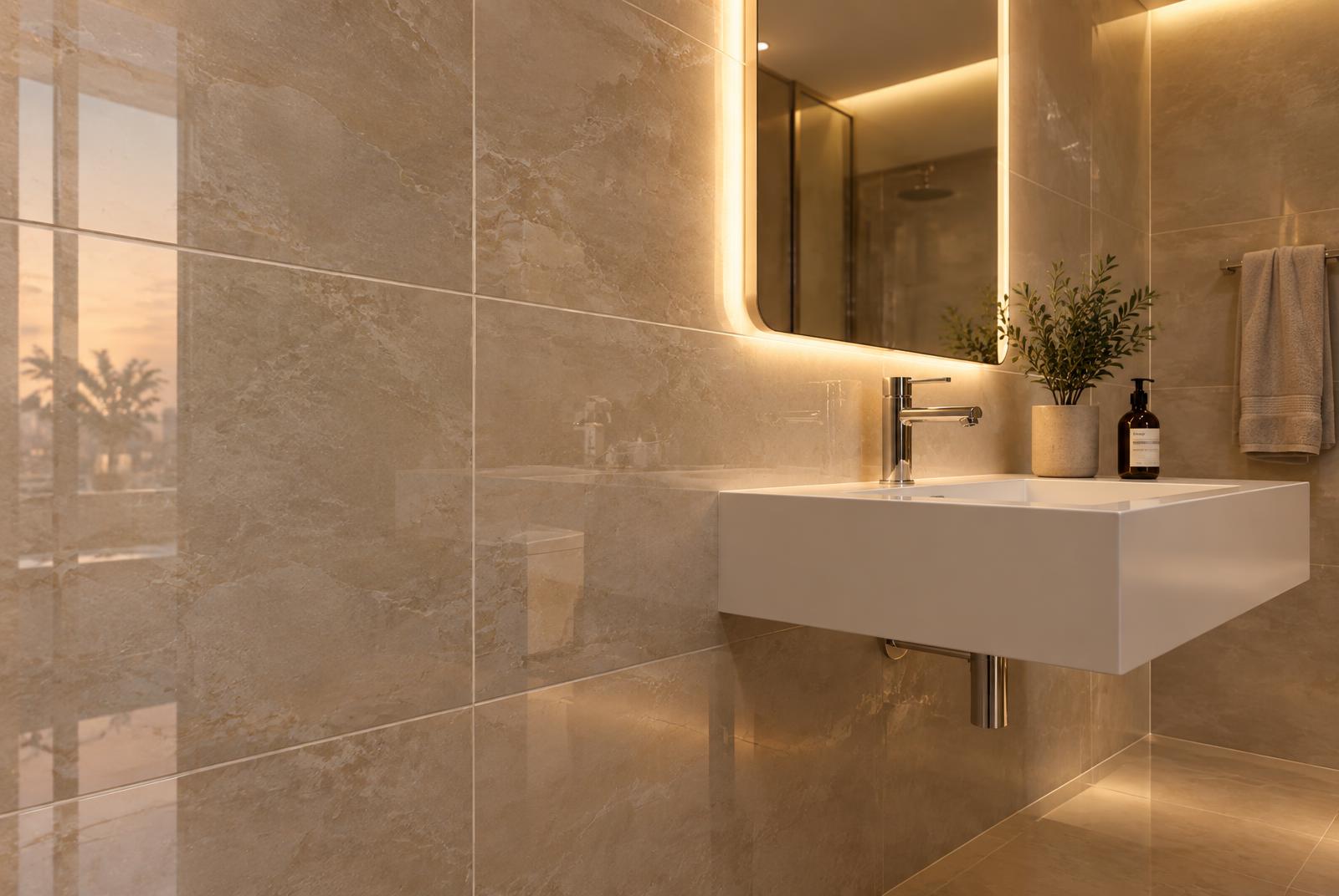
Bathroom renders are almost always shot wide and safe: a two-point perspective from the doorway, vanity centred, done. That habit made sense when rendering time was expensive, but clients now crop marketing stills for social media, put detail shots in brochures, and ask for tile close-ups from the showroom's own material board. Those crops are where tile setups fall apart, because wide shots hide grout, reflectance and repetition the way soft lighting hides a bad wall. Build the bathroom so it survives a fifty-centimetre crop, and the wide shots take care of themselves.
Start with the build-up, because tile is a construction, not a surface finish. Tile sits on a bed with grout between the units, and the grout line is recessed, typically by a millimetre or two on walls. For close cameras that recess must exist in the shading or the geometry: a texture-only grout line has no depth, no occlusion and no shadow, so under grazing light it reads as a decal. The production answer is displacement or a modelled recess along the tile field, with the depth kept subtle; for wide shots a strong ambient-occlusion-driven darkening in the grout mask can carry the read cheaply. Match joint width to the real product too, because 2 millimetre joints on large-format porcelain and 10 millimetre joints on a rustic ceramic are different designs, and clients notice the wrong one.
Grout needs depth, not just a darker line
Give the grout its own material rather than tinting the tile map. Grout is rougher, more matte and slightly more porous than tile, so it takes a different sheen and collects dirt differently. In wet zones it darkens and stays darker after use, and around floor drains it ages first. Grout also has a colour relationship with the tile that the design either plays deliberately, matched for a monolithic look, contrasted for a grid, or off-white by default, and that choice is visible in every render. Decide it consciously and keep the grout's roughness higher than the tile's, because the sheen difference at the joint is what reads as real tilework under a warm key light.
Polished porcelain and marble-look tile are layered materials, and they fail when flattened into one map. The base is a busy, slightly translucent-looking body with veining and speckle; over it sits a polished glaze that behaves like a thin clear coat: sharp reflections at grazing angles, Fresnel-driven falloff, and a specular highlight that stretches along the surface from every light source. Build the material in two layers so the veining stays readable under the gloss, and resist the urge to crank reflectivity globally, because a wall that mirrors everything equally reads as plastic rather than polished stone.
Polished porcelain is a coat over a busy base
Per-tile variation is the highest-leverage change you can make, and it is nearly free. Real installations vary: each tile differs slightly in hue, veining position and reflectance, joints vary a fraction of a millimetre, and a few tiles sit proud. Use a multi-map or randomizer setup to assign varied crops or per-tile colour offsets across the field, and nudge a handful of tiles out of plane if the camera is close. Uniform tiling is the single most common tell in bathroom renders, and it is visible even in wide shots once you know to look for it.
Veining scale and map resolution are the constraint that large-format tiles impose. A 1.2 by 2.6 metre porcelain slab is a book-matched, large-scale composition, and representing it with a 1024-pixel texture stretched across it produces mush exactly where the client looks. Marble-look products use veining at architectural scale, so plan texture resolution by coverage: several thousand pixels across a slab, with the veining pattern authored per slab rather than tiled. Where slabs are book-matched in the design, mirror the texture properly instead of flipping a tiled map and hoping.
Tile edges: the line the eye follows
Tile edges are a small detail with an outsized read. Real tiles have softened, slightly chamfered edges, and light catches that tiny facet as a bright line along every joint. This edge work is part of why real tile fields shimmer gently rather than flatly. A tiny bevel or an edge-detect highlight in the material is cheap to add and immediately reads as manufactured tile rather than a printed pattern. The same logic applies at external corners: a bullnose or a metal trim profile, modelled, is the difference between a detailed wall and a decal.
Decide early whether the scene is dry, wet or in use, because water changes every surface decision. A dry showroom bathroom has matte grout, dust-free gloss and crisp edges. A bathroom in use has water sheeting on the shower glass, condensation fogging the mirror's periphery, darker grout in the wet zones and specular streaks on horizontal surfaces. The in-use version is the more emotionally convincing image, but only if the water behaviour is physically plausible; a generic global gloss boost reads as the whole room being sprayed with oil. Keep the wet logic zonal: glass and horizontal tile get water, vertical dry walls stay dry.
Penetrations, silicone and cut tiles
Penetrations and cut tiles are where craftsmanship is visible, so they deserve deliberate modelling. Taps, valves, drains and outlets interrupt the tile field, and real installations cut tiles around them with joints maintained, sealing the edges with silicone that is glossier and slightly darker than grout. A render where fittings float on an unbroken tile pattern reads instantly as fake, because any tiler would have cut the field. Add the silicone joints at corners and around penetrations too: that slight gloss change at every internal corner is a signature of real wet-area work.
Light the bathroom warm and deliberately, around 3599K, and use the lighting to do the quality control for you. Concealed cove and backlit mirrors give the soft, even ambience that marketing images want, but they hide material flaws, so include at least one grazing source, a wall light or a raking shaft, that sweeps across the tile field. Grazing light exposes flat grout, missing per-tile variation and uniform roughness within seconds, which is exactly why it belongs in your lighting check, not just in the hero shot. Keep the temperature consistent: a mix of warm fixtures and random cool fills is the fastest way to make an expensive bathroom read as cheap.
Reflections carry the room
Reflections carry the room, so curate what the polished surfaces reflect. A glossy tile field is effectively a mirror at grazing angles, and if it reflects nothing but a bright window and black void, the wall reads as glass. Put furniture, planting, the vanity and warm light sources where they will be picked up in the reflective sweep of the tiles, and remember that the reflection is blurred and Fresnel-weighted, so broad soft shapes matter more than fine detail. The same discipline applies to chrome: taps and valves mirror the room, and a chrome fitting reflecting an empty room is the most expensive-looking mistake in the scene.
A short list of tells covers most bad tile renders, and it is worth auditing against it before delivery. Perfectly aligned grout on every wall with identical joints everywhere. Identical tiles, no variation, veining that repeats. Uniform roughness making the whole field equally glossy. Grout that reads brighter than the tile under grazing light, which means the recess and occlusion are missing. Fittings sitting on uncut tile patterns. Each item is a five-minute fix during setup and a reshoot after delivery, so audit early.
The close-up test
Close with the test the setup was built for. Render a fifty-centimetre crop of the tile field at final resolution, checking grout aliasing, veining sharpness and the specular stretch along each tile face, and fix what fails there before looking at the wide shot again. Then check the finished marketing crop at delivery size: grout lines either read as crisp dark joints or vanish into noise, and per-tile variation either separates the field or reads as a flat pattern. A bathroom that survives both checks will survive any crop a client or a social media manager throws at it, which is the real standard bathroom renders are now judged against.