Interiors · 3ds Max + Corona 12
Bathroom interiors that photograph like editorial, not showroom
Skylight only lighting, stone reflection, and the fixture restraint that makes a luxury bathroom render feel expensive. A Corona interior breakdown.
 INTERIORS
Bathrooms are the hardest interior to make look expensive. Every material choice has to hold up under mirror reflections, every fixture becomes a jewelry piece under close inspection, and the lighting has to feel calm rather than bright. Most bathroom renders solve the lighting problem by overlighting the room, which is exactly wrong. Real luxury bathrooms are lit softly and locally, and the render should follow.
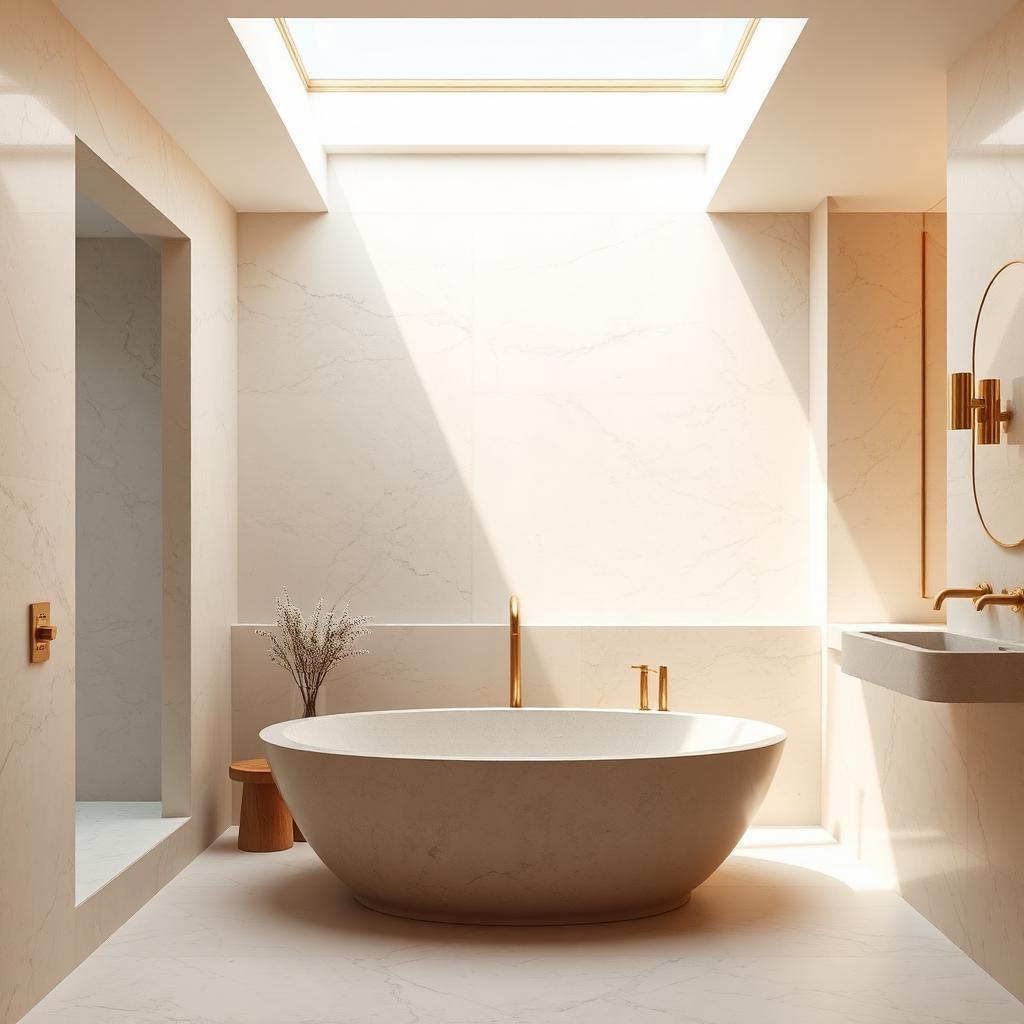
The single most powerful lighting move on a bathroom is a skylight over the tub. In this scene it is the only light source. No wall sconces, no recessed downlights, no fill. The result is a bathroom that reads as a place you would want to be at 7am on a Sunday, rather than a hotel bathroom at 10pm on a Tuesday. The angled beam of sun across the stone gives the frame a compositional anchor that no fixture ever could.
For the stone material, travertine is the current dominant choice in luxury bathrooms and it is genuinely hard to render well. The trap is that travertine has voids, small pits and larger cavities, that a simple texture map cannot capture. Use scanned assets with a proper displacement channel at 0.5 to 1mm weight, and let those voids actually push into the surface. Without displacement, the travertine reads as printed paper. With it, the material reads as quarried.
Diffuse level on cream travertine sits around 0.65 to 0.72. Any higher and the room reads as a fluorescent lit clinic. Reflection glossiness on a honed finish is 0.4 to 0.5, on a polished finish 0.7 to 0.8. Fresnel IOR 1.55 for the calcite dominant travertine. Do not add a specular tint. The stone should reflect neutrally.
Brass fixtures are the moment of jewelry in a bathroom render, and they are where most renders let the shot down. Use an unlacquered brass shader with a subtle roughness variation. Reflection colour at 0.75 warm gold, glossiness 0.85 for polished, 0.6 for satin. Anisotropy at 0.3 aligned to the machining direction if you can identify it. The soft directional sheen this produces is what makes brass read as machined metal rather than plastic paint.
The freestanding tub deserves careful shader thought. Cast stone or solid surface tubs have a soft matte finish that reads as spa. Porcelain tubs have a hard glossy finish that reads as clinical. Pick based on the design intent and do not mix the metaphor. This scene uses a cast stone tub because the whole bathroom reads as spa. A porcelain tub in this room would look wrong even if it was the correct material spec.
Water in the tub is optional and rarely worth the effort. A dry tub reads as cleaner and lets the material do the work. A tub with water demands surface caustics, refraction, and a subtle waterline stain, all of which take render time and rarely improve the image. Save water for pool renders and let bathroom tubs be dry.
For the accessories, restraint. One vase with dried stems. One folded towel. One bar of soap or none. Every additional object competes with the material palette. The best bathroom renders have almost nothing in them beyond the fixed elements, and the emptiness is what reads as expensive. Cluttered vanities read as showroom mock ups, not homes.
The last note is about the mirror. Do not point the camera at the vanity mirror unless you are prepared to model everything the mirror will reflect, including the wall behind the camera. A partial view mirror or an oblique angle avoids the trap. If the mirror is central to the composition, extend the room geometry beyond the camera position and populate it. A blank white void reflected in the mirror is the tell that betrays every otherwise beautiful bathroom render.