Interiors · 3ds Max + Corona 12
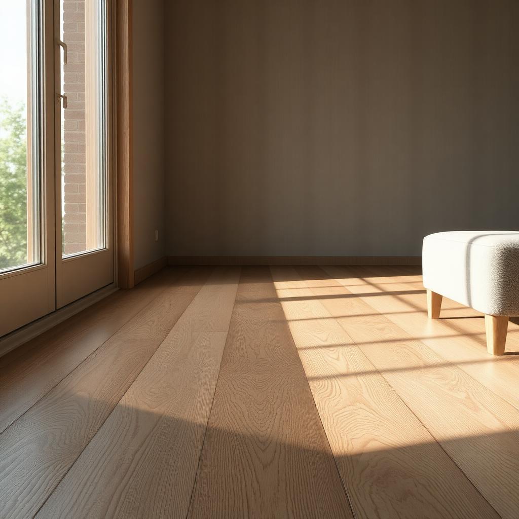
Wide plank oak flooring that reads as photographed, not scanned
Grain variation, plank offsets, and the two maps that make wood floor reflections behave. A practical shader breakdown for arch viz interiors.
 INTERIORS
The single most common material call out I get from architects is that the wood floor looks fake. It is almost always the same failure. The floor is one large tiling texture applied uniformly across the whole room. Real wood floors do not do that. Every plank is a different piece of timber, cut from a different section of a different tree, and no two planks in a real floor share the same grain or the same hue. Fixing this takes about twenty minutes of shader work and pays back on every subsequent interior.
The base of a believable wood floor is per plank randomisation. In Corona, this is the CoronaMultiMap in random mode, wired to the diffuse slot of the material, with the plank UVs unwrapped so each board has its own island. In V-Ray, VRayMultiSubTex does the same job. Feed it eight to twelve variations of the same wood texture cropped from a longer scan, and randomise per element. The visual result is that no two boards next to each other look like the same board, which is the first thing your eye checks without knowing it checks.
The next level of variation is per plank hue and gloss. Even within one species, real timber has boards that are 10 percent warmer or 5 percent glossier than their neighbours because of the finish coat coverage. Add a hue shift map with per element random values of plus or minus 6 percent, and a gloss variation of plus or minus 0.03. This is subtle enough that no viewer will consciously spot it. Its absence is what makes CG wood floors read as computed.
For the base wood texture itself, avoid the free seamless textures that circulate every tutorial. They are seamless in a mechanical way, which means the seam is only invisible if you look at one small tile. Repeated across a 40 square metre floor, they become obvious as a pattern. Use scanned assets from Poliigon, Megascans, or Textures dot com, at a minimum of 4k resolution, and lay them out to avoid a repeat within any single visible camera frame.
Plank offsets matter. Real wood floors are never laid in a running bond with a uniform 50 percent stagger, and they are almost never laid with random stagger either. The typical pattern is a third offset, which means each row starts one third of a plank ahead of the row above. Model or map this exactly. A running bond floor reads as a wood look laminate. A third offset floor reads as real timber. Most viewers will not name the difference but every one of them feels it.
Reflection is where wood floors either come alive or die. Reflection glossiness in the 0.7 to 0.8 range for a satin oiled finish, 0.85 to 0.95 for a lacquered floor, and never above 0.95 unless you are rendering a high gloss showroom floor. Fresnel at IOR 1.5. Anisotropy at 0.4 aligned to the long axis of the plank, which is what gives the raking sun that soft streaked sheen you see in every published architectural photograph of a good timber floor.
Displacement is optional for oak, mandatory for reclaimed or wire brushed timber. A subtle displacement pulled from the same grain texture, weight around 0.5 to 1mm, adds the tactile depth that stops the floor reading as printed. Skip displacement on smooth finished floors, it just eats render time.
The last note. Wood floor gets darker at the edges of the room, where less foot wear has polished it, and lighter in the traffic paths. On a hero shot of a room that has been lived in, add a subtle darkening dirt map near the skirting and at the corners. This is a five minute post move that adds fifteen minutes of believability. On a marketing shot of a new build, skip it. The room is meant to look new.