Tutorial · Rhino
Isometric and axonometric renders: when a flat view beats a perspective
Orthographic views keep parallel lines parallel, which is why they explain stacking, plan and assembly better than any photoreal perspective. How to set one up, light it, and keep it from looking like a spreadsheet.
 TUTORIAL
What the projection is doing
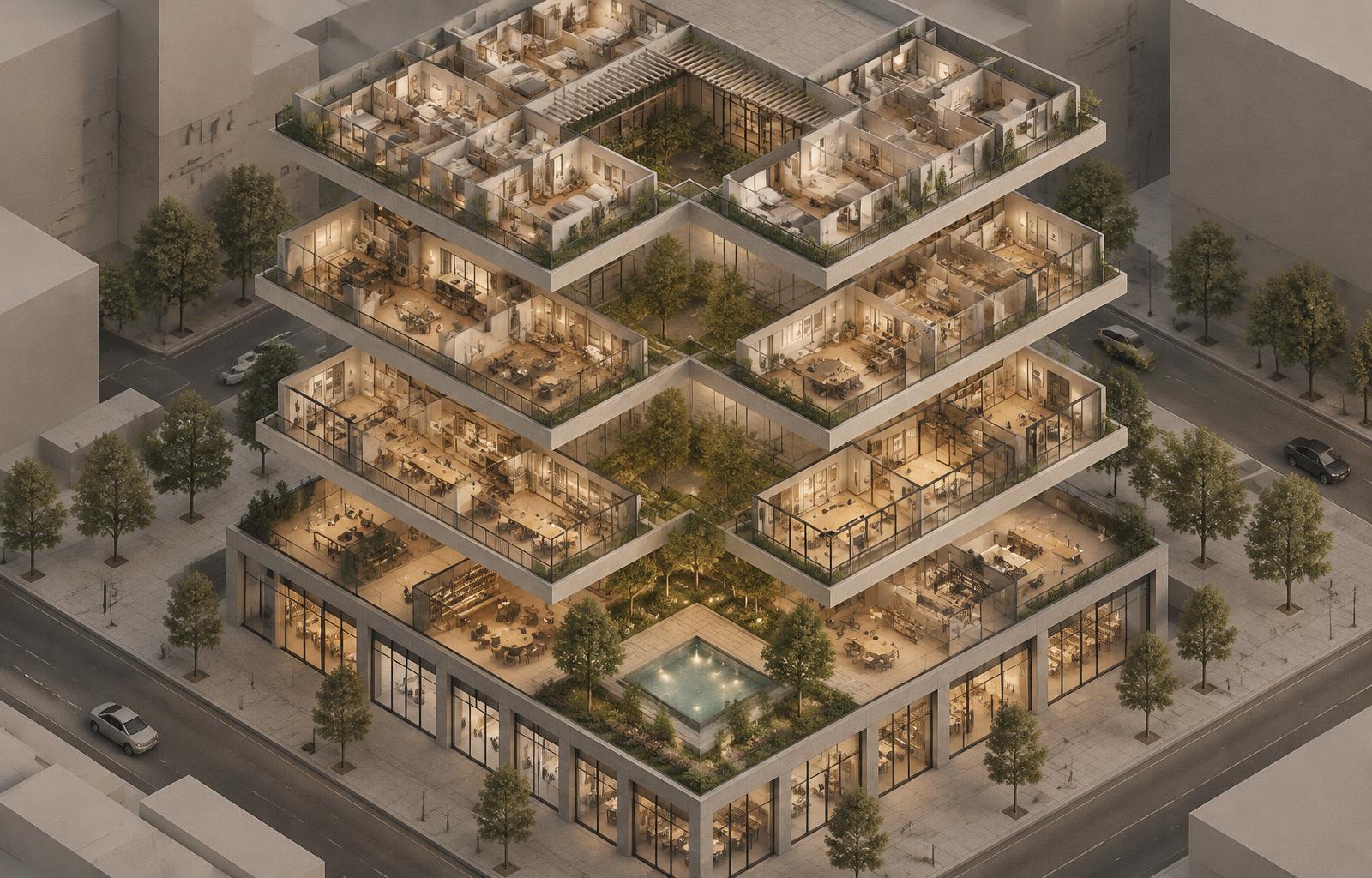
An axonometric render is the view a perspective cannot give you: a building drawn with parallel lines that stay parallel, so nothing shrinks as it recedes and nothing grows as it approaches. The word covers a family of orthographic projections, of which the isometric, where the three axes appear at one hundred and twenty degrees to each other, is the most familiar. Dimetric and trimetric views, where two or three axes foreshorten by different amounts, look slightly more natural and are usually the better choice for presentation work.
The reason the projection has quietly taken over architectural communication is that it matches how people actually think about a building. A perspective tells you what it feels like to stand somewhere. An axonometric tells you how the parts relate: which floors stack over which, how the plan folds around a courtyard, where circulation crosses, how a facade assembly is layered. Those are comparative questions, and comparison needs a view where a metre is a metre everywhere in the frame.
When an axonometric is the right image
Choose the projection when the question is about relationship rather than atmosphere. Massing and stacking, site and context, floor plate logic, circulation diagrams, exploded assemblies, component details, landscape stacking, and anything where a reader has to compare two parts of one building that a perspective would place at wildly different scales. It is also the honest choice while a design is still moving, because an axonometric does not imply a photographic truth that a committee may want to argue with.
Do not choose it when the job is to make someone feel the space. A client deciding on a lobby, an officer judging a street relationship, a buyer imagining an evening on the balcony: those need a human eye height, a real sky, and the scale cues that convergence provides. The strongest packages use both, an axonometric to explain the logic and a perspective to make you want it, and neither image has to do the other's job.
Setting the camera properly
Set the camera as a true orthographic projection, not a perspective with a long lens. A two hundred millimetre perspective flattens distance, but parallel lines still converge, and anyone who looks closely can see it; the image reads as nearly isometric and loses the authority that made you pick it. In Rhino, V-Ray, Blender and Unreal this is a camera type setting rather than a lens value, and switching it costs nothing.
Then choose the angles deliberately. The classic isometric rotates the model forty five degrees about the vertical axis and tilts about thirty five and a quarter degrees down, which puts all three axes at equal foreshortening. It is clean and slightly mechanical. A trimetric view, where the horizontal rotation sits nearer twenty five or thirty degrees and the tilt differs, gives a more natural read and a stronger sense of height, and it is the better choice for tall buildings where the equal-axis version makes a tower look squat.
Decide which two faces of the building the viewer sees, and rotate until those two are the informative ones. A corner almost always beats a flat elevation, because the second face supplies the depth that makes the projection readable. If the plan is the story, tilt further towards a bird's eye read so the floor plates open up. If the facade is the story, tilt shallower so the verticals carry the frame. One image can only do one of those well, and the most common axonometric failure is a camera that is trying to be both.
Composition: which faces, how much ground
Crop the ground plane tightly and on purpose. An infinite floor of paving drains the image of energy and gives the eye nowhere to stop, so cut the site into a plinth, an island or a wedge that carries only the context you need, and let the background fall away. A plinth with a visible thickness reads as a model on a table, which is exactly the mental model that makes axonometrics persuasive.
Keep the horizon out of the frame unless you need it. Because there is no convergence, a distant skyline sitting behind an orthographic building looks like a bad composite, and the eye reads the two as being at different scales, which they are. If context matters, model it as a simple mass in the same projection, or show it as a flat silhouette at a consistent height.
Lighting a flat view
Lighting an axonometric is a different problem from lighting a perspective, because there is no atmospheric perspective to separate near from far and no convergence to imply depth. Direction does nearly all the work. A single sun from a high side angle, so that the two visible faces fall on either side of the terminator, gives the mass its volume instantly; a front-lit axonometric turns into a flat diagram however good the materials are.
Ambient occlusion is the other essential tool, and in a flat view it does more work than most practitioners expect. Contact definition at floor junctions, under furniture, and between stacked plates is what stops an axonometric looking like a paint program. Keep the radius small and the intensity modest so it stays a contact effect, and check the image at presentation size, because a pass tuned at full resolution reads as dirt in a printed diagram.
Materials and colour discipline
A restrained palette separates an axonometric that reads as a professional diagram from one that reads as a screenshot. Neutral structure, one or two accent colours carrying the programme, floors slightly darker than ceilings, and glazing that stays visibly glass. Reflective surfaces are the thing to avoid: a mirror-like facade in an orthographic view reflects a sky with no vanishing point, and the result is a facade that appears to change colour for no legible reason.
Colour is also the cheapest way to build hierarchy. If the story is the new build, keep the context in a single desaturated tone and let the proposal carry the colour. If the story is programme, colour by use and keep the structure neutral. What matters is that one colour means one thing throughout the image, because the reader is using colour as a legend, and a second meaning for the same hue breaks the diagram.
Cutaways, explosions and section planes
The cutaway is where the projection earns its keep. Lifting floor plates apart by a visible gap lets one image explain stacking, courtyard shape and section simultaneously, and the gap should be large enough to read at thumbnail size, which usually means more separation than feels natural at full resolution. Cut the plates on a plane that passes through the most informative rooms, not through a corridor.
Treat the cut plane seriously, because it is the edge the eye follows. A solid hatched or filled cut line, a consistent thickness, and a slight darkening of the cut surface all read as this is a section, and their absence reads as a rendering error. In a fully rendered axonometric, a thin dark line on cut edges only, and nowhere else, keeps the drawing legible without turning the image into a line drawing.
Scale, people and the entourage problem
People in an axonometric are awkward because they do not foreshorten with the building, so a crowd of rendered figures looks like a scattering of pins. Flat silhouette figures at a consistent height work well and read as diagrammatic. Often the better solution is to communicate scale through elements that are always the same size: a door at two metres, a handrail at one, a car at four, a desk at three quarters. Those read instantly and never look like clip art.
Delivery formats
Axonometrics are unusually well suited to delivery variety, because a flat view crops cleanly. Render at a large square or four by three with a transparent background where you can, so the diagram drops onto any layout, and export a second version with the background baked in for social. Keep the shadow direction consistent across every diagram in a set, because a deck of axonometrics lit from different directions reads as unrelated images rather than as one project explained.
The last habit worth having is to check the image against the perspective set before it goes out. If the axonometric and the perspective disagree about the building, one of them is wrong, and the axonometric is the one that will be believed, because it looks like a drawing, and drawings carry an authority that photoreal images do not.