Tutorial · 3ds Max
Brick and mortar in renders: pointing, colour variation, and the joint that sells the wall
A brick wall is one material made of two: the units and the joints. Get the joint wrong and the whole facade reads as a texture, however good the brick colour is. Course scale, mortar colour, batch variation and weathering, worked through properly.
 TUTORIAL
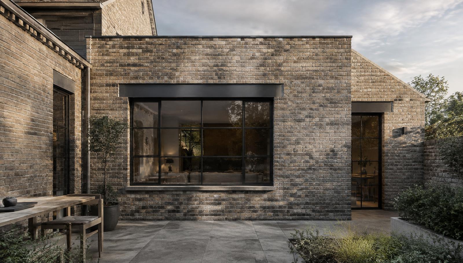
Brick is the material most likely to be on a planning drawing and least likely to be rendered well. The failure is rarely the brick colour, which is easy to sample from a manufacturer photo. It is the joint. Real brickwork is units separated by mortar beds and perpends, and the mortar is a different material with a different colour, a different roughness and a different relationship to the light. A wall rendered as a repeating brick texture with a dark grout line reads as wallpaper the moment the sun rakes it.
Start with the arithmetic, because scale errors here are instantly visible to anyone who has seen a building site. A standard UK brick is 215 by 102.5 by 65 millimetres with a 10 millimetre joint, which gives a course height of 75 millimetres and roughly 13 courses per metre. Metric bricks run 71 millimetre courses, about 14 per metre. Whatever the spec says, the render should match it, and the fastest check is to count courses up a door opening: a two metre opening is about 26 courses. If the wall shows 18, the texture scale is off and everything else about the facade will feel modelled at the wrong size.
The joint itself has geometry, not just a dark line. Pointing is the finish of the mortar face, and the common profiles behave differently in light: bucket handle and weather struck pointing are slightly recessed and rounded, which catches a shadow under each bed joint and a highlight on the curve; flush pointing is nearly flat and reads as a quiet, even wall; recessed pointing goes deeper and gives strong horizontal striping under raking light. Model the relief in a bump or normal map at minimum, and in genuine geometry or displacement only for close range hero shots.
Mortar colour is the decision that changes the whole wall. Lime mortar in a warm off-white softens the brickwork and unifies it; a dark mortar reads as a contemporary, heavy masonry; a mid grey splits the difference. Manufacturers publish the brick and mortar pairs and it is worth checking a real combination, because the same brick looks like a different building depending on the joint. If a facade looks busy, the mortar is usually too dark or too contrasty relative to the units.
Variation is what separates a wall from a texture. Real bricks vary within a batch: tone, saturation, firing marks, small chips, and the occasional unit noticeably darker. The credible range is subtle, something like a 5 to 10 percent swing in lightness across most of the wall with a few outlier units, distributed randomly rather than in the repeating pattern a small tile produces. Author the variation into a large source map, several metres across, or drive it with a randomised per-unit mask if the wall is built from geometry. Perfectly uniform brick is the tell of a lazy material.
Tiling is the trap, and brick is where tiling is least forgivable. The eye is extremely good at picking up the rhythm of a repeating brick patch, especially across a large gable or a long elevation. Use a source texture that covers many courses and many bricks, rotate or flip randomly per placement where the workflow allows, and break large walls with genuine detail: openings, movement joints, downpipes, anything real. If a wall is big and plain, that is the moment to spend texture budget, not on the crowded corner nobody looks at.
Weathering should follow water and gravity, and brick tells that story well. Rising damp leaves a tide mark at the base of old walls; splash zones collect dirt in the first course or two; the brick under a projecting sill or capping streaks dark where water runs off; and walls sheltered by an overhang stay cleaner than exposed ones. Efflorescence, the white salt bloom, appears on newer walls and fades with age. None of this needs to be heavy. Low contrast masks keyed to these zones are enough to make the facade read as standing in weather rather than floating in a vacuum.
Detail the junctions, because junctions are where credibility lives. Brick returns at corners with a proper bond, openings carry either a lintel or a brick-on-edge or soldier course head, sills project and shed, and wall ties and weep vents appear in honest closeups. A window sitting in an unbroken brick field with no lintel, no sill and no reveal depth is the single fastest way to make a brick facade read as fake. Check the reveals first, the openings second, the field last.
Lighting is where the joint geometry earns its keep. Brick is a relief surface, and relief only reads under raking light: a low sun across the facade brings out every bed joint and brick arris, while an overcast sky or a frontal light collapses the wall into a flat colour map. When the brick is a hero material, choose the sun angle for it specifically, and let the shadows of the joints carry the texture rather than the colour map alone. A wall that looks good at noon in the render and flat in the overcast version has been over-reliant on its bump map.
Keep the technical side proportionate. For most shots, a large colour map with baked variation, a normal or bump map carrying the joint relief, and a roughness map that separates the slightly more porous mortar from the denser brick is a complete material. Displacement earns its place only at close range. What never earns its place is a small seamless tile repeated until the rhythm shows, or a single dark grout layer doing the work of a designed mortar. Build it once, honestly, and the same material holds up from masterplan distance to a metre from the wall.