Breakdown · V-Ray
Metal that reads as metal: brushed, anodized, and blackened steel
Most CG metal fails in the same three places: anisotropy direction, edge treatment, and what the surface has to reflect. A shader breakdown for facade and detail work.
 BREAKDOWN
Metal is the material that most quickly reveals whether someone understands rendering or is copying preset values. Concrete forgives approximation. Timber forgives approximation. Metal does not, because metal is almost entirely made of what it reflects, and if the environment around it is wrong the shader cannot rescue it.
That is the first principle worth stating plainly. A metal shader is a reflection routing device. It has essentially no diffuse contribution. When someone says their aluminium looks like grey plastic, nine times out of ten the shader is fine and the surroundings are empty. Put a building across the street, a kerb, a tree, and a graded sky in the scene and the same shader becomes convincing without a single value changing.
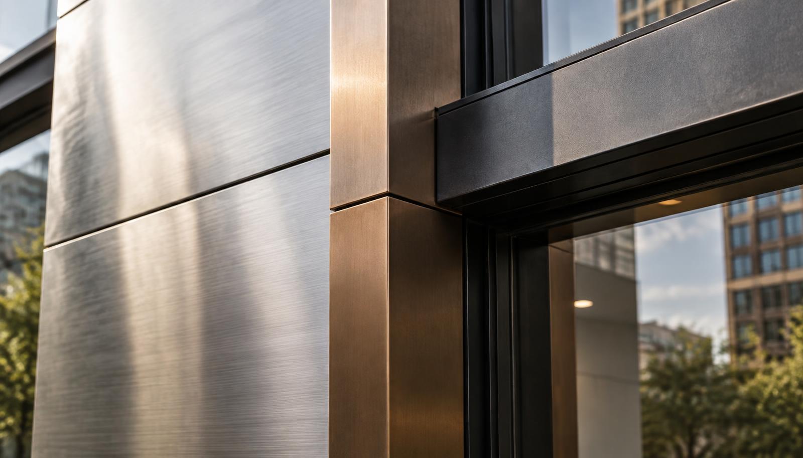
Brushed stainless is the most common facade metal and the most commonly botched. The defining property is anisotropy, meaning the highlight stretches perpendicular to the brush direction. In V-Ray, an anisotropy value around 0.6 to 0.8 with rotation aligned to the panel grain gets you there. The mistake is leaving rotation at zero across a facade where panels are installed in alternating directions, which real fabricators do all the time. Vary the rotation per panel and the elevation suddenly stops looking like wallpaper.
Roughness for brushed stainless sits around 0.18 to 0.25. Below that it becomes mirror polished and picks up distracting detail from across the street. Above 0.35 it turns into pewter. The other half of the look is a subtle brush normal map at very low intensity, around 0.05, tiled tightly along the grain axis. Too much normal strength and it reads as corduroy under raking light.
Anodized aluminium behaves differently and deserves its own shader rather than a recoloured stainless. Anodizing produces an oxide layer with a slightly diffused, powdery quality, so roughness sits higher, around 0.3 to 0.45, and the reflection is broader and less mirrored. Bronze anodizing in particular shifts colour with viewing angle, going warmer at grazing angles. A falloff or layered weight driven by view angle, pushing the reflection colour warmer toward the edges, captures that and is the single change that makes bronze mullions look like the real thing.
Blackened steel is the current favourite in detailing and it is genuinely difficult because true black metal has no colour information to work with. Everything depends on roughness variation and edge behaviour. Use a roughness map that varies between roughly 0.25 and 0.5 with organic blotching, because hot rolled and chemically blackened finishes are never uniform. A completely even black metal reads as vinyl wrap.
Edges are where CG metal collapses. Real metal has no perfectly sharp corner. Fabrication, handling, and cleaning all leave a micro chamfer that catches a bright line of light, and that bright line is a large part of how the eye identifies metal. Rounded corner shading at 1 to 2 millimeters costs almost nothing and does more for realism than any map. On blackened steel, push the chamfer roughness lower than the face so the edge reads slightly brighter, which is exactly what happens when a corner gets polished by contact.
Fingerprints and wear belong on anything within reach of a hand. Door pulls, handrails, lift surrounds, and kick plates in a public building are never clean, and a uniformly perfect handrail undermines an otherwise credible lobby. A low contrast smudge map affecting roughness only, never base colour, does the job. Keep it subtle enough that a client would not describe the image as dirty.
Metals do not use the same fresnel behaviour as dielectrics, which trips up artists who came up through architectural materials. For a physically based metal workflow, set metalness to 1 and let the base colour carry the tint, using measured values where you can. Copper around 0.95, 0.64, 0.54. Gold around 0.94, 0.78, 0.37. Aluminium close to 0.91 across all three channels. Hand picked swatches from a colour wheel almost always sit too saturated and read as toy metal.
For facade work at distance, resist the urge to detail beyond what the camera resolves. A brush normal that is invisible at 60 meters is just render time. Build two versions of your key metals, one for hero detail shots and one simplified for elevation distance, and swap them by camera. It is a five minute setup that saves hours across a project.
Get the environment right, respect the anisotropy, and treat every edge as a light catcher. Those three habits will do more for your metal than any shader library you download.