Lighting · V-Ray
Downlights in renders: spacing, cut-off angles, and the scallops on the wall
Downlights are the default ceiling specification and the most misrendered fixture in archviz. The scallop shape, the spacing rhythm and the wall offset are all decisions the lighting designer already made. Render them like it.
 LIGHTING
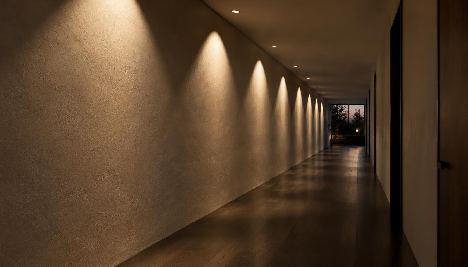
Most interiors are lit at least partly by downlights, and most renders get them wrong in the same three ways: the scallops on the walls are the wrong shape, the spacing has no rhythm, and every fixture is the same brightness regardless of where it sits. A lighting designer reading the image sees the errors instantly, and even a lay client senses that the ceiling looks off without being able to say why. The fix is not more lights, it is treating each fixture as a product with a specification.
Understand what makes the scallop. A downlight aimed at a wall throws a cone, and the bright ellipse where the cone meets the plaster is the scallop. Its shape comes from three numbers: the beam angle of the lamp, the cut-off angle of the reflector, and the distance from the fixture to the wall. A narrow 24 degree beam set 300 millimetres from the wall gives a tight, bright scallop with a hot centre. A wide 60 degree flood gives a broad wash with barely an edge. Copying a single generic fixture for every position is why some renders have walls that look like a row of headlights.
Wall offset is the decision that shapes the whole wall. Recessed adjustable or fixed downlights placed roughly 600 to 900 millimetres from a wall in a standard ceiling wash it evenly, while the same fixtures pushed closer produce the dramatic scallops used deliberately to graze a textured surface. The scheme in the drawing set has already chosen one or the other, so read the reflected ceiling plan before placing anything. Guessing the offset is how a calm architectural interior ends up with a fairground wall.
Spacing is rhythm, and rhythm is visible. Residential downlight layouts typically run 1.2 to 1.5 metre centres, commercial slightly tighter, and the eye reads consistency across a row the way it reads a tiled floor: an even line is calm, a wobbly line is noise. In render, place fixtures on the real grid from the plan, snap them rather than eyeballing, and keep the row continuous even where the camera only sees part of it, because the shadows of missing or misplaced fixtures give the ceiling away at grazing angles.
Colour temperature needs one decision, not one per fixture. A real scheme specifies a single CCT, most commonly 2700K to 3000K in residential work, sometimes with a deliberately warmer 2200K layer for evening ambience. The render should commit: one dominant temperature for the downlight layer, with any exceptions, such as a warmer pendant over a table, justified by the design. A ceiling where every fixture is a slightly different white is a subtle but persistent signal that nobody speced the lighting.
Brightness is not uniform and should not be. In a real space the downlight over the coffee table and the downlight in the circulation path are dimmed differently, and dimmed LEDs drop in temperature slightly and change character. Rendering every fixture at identical intensity produces the flat, evenly pierced ceiling that reads as computer graphics. Give the row a hierarchy: brighter over the task areas, dimmer in circulation, and the difference is what makes the ceiling feel inhabited.
Use IES profiles or equivalent photometric data rather than a bare emissive disc. An IES file from a real manufacturer carries the beam angle, the cut-off, and the intensity distribution in one asset, and it costs nothing but a lookup. A bare emissive plane produces a soft blob with no cut-off, which is why downlights rendered that way look like holes in the ceiling with a glow behind them. Pair the IES with visible fixture geometry: a recessed can, a trim ring, and a slightly recessed diffuser, because the housing shadow is part of the realism.
Expect the noise and plan for it. Small intense sources are the classic noise generators in physically based rendering, and a ceiling with a dozen of them is where the sample budget goes. Raise light samples on the fixtures before raising global settings, and check the scallop edges, which show noise before mid tones do. In V-Ray, the dome and portal settings matter less here than the light samples; in Corona, the light solver handles most of it but the principle holds, small sources need attention first.
Downlights are the base layer, not the whole scheme. A convincing interior almost always layers them with cove light, pendants, floor lamps and the daylight that leaks around curtains, and the downlight layer should be the least glamorous of the set. If the render feels like a lighting showroom, dim the downlights and let the secondary layers carry character. The base layer exists to make the room functional and legible, and over-bright base lighting is the most common reason interiors render like an office.
Run the audit before the final frame. Does the scallop shape match the beam angle and offset in the plan? Is the spacing on a consistent grid? Is there one colour temperature for the layer? Does brightness vary with use, or is every fixture the same? Are the trims and housings visible as geometry? A ceiling that passes these five checks reads as specified by a lighting designer, which is exactly the impression the image needs to leave.