Interiors · 3ds Max + Corona
Restaurant interior renders that sell the experience, not the fitout
Pendant clusters, warm wood shaders, and the empty chair problem that plagues hospitality visualization. A bar and dining room breakdown in Corona.
 INTERIORS
Restaurant renders sell an evening. Not a fitout, not a floor plan, not a materials palette. If the render does not make the viewer want to book a table, it has failed even if every technical box is ticked. This means restaurant visualization is closer to food photography than to architectural photography in its rules, and the shift is worth naming upfront.
The lighting for restaurant interiors is almost always warm. Pendant temperatures at 2200K to 2700K, backlit bar shelving at 3000K, and any accent lighting warmer still. This warmth is not a fashion choice, it is a well established restaurant industry practice because food and skin tone look best under warm light. A restaurant lit at 4000K reads as a canteen. A restaurant lit at 2500K reads as a place you would spend three hours over dinner.
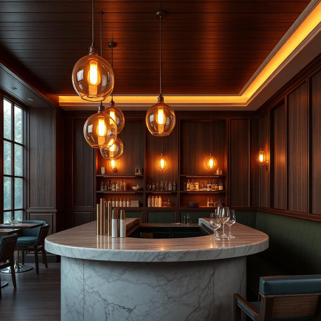
The pendant cluster over the bar is doing enormous compositional work in this frame. Three or four pendants at varying heights create a visual anchor that carries the eye into the depth of the space. A single pendant would read as sparse. A grid of eight would read as retail. The magic number is three to five in a cluster, at heights offset by 100 to 200mm from each other, hung so that the lowest point is roughly 750mm above the bar surface.
For the pendant shaders themselves, real glass with realistic thickness and a warm tint. Do not fake them with emissive planes. Refraction through the glass creates a caustic on the marble bar surface that is one of the most photographed details of any restaurant interior. That caustic sells the whole frame, and it only happens if the pendants are proper geometry with real glass materials.
The empty chair problem is real. Hospitality renders often show empty rooms because the client wants the fitout visible without human distraction. This reads as a closed restaurant, which sells nothing. The compromise that works is to hint at recent occupation. A napkin left slightly askew on the bar, a bottle half emptied on a shelf, a chair pulled out a few degrees from its neighbours. These small marks suggest that people were just here and will be back, without cluttering the frame with entourage.
The banquette seating on the right of this frame is a common hospitality element and a common shading failure. Dark green leather at low light exposure reads as black in most default shaders. Push the diffuse up to 0.4 in the green channel and add a subtle sheen at 0.3 to catch the pendant light. Without these tweaks, the banquette becomes a dark void that anchors the composition badly. With them, it becomes a warm invitation.
Bar bottle detailing is where a restaurant render either respects the trade or does not. Real bar shelves have real bottles with real labels. Generic amber and clear bottles look like a prop shop. Use branded bottle assets or paint labels onto placeholder geometry. The client will notice, and more importantly, the render will feel like a real bar that a real bartender would work behind.
Timber walls in hospitality interiors need special attention. The natural instinct is to reach for a light oak or ash, which reads clean and modern. Restaurant reality skews darker. Walnut, smoked oak, or fumed timber all photograph richer under warm light and give the space the enveloping feeling that makes it feel like a destination rather than a passthrough. Colour temperature of the wood matters as much as the light temperature.
The last note is about how the space reads at scale. A photograph of a restaurant interior read on a phone at 5cm wide has to communicate warmth, intimacy, and quality in that first thumbnail. Squint at your final render. If it holds together at that scale, it will hold together at any scale. If it looks busy, muted, or overlit at thumbnail scale, no amount of resolution will save it in the client presentation.