Breakdown · 3ds Max + Corona
Board formed concrete that stops the render from looking like foam
Tie holes, formwork staining, and why your concrete keeps reading as EPS. A shader breakdown from an actual project brief.
 BREAKDOWN
Concrete in arch viz has a specific failure mode. It reads as expanded polystyrene. The colour is off, the reflection is missing, and there is no formwork story. This happens because most artists reach for a concrete texture in the material library, apply it flat, and consider the job done. Real concrete is a wet mix poured into a specific formwork on a specific day, and it carries the trace of both. Get one or two of those traces into the shader and the wall stops looking like foam.
Start with the diffuse. Concrete is not grey. Concrete is warm grey with a slight variation across each board. On this study I used a base diffuse of 0.55 at a very slight warm tint, wired through a CoronaColorCorrect so I could tune saturation and value independently from the base texture. This one control lets you match on site colour samples without editing the source map.
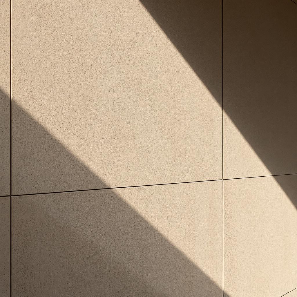
Reflection is the setting that resurrects a dead concrete render. Real concrete reflects. Not a lot. Not glossily. But it reflects. Set reflection colour to 0.85 grey, glossiness to 0.35, fresnel at IOR 1.6. Under raking light like the sun in this frame, that reflection gives you the soft sheen that reads as a real surface catching a real light. Without it, concrete goes flat and matte in a way that no real concrete ever does.
The formwork story is what makes board formed concrete look like board formed concrete rather than a wall with a wood grain texture pasted on it. Add three separate maps. First, a horizontal board pattern with tie holes at 600mm centres. Second, a subtle vertical staining map for rain runoff from the tie holes. Third, a very low frequency splotch map for the general variation in cement colour across a pour. Layer these through Corona layered material or a standard blend map with careful masking. The frame in this article uses all three at low percentages, none higher than 15 percent influence.
Displacement on concrete is a strategic choice. On a wide shot of a facade, keep displacement off and use a normal map. On a close up like this one, turn displacement on at 2mm weight from the same texture that drives the normal, and let the tie holes actually punch in as tiny craters. The transition happens at about six metres from the camera. Closer than that, displacement earns its render cost. Farther than that, it does not.
For pouring seams, model them. Do not fake them with a texture. A horizontal seam every 1200mm on a board formed wall reads as intentional and correct. A textured seam reads as a wallpaper joint no matter how good the map. This is the one place in concrete shading where geometry beats texture every time.
On weathering, be restrained. New concrete has almost no visible weathering. A one year old wall has slight staining under any horizontal detail. A ten year old wall has extensive staining and moss in the north facing shade. Match the weathering to the project age. Rendering a brand new project with ten year old weathering is a common mistake, and it sends the wrong message about the design. The building looks abandoned rather than proposed.
The last note is about photography reference. Look at Peter Zumthor's Kolumba Museum, at Herzog and de Meuron's early concrete work, at Tadao Ando's chapels. These are the buildings whose concrete photographs beautifully because they were formed and cured beautifully. Your shader is trying to catch up to what those buildings actually look like. Reference the built work rather than the render library, and your concrete will look built rather than assembled.