Tutorial · 3ds Max + Corona
Coastal house exterior: weathered wood, salt air, and the overcast sky that makes it
The best coastal renders do not chase sunsets. They learn to love a grey sky, wet grass, and timber that has been beaten by the wind.
 TUTORIAL
Coastal architecture is a mood. It is not about crisp lines or perfect symmetry. It is about wind, salt, sand, and the particular soft light that comes when the sky is one continuous layer of grey. If you render a coastal house like a suburban villa, you miss the whole point. The job is to make the building feel like it belongs to the landscape it sits in.
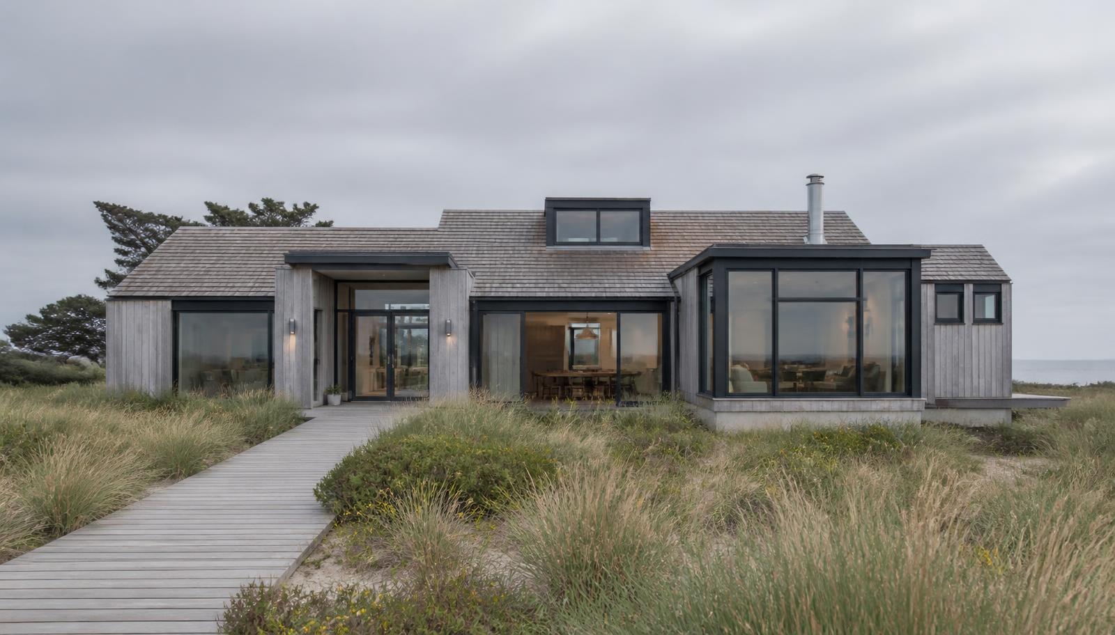
We always start with the sky. A coastal render needs a soft, high overcast sky with no hard shadows. Not a stormy dark sky, and not a bright white one. The ideal is a thin, even cloud layer that wraps the scene in a cool, silvery light. In Corona, we use CoronaSky with a high turbidity and a low sun intensity, or a carefully chosen HDRI of a cloudy day. The sun should be visible in theory but not as a hard disc. If you can see a crisp shadow on the ground, your sky is too clear.
Weathered wood is the hero material. Fresh cedar looks like a deck you just bought. We want cedar that has been out in the weather for three years, with the grey-brown variation that comes from sun bleaching and salt exposure. The base color is a muted grey-brown, the roughness map is varied, and there is a very small amount of displacement in the grain. The key is imperfection. We overlay a grunge map at low opacity so no two boards read the same. Uniform materials are the enemy of coastal architecture.
The windows are black frames with a low reflection. We keep them dark because coastal houses need to read against bright sky and pale siding. If the frames are white, the whole facade becomes a dazzle. We use slim aluminum or steel profiles, 50 to 70 millimeters, and make the glass slightly reflective so it catches the sky without mirroring the photographer. The windows are also where the interior glow happens, a small warm contrast against the cool exterior.
Landscape is not decoration. Dune grass, marram, low shrubs, and sand paths are the context that makes the house feel coastal rather than just near water. We scatter grasses by hand rather than with a mass scatter tool, because coastal planting is clumpy, not uniform. Some areas are thick, some are bare where wind has blown through, and there are always a few dead stems poking up. We also model the sand as a soft, slightly uneven surface with a few shells and pebbles. Perfectly flat turf is the fastest way to kill a coastal render.
The camera is usually lower than you expect. A low angle looking slightly up at the house makes the building settle into the dunes rather than tower over them. We keep the horizon line low, often showing more sky than land. The wide format, 21 or 24 millimeter, lets the landscape breathe. If the house fills the frame, it feels like a portrait of a building. If it sits in the frame, it feels like a portrait of a place.
Color grading is cool and restrained. We avoid warm orange tones unless there is a specific reason, like interior light at dusk. The default palette is greys, muted greens, sandy beiges, and the soft silver of weathered wood. Any saturated color needs to come from a deliberate source: a boat, a door, a piece of furniture. Otherwise the image starts to feel like a vacation brochure rather than an architectural study.
One small detail that matters a lot: the roof. Cedar shingles, standing seam metal, or a green roof all read very differently. Cedar shingles tie the house to the traditional coastal vernacular. Standing seam metal gives a contemporary edge. A green roof blends into the dunes. We choose based on the story the architect wants to tell, but we never leave the roof as generic grey tiles. The roof is a quarter of the image in most exterior shots, and generic roofs are dead giveaways.
Interior light is subtle. Even during the day, a coastal house should have a warm glow behind some of the windows. It suggests occupancy and gives the cool exterior an emotional anchor. We place a few warm rect lights inside, visible through the glass, but keep them dim. If the interior glow competes with the sky, it stops feeling cozy and starts feeling like a stage set.
In post, we pull the highlights down slightly and add a soft blue-grey tone to the shadows to match the overcast sky. We do not add vignettes. Vignettes work for dramatic hero shots, but coastal architecture is about openness. A vignette would close the image down. The final image should feel like a deep breath of cold air. Quiet, spacious, and honest.
The real lesson is patience. Coastal renders do not rely on a single wow moment. They rely on a hundred small decisions that add up to a believable atmosphere. The sky, the wood, the grass, the sand, and the quiet warmth behind the windows. When all of those agree, the building feels like it has always been there.