Workflow · Photoshop 2026, render agnostic
The Photoshop steps I actually do on every exterior render
Not a comprehensive tutorial. Just the seven or eight things I do in Photoshop to every exterior before it goes to a client, in the order I do them.
 WORKFLOW
There is a whole cottage industry of 90 minute Photoshop tutorials for archviz on YouTube and honestly most of them overcomplicate what is a fairly short list of steps. I've been doing post on my exteriors the same way for probably four years now with small refinements, and I want to write out the actual sequence, because when I mentored my last two juniors this was the single most useful thing I could hand them.
Step one is always crop. Not to a specific ratio, just to what the image needs. If my Corona output is 4k at 16:9 and I decide the image works better at 3:2, I crop first before doing anything else so the histogram I look at later reflects the actual image. Cropping at the end after color grading is a recipe for a distribution that no longer matches what you graded for.
Step two is levels. I open a Levels adjustment layer, look at the histogram, and pull in the black point until it touches the leftmost data, and the white point until it touches the rightmost. This is not artistic. It just normalises the range. Corona and V-Ray both output with a small buffer on both ends and this reclaims it. Sometimes I leave the black point one or two units short of the data if the image needs to feel airy.
Step three is a subtle S curve on a Curves layer. Just barely. I lift the shadows one notch, drop the highlights one notch. This adds contrast without crushing anything. If I need more contrast than that, it usually means my lighting was underdone in 3d and I should think about whether to go back rather than fix it in post.
Step four is selective saturation. I use Hue Saturation with the master saturation left alone, but I bump the yellows and reds by 5 to 10 for warmth, and I usually pull the blues down 5 to 10 because raw renders often have blue skies that are too saturated. This is a taste call, not a rule. Look at the image and ask what feels right.
Step five is atmospheric depth using a Z depth pass. I duplicate a slightly desaturated layer of the background, apply a Gaussian blur of 2 to 4 pixels, mask it using the Z depth pass so it only affects the far parts of the image, and reduce the opacity to about 30 percent. This gives me subtle aerial perspective that the render alone might not have had. Do not overdo this. If you can see the effect, it is too much.
Step six is glow on the highlights. I duplicate the background, run Filter Blur Gaussian Blur at 15 to 25 pixels, and set the layer mode to Screen at 15 to 25 percent opacity. This is a Diffusion filter effect and it makes bright areas bloom softly the way film would. Reduces the crispness of the render into something that reads as photograph.
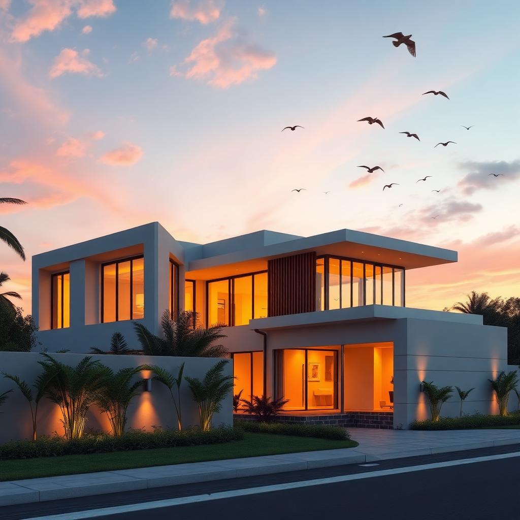
Step seven is birds or a very subtle lens flare if the composition calls for it. I use two or three birds max, silhouetted against the sky, at a size that reads as distant not decorative. Never a flock unless the image is genuinely a nature scene. Never a lens flare unless the sun is in frame and the flare would be optically correct. Junior artists overdo both of these things and it always shows.
Step eight, if the client requested people, I composite them in from Skalgubbar or my own reference library. Feet on the ground plane, cast a shadow using a hard brush at the right sun angle, color match with a curves layer clipped to the person. If they don't blend in 30 seconds, they don't belong in the image. That is my full workflow. Anything more than this is either fixing a mistake from earlier in the pipeline or gilding a lily.