Workflow · Corona
Listing renders versus award renders: same building, two completely different briefs
The image that sells a property fast and the image that wins a design award are not the same image, and the mistake is shooting one and hoping it works as both. How audience, lighting, styling and grading differ between real estate visualization and competition work.
 WORKFLOW
Ask a renderer to make an image of a living room and the first question that matters has nothing to do with software: who is this for? The same room, modelled identically, can be rendered as a bright, wide, neutral listing image that helps a property sell in a weekend, or as a moody, specific, art-directed frame that a design award jury lingers on. The geometry is shared. Almost everything above the geometry is different, and treating the two briefs as interchangeable is why some technically excellent images underperform in exactly the context they were made for.
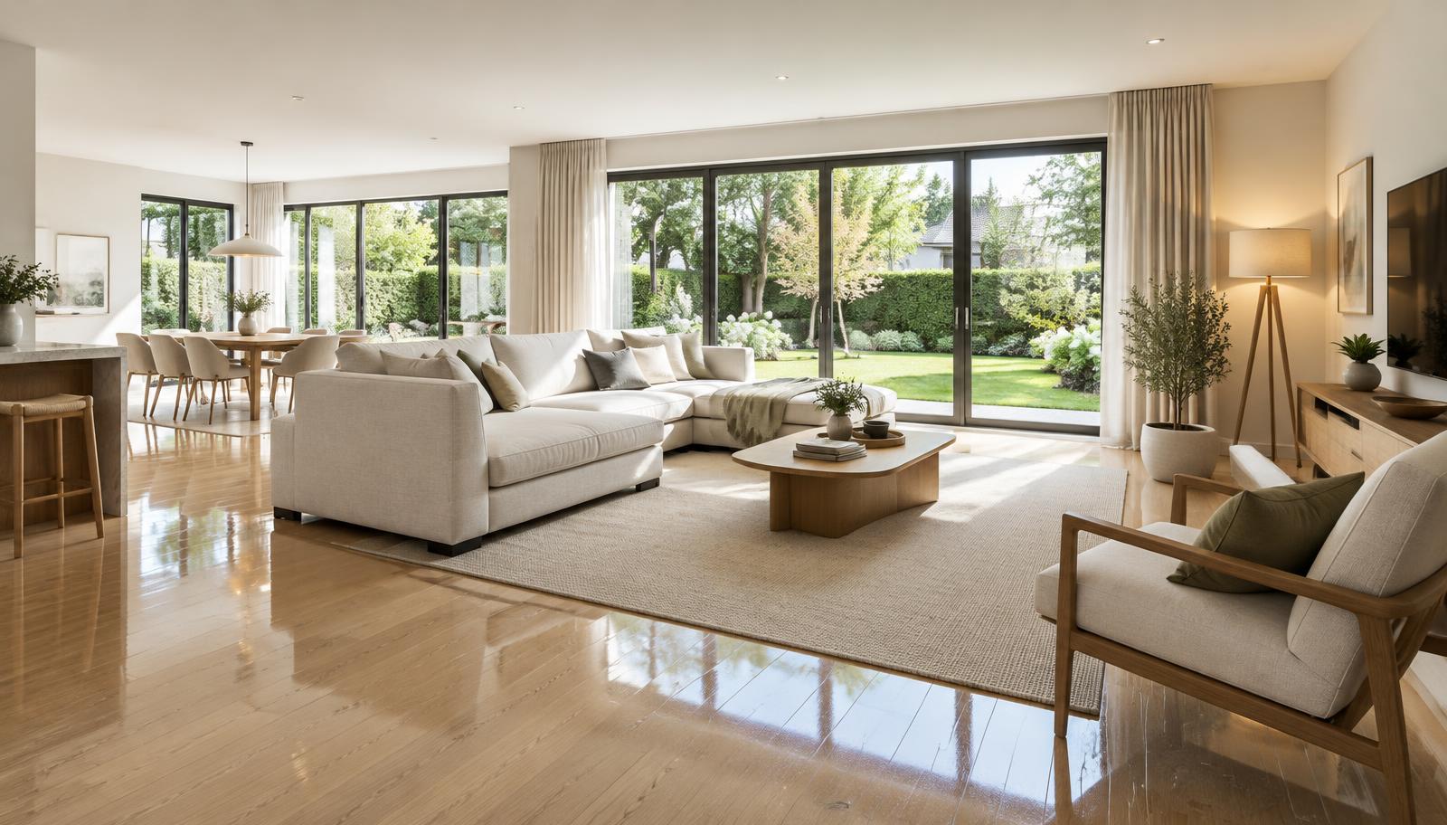
The listing render works for a buyer scanning a portal at speed. It will be seen first as a thumbnail among dozens, so it needs immediate legibility: bright and even exposure, generous width so the room reads as large, a clear view to glazing or outdoor space, and styling broad enough that a wide range of buyers can place themselves in it. Eye level sits around 1.4 to 1.6 metres, matching listing photography conventions, with verticals kept true. The emotional register is optimistic and uncluttered. Its job is to generate the viewing, not to express a point of view.
The award render works for a jury giving an image a few considered seconds, usually at full screen, often next to plans and a project description. Here legibility matters less than specificity: a point of view, a time of day, a story about how the light moves through this building on this date. Imperfections are welcome when they are the right ones, a worn table edge, a half-drawn curtain, the evidence of use. Composition can be tighter and more graphic, cropping in on a detail that would be wasted on a listing. The register is authored, not neutral.
Lighting diverges first. The listing brief wants daylight that flatters everything: high key, evenly filled, windows bright but not blown, shadows soft and short. The award brief wants direction: one dominant source with purpose, deep shadows allowed, contrast that shapes the space, and a colour temperature story, cool daylight against warm interior accents, that gives the frame depth. A renderer moving between the two is not changing brightness, they are changing the entire lighting design of the scene.
Styling follows the same split. Listing styling is aspirational and anonymous: neutral sofas, restrained art, plants, nothing that dates the image or narrows the buyer pool. Award styling is character work: the objects chosen say something about who lives here, and they are placed for the camera rather than for a life. Neither is more honest, and neither is easier. Mass-appeal styling is harder than it looks precisely because it must offend no one and still feel warm, while award styling carries the risk of the specific, which is its whole point.
Grading is where the two briefs really part ways. Listing post-production is about clarity and cleanliness: whites genuinely white, colour neutral, local contrast lifting detail, every window view readable. Award grading is about tone: a deliberate palette, selective contrast, maybe grain, and the willingness to let parts of the frame fall into shadow. Run a listing image through an award grade and it looks moody and small. Run an award image through a listing grade and it looks like every other portal photo. The grade is not decoration, it is the brief made visible.
The practical workflow answer is to decide the brief before the scene is lit, and to price and schedule accordingly. Where a client genuinely needs both, the efficient path is one master scene with two lighting and styling states, rendered as two deliberate sets, rather than one compromise image asked to serve both. Compromise images are the worst of both worlds: too moody for a portal, too safe for a jury, and they take as long to produce as either done properly.
Deliverable specs differ too, and they are worth confirming in writing. Listing work typically needs a set of many images, consistent across the property, in the aspect ratios the portals and brochures use, delivered fast and revised quickly. Award work usually needs a small number of frames at maximum quality, sometimes with a specific aspect or print requirement, and the schedule can afford a proper render and grading pass on each. The economics, the count, and the level of finish per frame are simply different jobs.
A useful discipline is to articulate the audience in one sentence before starting: this image is for a buyer scrolling a portal in eight seconds, or this image is for a jury deciding whether this project has a voice. Every downstream decision, camera height, lens, sun, styling, grade, follows from that sentence. Renderers who can move fluently between the two briefs are more valuable to both audiences, precisely because they never pretend the two images are the same image.