Workflow · Corona
Cars in exterior renders: placement, paint, and the details that betray CGI
Vehicles are the most scrutinised proxy in an exterior render. People who know nothing about brick coursing still know what a parked car looks like. Where to place them, how to park them, and the paint, glass, and contact details that decide whether a street reads as real.
 WORKFLOW
Every exterior render gets judged by the same silent jury, and the most unforgiving members are not architects. They are the ordinary viewers who cannot tell you what is wrong with the window reveals but know instantly that the parked car looks wrong. Vehicles sit in the exact overlap between architecture and everyday life, which makes them the most scrutinised proxy object in the frame.
The first mistake is treating cars as decoration to drop in at the end. A vehicle is a piece of street context with its own logic: it belongs to a road system, a parking standard, a price bracket, and a neighbourhood. A render of a social housing scheme lined with late model performance saloons sends a message nobody asked for, and a luxury penthouse scheme with a row of ten year old hatchbacks reads just as strangely.
Match the vehicle mix to the brief and the market. A sensible street carries one or two mid range cars, something older, maybe a van or a small SUV, and at least one vehicle that is slightly unloved. Perfectly uniform parking rows full of matching cars are a rendering library tell. Real streets have variety because real people have budgets.
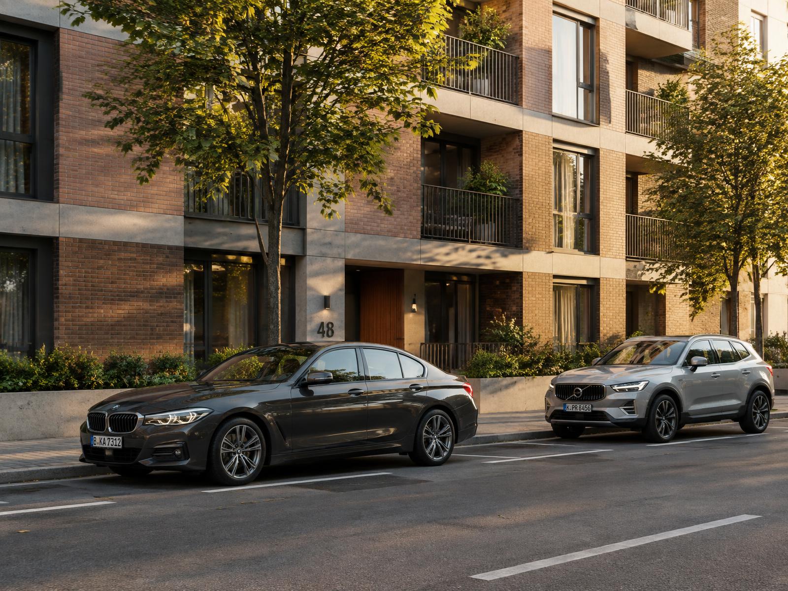
Placement matters more than model quality. Parallel parked cars should sit close to the kerb, nose to tail with roughly half a metre to a metre of gap, wheels turned toward the curb on the driver side. A car floating half a metre off the kerb, or parked at an angle that nobody could have achieved while driving it, destroys credibility faster than bad paintwork ever could.
Check the parking against the drawing set. If the landscape plan shows a loading bay, do not park a car in it. If the traffic consultant has marked no waiting lines, respect them. In planning renders especially, an auditor can and sometimes will check that the parking provision shown matches the approved layout, and having to reissue a render because of a parked car is an avoidable cost.
Contact is the detail that separates a placed car from a rendered one. Tires should squash very slightly under load, which most library models already include but some free models do not. Check the ride height and the shadow: a car needs a soft, dark, tight contact shadow under the sills and tires, not a single blob shadow offset ten centimetres from the body. On sunny scenes, let the ambient occlusion under the chassis stay dense while the ground shadow stretches.
Paint is the second checkpoint. The single most common error is showroom paint in a street scene: full gloss clearcoat, perfectly even, like the car just left the dealer. Street cars carry a thin film of dust, especially on the lower sills and behind the wheels, and their paint roughness varies with panel and with how often the owner washes the roof they cannot reach. A small roughness map doing slow, low contrast variation across the bodywork is enough.
Windows are the other giveaway. Real parked cars in a render are usually empty and the glass behaves accordingly: slightly reflective, slightly hazy, never the crystal clear transparency of a configurator image. If a scene includes occupied cars, the seats and a steering wheel silhouette need to exist, because a transparent glass box with a visible road through it reads as a toy.
Number plates deserve ten seconds of thought. Blurred or blank plates are fine in most markets and often the safest choice, but a plate with obviously fake lettering in a legible typeface is worse than either. If the render is for a planning submission in a jurisdiction that cares, follow whatever the client's precedent images do.
Lighting interacts with cars more than most proxies. Automotive paint is designed to be reflective, which means it picks up sky gradients, neighbouring facades, and every bright window behind the camera. This is genuinely useful: a car body is a free secondary lighting indicator, showing the sky colour and the street brightness in one curved surface. If the paint reflections contradict the sky in the render, one of the two is wrong.
Be careful with hero cars. A single striking vehicle in an accent colour is a legitimate compositional device and a classic marketing trick, but it moves the eye away from architecture, and in residential marketing it can set an expectation about the buyer that the developer may not want. When in doubt, ask. It is a two line email that prevents a revision round.
Weathering should follow the same logic as the paint. A car in a rainy scene collects water in the panel joints and beads on the roof. A car parked under a tree carries pollen and leaf debris. A car in a winter scene has a rim of salt spray behind the wheels. None of this needs to be heavy handed; the point is that the vehicle has apparently existed in the same environment as the building for more than an hour.
For animations, vehicles need one more decision: do they move? A moving car at shutter speeds appropriate to architectural photography is a smear or a sharp object, not both, and mixing a sharp moving car into an otherwise still frame reads as composited. Either leave traffic parked, or commit to motion blur with a shutter angle and duration that matches the stills' look.
Before submitting, do a two minute car audit. Are the vehicles appropriate to the market and the brief? Is every car parked somewhere a driver could actually leave it? Do the tires touch the ground with proper contact shadows? Is the paint showroom gloss or street worn? Is there at least one ordinary, slightly boring vehicle in the set? The audit costs nothing and it removes the single most noticed proxy failure in exterior work.
Cars are not the subject of an architectural render, and they should never compete with the building. But they are the element that most efficiently convinces a lay viewer that the street is real, and that conviction transfers to everything around them. Treat the vehicles with the same respect as the brickwork and the whole image rises.