Workflow · Corona
Reading a commercial office brief: what the client is actually asking for
Workplace renders are sold to a different audience than residential ones. What developers, agents, and design teams each need from the image, and how to satisfy all three.
 WORKFLOW
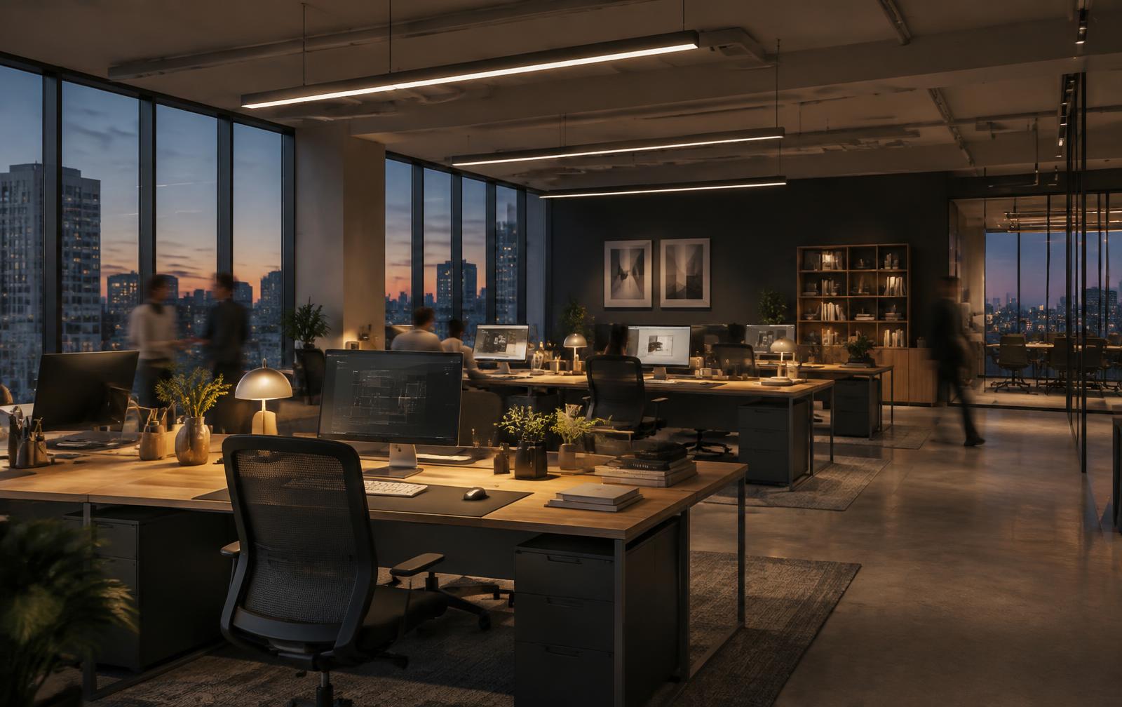
A workplace render is rarely bought by one person. There is usually a developer who needs the asset to look lettable, a leasing agent who needs it to look full of life, and a design team who needs it to look like the scheme they drew. Those three readings pull in different directions, and the job is to satisfy all of them in a single frame.
The developer is thinking about area efficiency and perceived quality. That means the image needs to show generous floor to ceiling height, a clean services strategy, and a finish level consistent with the rent being targeted. An image that implies a specification the budget cannot deliver creates a problem at handover, so ask early what grade the fit out is and make the materials reflect it honestly.
The agent is thinking about occupancy. An empty office looks like a warehouse. Desks, monitors, coffee cups, jackets over chairs, and a couple of figures in motion communicate that this is a place where work happens. Keep people slightly blurred rather than frozen, because a sharp figure invites judgement about their clothing, their pose, and whether they look like the target tenant.
The design team is thinking about intent. If the ceiling is exposed services painted dark, that is a decision, and the render should show it clearly rather than hiding it in gloom. If a specific linear fitting was specified, use its actual profile and output. Getting these right buys enormous goodwill and reduces revision rounds, because architects generally push back hardest on things they explicitly designed.
Time of day is a strategic choice in workplace imagery. Daylight shots sell the daylight factor and the view, which matter for wellbeing arguments and planning submissions. Dusk shots sell atmosphere and are stronger for marketing because the interior glows against a darker exterior. If the budget allows two images, do one of each and the brief is usually covered.
Lighting a dusk office has a specific balance. Linear fittings carry the ambient level and should sit in the neutral range, around 4000K, because that is what specification will be. Desk lamps and breakout area lighting sit warmer, around 3599K, which creates pockets of warmth that break up the uniformity of an open floor. Getting those two temperatures to coexist without looking dirty is most of the craft.
Ceiling voids and services are where realism lives in commercial work. Real offices have sprinkler heads, smoke detectors, speakers, and air diffusers, and leaving them out produces a ceiling plane that reads as a render even when everything else is convincing. Model them simply, place them on a plausible grid, and let them recede.
Views out matter more than people credit. Workplace tenants are buying an outlook. A vague white void beyond the glazing removes the single strongest amenity argument the building has. Use a real context model where possible, or at minimum a graded photograph from approximately the right height and orientation, which is defensible provided the marketing team knows it is indicative.
Monitor content is a small detail with outsized effect. Blank screens read as an empty building. Screens showing generic spreadsheets read as a stock photo. Screens with soft, unreadable content at slightly varied brightness, some asleep, read as a working floor. It takes fifteen minutes and it is one of the first things people notice subconsciously.
Ask what the image will be used for before you set the camera. A planning document, a leasing brochure, and a website hero all crop differently and tolerate different amounts of detail. Framing that works on a printed A3 spread can lose its subject entirely in a 21 by 9 web banner, and finding that out after final render is an avoidable cost.