Interiors · V-Ray 7
Circulation spaces are not filler, and clients notice when you treat them that way
Stairs, corridors, and lift lobbies get five minutes at the end of the project. Spending an hour on them instead is the cheapest way to raise the perceived quality of a whole set.
 INTERIORS
Every residential set we deliver has one or two circulation images in it. The lobby, the stair core, the corridor outside the apartments. They are almost always the last thing produced, usually by whoever is free on Friday afternoon, and they are almost always the weakest images in the pack.
The reason they are hard is that there is nothing in them. No furniture to stage, no view to sell, no lifestyle moment. A corridor is a plaster tube. If you light it badly there is literally nothing else for the eye to look at, so the bad lighting is the whole image.
That is also why they are the best value hour of work in the project. Because there are so few variables, getting one of them right transforms the image. Usually that variable is the light.
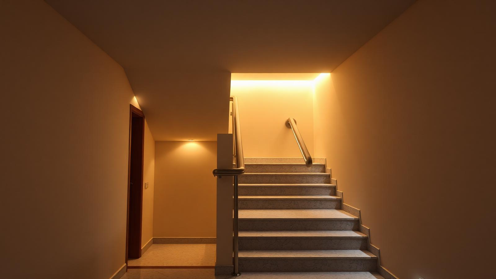
Concealed lighting is the workhorse of circulation design and it is chronically badly rendered. A cove strip is not a glowing tube stuck in a slot. It is a source you should never see directly, producing a soft gradient on the surface above or below it. If you can see a hard bright line in your render, the strip is either too exposed or too small.
Give the emitter some physical size. A one millimetre thick plane produces a razor line. Model the strip as a five to ten millimetre band, recessed at least thirty millimetres into the slot, with a small return lip. That geometry is what produces the soft falloff that makes concealed lighting look expensive.
Keep it at 3599K along with everything else in the building. Circulation is where temperature drift becomes obvious, because you often see two or three spaces at once through an opening. A warm corridor leading to a cool lobby looks like a rendering error even when it is intentional.
The second variable is the plaster. Circulation walls are usually painted plasterboard, which is the least interesting material in the world and also the one that will expose every shortcut in your shader. Flat white diffuse with no roughness variation renders like paper. We add a very subtle bump, roughness in the 0.55 to 0.7 range, and a barely visible large scale mottling map. It should not be readable as a texture, it should just stop the surface being perfect.
The third variable is composition, and here circulation actually gives you something to work with. Stairs and corridors have strong natural perspective. Put the camera on the centre line, keep it level, and let the geometry do the work. A one point perspective down a corridor is a cliche precisely because it works.
Do include something at the end of the view. A door, a window, a piece of art, a change in material. A corridor that terminates in a blank wall is a dead image. If the architecture terminates in a blank wall, ask the architect what goes there, because the answer usually exists and just has not made it into the model.
Treads and nosings are worth ten minutes. A stair with a sharp ninety degree tread edge reads as untextured geometry. Real terrazzo and stone treads have a small chamfer or bullnose, usually two to five millimetres, and that tiny edge catches the light and instantly makes the stair look built rather than modelled.
One practical note on render settings. Circulation spaces are usually enclosed with no daylight, which means everything is indirect. Light cache or irradiance solutions will struggle if your bounce count is low. We push global illumination bounces higher here than anywhere else in a project, often to twelve or more, because a corridor is basically a light trap and the last few bounces are doing real work.
The payoff is disproportionate. When a client flips through a set of fifteen images and the corridor is as considered as the living room, it changes how they read the whole package. It signals that nothing was phoned in, which is exactly the impression you are selling.