Workflow · General
Entering render competitions: how a winning entry is put together
Render competitions are won on discipline, not on renderer settings. What judges actually score, why the strongest entries commit to one idea, how a statement and WIP thread change the verdict, and the common reasons good images get cut.
 WORKFLOW
What judges are actually scoring
Render competitions concentrate more judgement into one image than any client brief ever will, and they reward a different discipline. A client asks for the building; a competition asks for the artist. The winning entries are rarely the most technologically impressive renders in the pool, and they are almost never the busiest. They are the ones where every element, the light, the materials, the composition and the words around the image, pulls in one direction that the artist chose on purpose. Understanding what is being judged is the first step, and it is not the render engine.
Across the major awards and community challenges, the scoring axes are remarkably consistent: light, materials, composition and response to the brief. Light leads because it is the hardest to fake and the clearest signature of control. Materials follow, judged on believability at the scale the camera allows. Composition separates the portfolio-quality entries from the hobby ones. Response to the brief is the quiet axe: an image that ignores the theme can be technically excellent and still score zero on a third of the rubric. Artists who lose competitions repeatedly are usually losing on that last axis, not the first three.
One image, one idea
The strongest entries commit to one idea and remove everything that is not that idea. A single mood, a single moment, a single reason the frame exists. Dusk against dawn, storm against stillness, abandoned against inhabited: the idea is chosen and the scene is built to serve it, so every light source, every prop and every material decision answers to it. Weak entries hedge, containing a beautiful dusk sky, a lunchtime sun angle, a night-time neon sign and a cozy interior glow, each good in isolation and mutually destructive in one frame. Judges read that hedging instantly as an artist who has not decided anything.
One image also means trusting the single frame to carry the story. Multi-image entries spread attention and invite comparison; the single hero frame demands that everything worth saying fits in it, which is exactly the discipline competitions test. If the challenge allows supporting images, treat them as evidence rather than as more chances to impress: process shots, clay passes and detail crops that prove the hero image is built and not assembled. The frame the judges remember is the one that needed no explanation, and everything you attach to it should make that frame more credible, not compete with it.
The hero frame: composition and restraint
Composition in a competition context is about restraint as much as arrangement. The eye-level, one-point or gentle two-point views dominate winning pools because they put the viewer inside the space rather than admiring it from a drone. Strong entries usually have a foreground that invites, a middle that delivers and a background that promises, with one clear line guiding the eye through the frame. They also crop honestly: if the composition only works at 21:9, the entry is either cropped to 21:9 or rebuilt, not letterboxed into a required resolution with black bars. Check the frame at the size it will be judged, projected large on a wall, not at the size you worked on it.
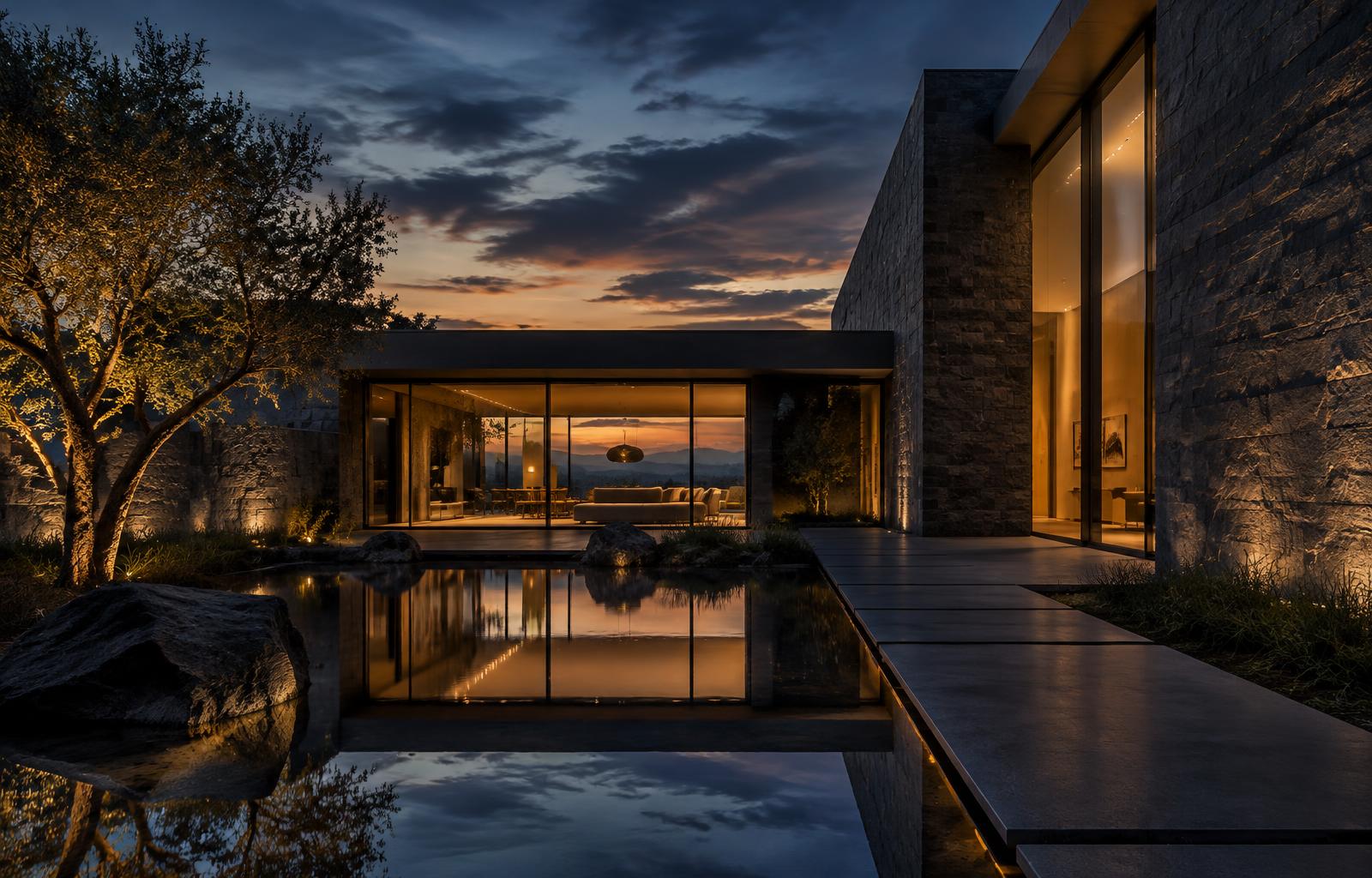
Light quality is the axis where the most points are won and lost in the top decile, and it is won by matching light to story rather than by brightness. Raking late sun for texture, flat overcast for calm, a single practical for intimacy: the winning choice is the one that makes the brief's mood inevitable. What loses points faster than any setup error is the partially committed scheme, a scene with believable sun and an unexplained second source, or dusk ambience contaminated by a leftover daylight HDRI. Judges of major awards see thousands of frames a year, and light logic errors that a client would never notice are, to them, the first thing visible.
Post-production that supports the story
Post-production should behave like a good editor: invisible, decisive and loyal to the render. The standard winning toolkit is modest, a gentle grade that unifies the temperature zones, selective contrast to protect the intended focal path, careful denoising and clean sharpening at final resolution. What reads as amateur is the opposite: saturation pushed until materials stop belonging to the building, glow applied to every light source, an HDR look that crushes shadows and blooms highlights simultaneously, or heavy-handed photomanipulation that fights the geometry. If the post is doing structural work, the 3D was not finished, and competition judges are the audience most likely to notice.
The words around the image carry more weight than most artists expect. A short statement, two or three sentences, that names the idea, the hour of day and the design intent, tells the judges how to read the frame and signals an artist who makes decisions. It should be specific rather than poetic: what the brief asked, what the entry chose to answer, and what the light is doing. Vague statements about passion and inspiration waste the one paragraph of attention an entry gets, and a precise one often rescues an image that sits on the shortlist borderline.
The statement, the WIP and the breakdown
Work-in-progress evidence changes verdicts at the line between shortlist and winner, because it demonstrates authorship. A clay pass, a lighting study, a material flat or two and a dated thread showing the image evolving prove that the composition was designed rather than stumbled into, and they protect against any doubt about how the image was made. The same material doubles as the breakdown that audience-facing awards love: pass-by-pass frames with two or three sentences each about the lighting build, the material strategy and the post. Entries that arrive with this evidence pre-organized read as professional before the hero image is even considered.
Brief response is the axis where technically brilliant entries die, and the failure is usually reading the brief as decoration rather than as the assignment. If the theme is a single interior after dark, an exterior twilight is off-brief no matter how beautiful. If the brief specifies one image, a five-image spread ignores it. Judges frequently score response explicitly, and even where they do not, a compliant entry makes their job easier and their goodwill warmer. The trap is the brief that seems open: open briefs still have a centre of gravity, and the entries that score highest are the ones that land near it while looking like nobody else's work.
Brief response and the brief trap
Logistics cut more entries than art does, so treat the rules as part of the craft. Resolution and format requirements, WIP requirements for certain challenges, deadline timezone, naming conventions, eligible software, original-model rules and the exact definition of what counts as post-production: each has disqualified strong images in every competition cycle that has ever run. Read the rules twice, once before starting and once before submitting, and prepare the submission a day early, because upload queues and file-size limits do not care about your deadline. The artists who win repeatedly are, without exception, also the ones who never lose points to paperwork.
A short list of the usual cut reasons is worth auditing against before submission, because they repeat every cycle. Oversaturated colour and HDR-styled contrast that reads as a filter. Light with no logic, or two lighting schemes fighting in one frame. Composition with no focal path, or a camera angle chosen to show off modelling. Noise, fireflies or over-denoised plastic shadows at final resolution. A brief ignored, or a statement that says nothing specific. Clutter: every asset the library owns deployed into one scene. Each of these is fixable in an evening during production and unfixable on deadline day, so audit early.
Common reasons entries get cut
Close by remembering what a competition entry actually is: a portfolio piece with a public verdict attached. The images that win challenges become the centre of a portfolio page, the ones that get shortlisted still open doors, and the process of entering, one image, one idea, one clear statement, is the same discipline that wins client work. Enter selectively, finish properly, and publish the entry on your own site regardless of the result, because the breakdown you wrote for the judges is the same article that brings clients to your portfolio for years. ArchVizDaily's own Render Challenge follows exactly the judging axes described here, and it exists to give artists that first published feature.