Lighting · Corona 12
Rendering galleries and exhibition spaces where the lighting is the design
Track lighting, wall washing, and controlled falloff. Gallery renders live or die on how accurately you handle beam angles, and most artists never touch them.
 LIGHTING
Gallery and exhibition work is the closest archviz gets to pure lighting design. There is no furniture, the materials are white plaster and dark floor, and the architecture is deliberately quiet. What is left is light, and if you get the light wrong there is nowhere to hide.
The first thing to understand is beam angle, which is the parameter most visualisers ignore entirely. A spotlight in your renderer defaults to something like a forty five degree cone with a soft edge. Real gallery track fittings come in narrow spot at around ten degrees, spot at twenty four, flood at thirty six, and wide flood at sixty. Those are not arbitrary. They determine the size of the pool of light on the wall and therefore the entire rhythm of the space.
If you want a specific look, download the IES profile from the manufacturer. Erco, iGuzzini, and Flos all publish them freely, and a real IES profile carries the exact intensity distribution including the falloff at the edge of the beam. Dropping a real profile into a light takes thirty seconds and it is the single largest quality jump available on this type of project.
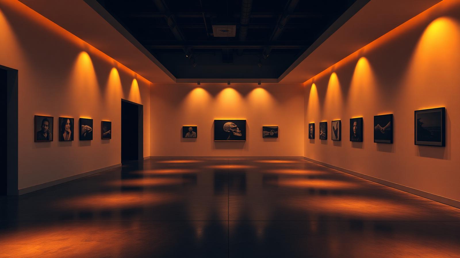
The visual signature of gallery lighting is the scallop. When a row of spots is aimed at a wall from a track set back a metre or so, each one produces an oval pool and the overlaps create a scalloped band along the top of the wall. Getting the spacing right so the scallops touch but do not merge into a flat wash is what makes the render look like a real gallery rather than a rendering of a white room.
Wall washers do the opposite job. They are designed to produce an even vertical gradient with no scallop, and they sit much closer to the wall, usually three hundred to five hundred millimetres out. If your brief is a commercial gallery with large works, you probably want washers. If it is a boutique museum with individual pieces, you want spots. Mixing them without understanding the difference produces a mess.
We run every fitting at 3599K here as with all our interior work. Galleries in the real world often specify higher CRI lamps around 3000K for conservation reasons, but for visualisation purposes 3599K keeps the plaster reading white rather than cream while still feeling like artificial light. If the brief specifies a lamp, follow the brief.
The floor is usually the biggest surface in frame and it should not compete. Dark polished concrete or resin at a fairly high roughness, somewhere around 0.35, gives you soft indistinct reflections that suggest the light pools without duplicating them sharply. A mirror finish floor in a gallery render is a very common mistake and it doubles the visual noise of every fitting.
Ceilings in exhibition spaces are usually dark and full of services. Do not clean this up. Exposed track, ducting, and a matt black ceiling is the honest condition and it also creates a strong compositional band that frames the top of the image. Rendering a pristine white ceiling makes the space look like an office.
Ambient level is a judgement call and it is worth discussing with the architect. A gallery lit purely by accent spots is dramatic and dark, which photographs beautifully but may not match the operational reality where the space needs general circulation lighting. We usually produce two variants, one dramatic and one with ambient lifted, and let the client choose.
Falloff discipline matters. Real light obeys the inverse square law and your renderer does too, provided you have not switched to a non physical decay mode to solve a brightness problem. If your gallery looks flat, check that decay is set to inverse square and fix the brightness with intensity rather than by cheating the falloff.
For the artwork itself, be careful about what you hang. Using recognisable copyrighted works in a client render is a real problem and it comes up more often than people expect. Either use the client supplied collection, commission simple abstract pieces, or generate neutral placeholder works. It is a five minute conversation that avoids a genuinely awkward one later.
Last point. Gallery renders are usually noisy because most of the frame is illuminated indirectly by bounce off a white wall. Do not try to fix this with denoising alone. Give the render the samples it needs, particularly if there are any soft shadow gradients on the plaster, because denoisers tend to band those gradients in a way that is immediately obvious on a large print.