Interiors · 3ds Max + V-Ray
Retail store renders: display lighting that flatters product
Ceiling wash versus track spots, terrazzo reflectivity, and the empty rail problem in fashion retail visualization. A working boutique breakdown.
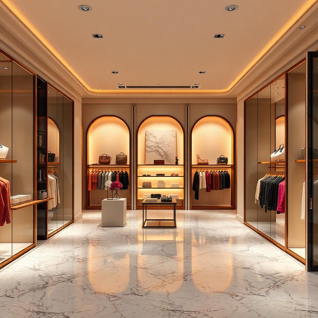 INTERIORS
Retail visualization has a specific job. The render is not showing a room, it is showing where product will be sold. Every lighting decision, every material choice, every camera angle should be judged by whether it flatters the merchandise that will eventually occupy the space. This is what separates retail arch viz from other interior categories.
The dominant lighting principle in retail is that the product zone should be brighter than the circulation zone. Displays and merchandise get 800 to 1200 lux at the surface. Aisles and gathering zones get 300 to 500 lux. This contrast pulls the eye onto product without the customer consciously noticing why. Render your retail spaces with this hierarchy respected and the space will read as premium. Uniform lighting reads as supermarket.
Track spots on IES profiles are the workhorse of retail lighting. Use actual manufacturer IES files, not generic point lights. The beam pattern of a real retail spot is a controlled 24 or 36 degree cone with a soft edge, and that specific pattern is what makes the merchandise pop. A generic point light gives you a soft circle that reads as CG. Every serious retail render lives or dies on IES profile fidelity.
The arched display alcoves in this scene are backlit with a soft warm panel at 3200K. Backlighting a display niche makes the merchandise sit in front of a glowing halo that draws the eye. This is the single most photographed retail lighting technique of the past decade, from Aesop stores to fashion boutiques worldwide. Use it deliberately and it works. Use it everywhere and it becomes noise.
Terrazzo floors are the current default in premium retail, and rendering them well requires attention to the aggregate. Real terrazzo has visible chips of stone, glass, or metal set in a base matrix. Use scanned terrazzo textures rather than procedural, and set reflection glossiness around 0.85 for a polished finish. The reflection is what makes terrazzo read as expensive. A matte terrazzo reads as vinyl.
The empty rail problem is unique to fashion retail visualization. A render of a fashion store with empty rails reads as a store closing sale. But rendering full rails of merchandise is enormously time consuming and clutters the frame. The solution is a curated middle ground. One rail with three or four hanging garments, one folded stack on a table, one mannequin in the front window. The impression of merchandise without the burden of rendering every SKU.
Mirrors in retail spaces are strategic. They double the perceived width of the space and reflect the ceiling lighting back into the room, which fills shadows without needing more fixtures. Do not point the camera directly into a large mirror unless you are prepared to model the reflected room in full detail. Use mirrors as background elements in the composition rather than focal points.
The colour temperature choice in retail is a brand decision as much as a design decision. Cool white at 3500K to 4000K reads as clean, minimal, and premium in a Nordic or Japanese context. Warm white at 2700K to 3000K reads as intimate, curated, and premium in a European context. Pick based on the brand identity and hold to it consistently. Mixed colour temperatures in a single retail render suggest that the lighting design was not thought through.
The last note is about occupancy suggestion. A hint of a customer at the back of the frame, a bag left on a display table, a coffee cup at the till. These small human artefacts communicate that the store is functioning without cluttering the composition with entourage. Retail renders where every rail is untouched read as brand new stores that have not yet opened. Renders with subtle habitation read as successful stores that are working.