Tutorial · Corona
Colour bleeding explained: why white walls turn pink in renders
Red floors tinting white walls, beige ceilings, green shadows in the corners. Colour bleed is physically correct global illumination, and fighting it with the wrong tool makes renders worse. What causes it, when to keep it, and how to control it.
 TUTORIAL
Every archviz artist has seen the complaint. The walls were specified white, the render came back pink. Or the ceiling is beige, or the corner of the room has gone green, and the client wants to know what is wrong with the paint. Colour bleeding is one of the most misunderstood phenomena in rendering, mostly because the explanation and the fix are usually different things.
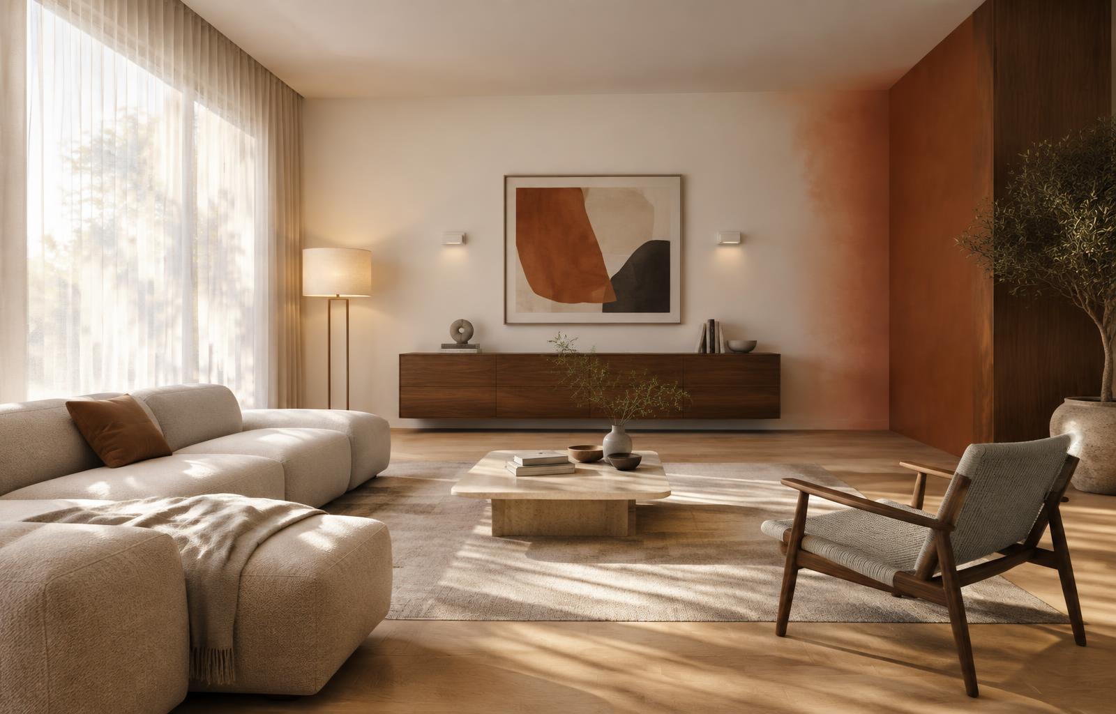
The mechanics are simple. Global illumination works by bouncing light between surfaces, and every bounce picks up the colour of the surface it hits. Light from a window strikes a terracotta floor, the floor absorbs the blue end of the spectrum and bounces the rest, and that warm bounce lands on the nearest white wall. The wall is not pink because the material is wrong. It is pink because the physics says it should be.
The complication is that physically correct is not the same as matching the client's expectation. Real white walls do pick up bounce colour, but human vision adapts. When you stand in a room with a red floor, your visual system discounts the warm cast and the wall looks white. The camera and the renderer have no such adaptation, and tone mapping can exaggerate the tint further. So a technically accurate render can look wrong compared with the room a client remembers visiting.
Before touching any settings, diagnose where the bleed is coming from. Look at the corners and contact areas first: those are the zones with the most interreflection and they show the problem earliest. Then check the albedo of the large surfaces in the scene. Strongly saturated floors, rugs, upholstery, and coloured glazing are the usual offenders. A white wall in a room with a saturated red oxide floor will always pick up red.
The most effective fix is also the least popular one: desaturate the source material. Renderers are unforgiving about texture albedo, and most texture maps created for games or downloaded from libraries are far more saturated than the real material they represent. A real terracotta floor sits at maybe 30 to 40 percent saturation under studio lighting, while a photo texture read straight into a scene can sit well above that, and GI multiplies the error with every bounce. Pulling the saturation of large surfaces down is a fix at the cause, not the symptom.
The second lever is the renderer's GI saturation control. Corona lets you desaturate global illumination, and V-Ray offers GI saturation through its colour mapping options. Dropping GI saturation by 10 to 20 percent is a standard production trick, and it is a reasonable default for interiors with strong accent colours. Use it sparingly: push it too far and every material starts to look like it was lit by neutral studio flash, which is its own kind of artificial.
A useful diagnostic when you are unsure how much of the tint is bleed and how much is your lighting: render a clay version, or override all materials with a neutral grey. If the pink cast survives the override, the cause is a light source colour, the white balance, or tinted glazing. If it disappears, the cause is surface colour, and you know to work on materials rather than lighting.
That distinction matters because not every warm cast is colour bleed. Tinted glazing will wash an entire room in the glass colour, since every photon from outside passes through it. A wrong white balance does the whole frame uniformly. Bleed is always strongest near the coloured surface and fades with distance. Learning to tell them apart at a glance saves a lot of blind setting changes.
Do not overcorrect. Warm bounce from timber and natural materials is one of the most valuable qualities in an interior render, and it is often the reason a render feels warm and lived in rather than clinical. A CLT office or an oak floored living room leans on that warm secondary light. The goal is control, not elimination: keep the bleed that sells warmth and material, remove the part that reads as an error.
Coloured glass deserves its own mention because it causes the harshest casts. Physically accurate absorption in thick glass models can turn a whole interior blue or green. If the design genuinely has tinted glazing, that may be correct, but check whether the architect intended the tint as a coating property rather than a body colour. Thin walled transmission or a surface only tint reproduces many coated glasses without the cast.
When the complaint arrives anyway, and it will, resist defending the render on physical grounds. Ask instead which surface is causing it and whether that surface matches the specification. Half the time the answer is that the floor really is specified in a saturated red oxide and the client is only now seeing the consequence. That is a design conversation, and having it early is part of the job.
Prevention is mostly albedo discipline. Keep the diffuse values of large surfaces in a narrow, slightly desaturated range unless a strong colour is a deliberate design feature. Check texture maps on import: many read brighter and more saturated under render lighting than they did in the image viewer, because the renderer is applying physically based lighting to an 8 bit image that was never adjusted for it.
If your studio does repetitive interior work, build the correction into the material library. A pre-tuned concrete, timber, and plaster set with sane albedo values stops the problem appearing in the first place, and means GI saturation stays at 100 percent where it belongs, reserved for scenes that genuinely need it.
Colour bleeding is not a bug in the renderer. It is the render telling you what the room would actually do with light. Learn to read it as information about your materials, control the few cases where it fights the client's perception, and the pink wall problem mostly disappears, along with a lot of other subtle material errors that were hiding behind it.