Workflow · General
Aspect ratios and crops: one render, every destination
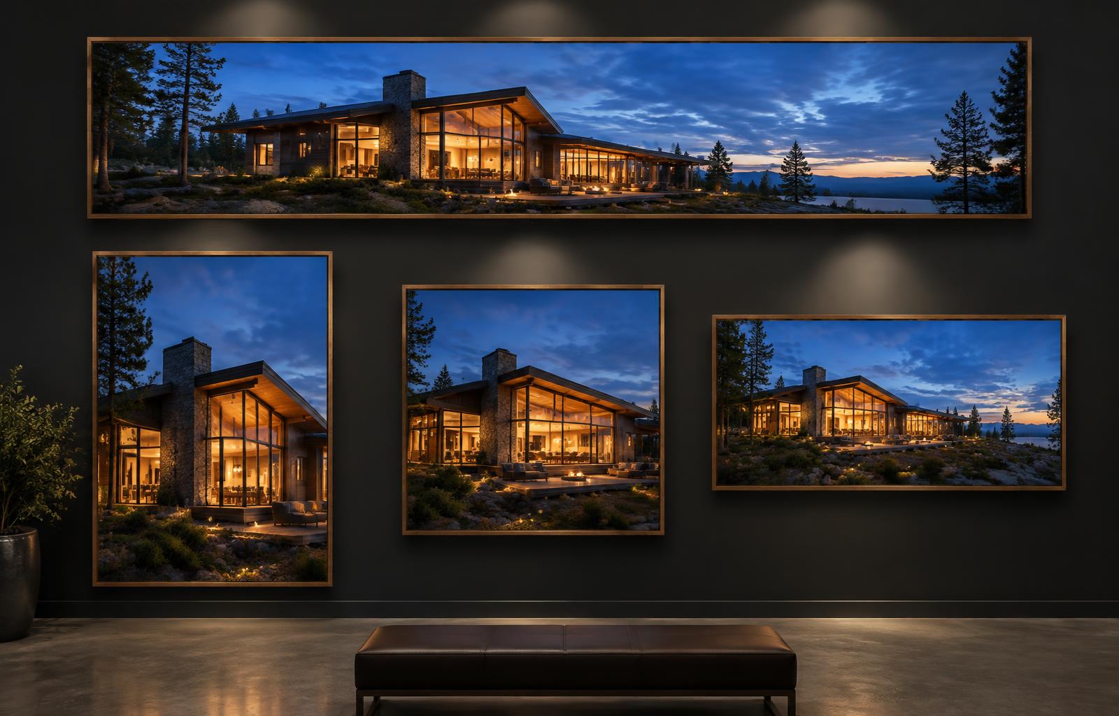
A hero render now lives on a website, two social platforms, a listing portal and occasionally a printed panel, each with a different frame. How to design the master shot for cropping, recompose rather than squash, and deliver every ratio without re-rendering.
 WORKFLOW
One scene, many destinations
The economics of architectural visualization changed quietly over the last decade: the render is no longer finished when the client approves it, it is finished when it works in every place it will appear. One hero image now travels from a website banner to an Instagram feed, a story, a listing portal, an awards submission and sometimes a printed hoarding, and each destination wants a different shape, a different resolution and a different tolerance for busy edges. Studios that treat the crop as an afterthought produce one beautiful frame and four degraded ones, all carrying the studio's name.
The answer is to design the master frame for the crops it will feed, which starts with knowing where the image is going before the camera is placed. The discipline is safe zones: while composing the 16:9 master, keep the architectural subject and any critical detail inside an imaginary centre region, and let the edges of the frame carry supporting material, sky, landscape, foreground texture, that can be lost without losing the story. A composition whose meaning only survives at exactly one ratio is not finished; it is fragile, and delivery day is when fragility gets expensive.
The master frame and safe zones
Cropping well is composition repeated at another ratio, and the mistakes are predictable. The centre-weighted crop is the most common: the crop tool defaults to the middle, and a composition built on the rule of thirds loses its tension point into the frame edge. The second is cropping into architecture: slicing a column, a window mullion or a staircase at an arbitrary line reads as error in a way that slicing into sky or paving never does. The third is cropping out the grounding: a building that loses its base in a portrait crop floats, and no amount of atmosphere pulls it back to earth.
Portrait crops deserve more care than they usually get, because the platforms that use them are the highest-traffic destinations the render will have. A 4:5 or 9:16 crop of a landscape composition is usually a vertical slice through a horizontal idea, and it shows. The stronger approach is to recompose: shift the camera or the crop to a vertical stack, foreground detail, the building, the sky, so the portrait has its own visual order rather than being the landscape's leftovers. Scenes with strong vertical structure, towers, atria, stairwells, double-height glazing, recompose naturally; low horizontal buildings need the camera tilted or the crop chosen around one strong vertical element.
Recompose, do not crop blindly
Social platforms also punish detail at small sizes, and this is a rendering issue before it is a cropping one. A 4:5 frame seen on a phone is a few hundred pixels wide, which means material finesse that reads at 4K disappears and silhouette, light contrast and colour story carry the entire image. Check every crop at delivery size before shipping it: zoom the phone out, look at the thumbnail grid, and note where the image loses its point. The fix is usually raising local contrast around the subject and simplifying the crop, not sharpening the master.
Print and large-format work by different rules, and the aspect ratio there is usually fixed by the object rather than by the platform. A hoarding panel, a brochure page, an exhibition wall: measure the physical ratio before rendering, because a 16:9 image cropped to fill a 3:2 page either loses content or letterboxes. Print also exposes resolution, and the honest rule is that a rendered image can usually carry larger prints than its nominal DPI suggests because architectural imagery has few fine skin textures, but text-heavy or detail-critical prints deserve a render at the final physical size rather than an upscale.
Portrait formats and social platforms
That leads to the cardinal rule: never stretch, and be reluctant to upscale. A 16:9 image forced into 4:5 by scaling distorts every line in the building, and architectural lines are the one content type where distortion is instantly legible; verticals lean, circles become ellipses, and every architect in the audience notices. Where a higher resolution is genuinely needed, re-render from the scene file rather than upscaling the finished frame. AI upscalers have improved and have a legitimate role for social reuse, but they belong in the delivery toolkit, not in front of a client's print vendor.
Resolution practice is straightforward once separated from ratio. Deliver the master at or above the largest physical dimension any destination needs, and keep the full-quality file rather than the social-optimized export, because requests for the print version arrive months after delivery. Export social crops as new files from the master, at the platform's native ratio and a resolution matched to how the platform re-encodes, which avoids the platform doing the cropping for you at the worst possible position.
Print and large-format ratios
Delivery hygiene is where professional studios separate from good amateurs, and it is mostly naming and file management. One master, named with project and view code. Crops named for destination, hero_web_16x9, social_4x5, story_9x16, print_a2. A delivery note that says what each file is for, so the marketing person who receives the folder does not crop it themselves. Version the crops when the master changes, because a social crop rebuilt from an outdated master is a silent embarrassment that surfaces later, usually at scale.
There is also a story-format dimension that stills-only studios miss. Stories and reels run at 9:16 with interface elements at top and bottom, which means the usable area is roughly 9:16 minus generous margins, and the composition has to survive that. If a project has an animation, the same discipline applies to frames: compose the hero frame knowing that its centre will become a story frame and its edges will become a website hero. Designing once for the family of destinations is faster than designing repeatedly for each.
Resolution, not stretching
Two habits make the whole system cheap to run. First, render the master taller and wider than the primary ratio demands when the scene allows, because the extra resolution costs little at render time and buys every later crop; the exception is where the crop would change the perspective relationship, in which case move the camera instead. Second, build crop guides into the post-production template: overlay guides at the ratios you regularly deliver, so composition decisions during grading happen with the destination ratios visible rather than discovered at export.
Close with the principle underneath the mechanics: the render is a system, not a picture. The hero frame is designed, but the 4:5, the story, the portal thumbnail and the print panel are deliverables with equal claims on quality, because each is somebody's first impression of the project and of the studio that made it. A scene composed with its destinations in mind costs marginally more at the camera stage and dramatically less at every delivery after, which is the same trade every other production discipline in this field makes.