Breakdown · 3ds Max / V-Ray
Stone cladding facades: split face, ashlar and mortar that survive a close camera
Stone cladding fails in renders when it is treated as a texture instead of a construction. Courses, joint logic, displacement decisions, per-stone variation, weathering and the detailing that holds up when the camera comes close.
 BREAKDOWN
Cladding is a construction before it is a texture
Stone cladding is where architectural renders quietly fail. From a typical marketing camera a stone facade looks easy: apply a stone texture, adjust the scale, move on. The problem arrives when the client asks for a detail shot of the entrance, or the camera comes down to street level for a planning visual. Suddenly the texture is a flat decal, the courses drift out of alignment around corners, and the mortar reads as painted stripes. The fix is conceptual: treat cladding as a construction with real course heights, real joint depths and real dressings, and let the texture serve that construction rather than replace it.
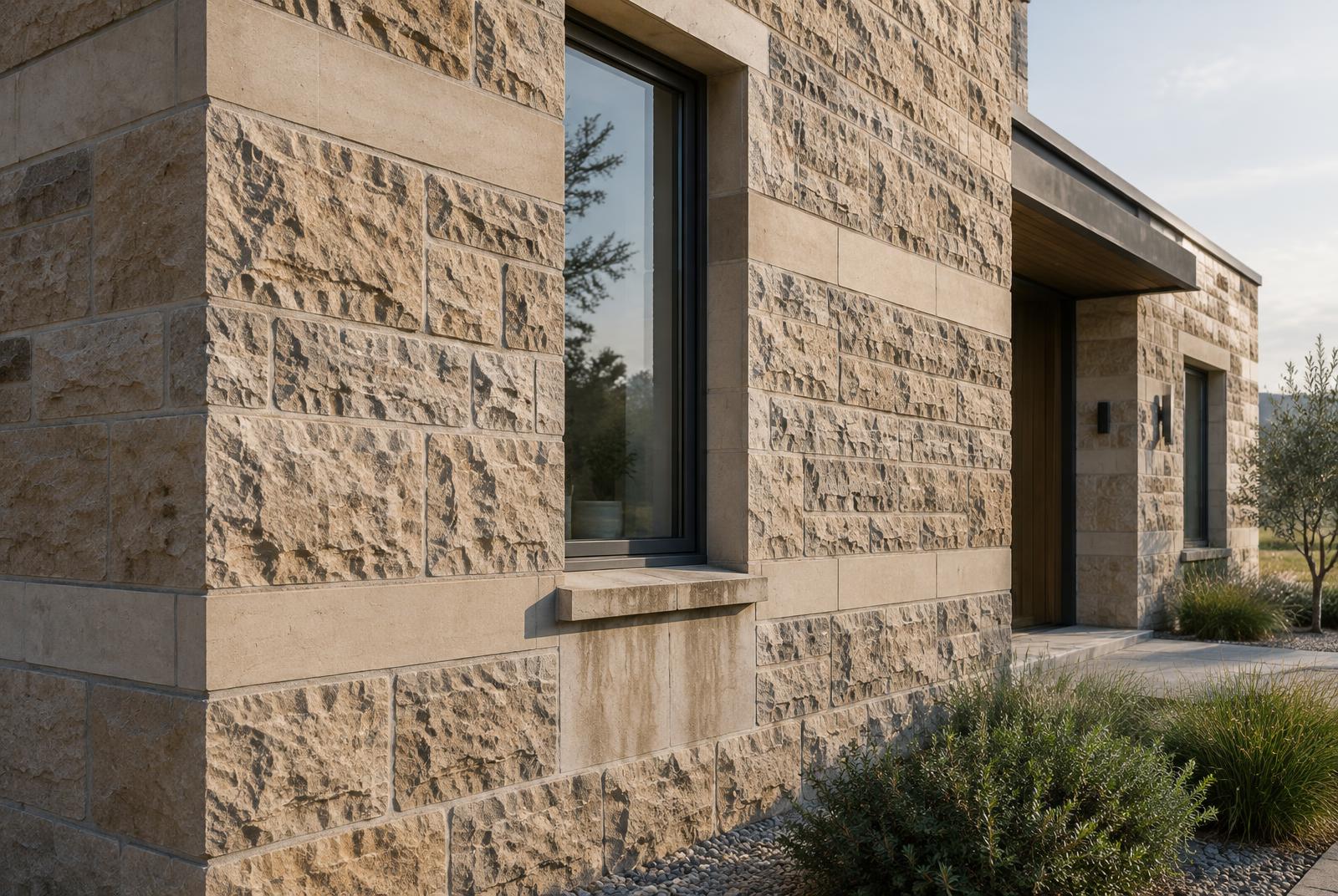
Know the families before texturing, because they behave differently in light. Coursed ashlar is sawn stone laid in regular courses with tight joints, reading as smooth planes with crisp shadow lines. Split face stone is split along its natural bed, leaving a rough, deeply shadowed face that changes character dramatically with the sun angle. Random rubble mixes sizes and irregular courses; clipped and pitched faces sit between the extremes. Most bad stone renders come from using one texture and one material to represent all of these, which is why a wall that should read as two materials, rough field and smooth dressing, reads as one confused surface.
Bump, displacement or geometry: decide by camera distance
The displacement decision should follow the camera, not the fashion. For mid and distant cameras, a strong bump or normal map on a flat surface is efficient and often invisible as a cheat. For close cameras, bump flattens at grazing angles exactly where the stone is most visible: the split-face hollows that catch shadow at three metres disappear at one. Displacement solves this at the cost of memory and render time, and a hybrid is the production answer: displacement or modelled relief on the foreground elevation, bump on the rest. Model the stone as real geometry only where a camera dwells, and never let a hero close-up rely on bump alone.
Course logic is what separates believable masonry from wallpaper. Real cladding runs in courses with heights that belong to the stone type and the region, often mixing two or three course heights in a pattern, with every course level and every stone aligned to its neighbours. Get a reference photograph of the actual stone or a close cousin, measure the course heights against a door or window, and rebuild the pattern so the tiling unit is a full set of courses rather than a single repeatable square. Nothing betrays a fake faster than course heights that wander, or a bond pattern that visibly repeats every two metres across a whole elevation.
Mortar: the joint does more work than the stone
Mortar does more for the read of a stone wall than the stone does. Joints are recessed, and their depth is what creates the shadow line that articulates the wall; a flush joint with no depth flattens even good stone geometry. Joint colour is usually lighter and duller than the stone, but it weathers differently: damp walls darken the joints first, and south-facing walls keep them pale for years. Keep joint width honest for the stone type, and resist the urge to deepen every joint equally: raked joints on rough stone, tight joints on ashlar, and let the jointing style follow the construction the design implies.
Raking light is the honest test of a stone material. Under a high sun, split-face texture produces a fine, glittering shadow pattern; under an overcast sky the same wall reads almost flat, with the coursing carried by the joint lines alone. Choose the sun angle to flatter the material the brief asks for: low raking sun for texture-driven elevations, softer light where the design's form should dominate. This is also the cheapest debugging tool you have. If a stone wall looks wrong, rotate the sun low and graze it before touching the texture, because most stone problems are lighting problems wearing a texture costume.
Weathering that follows water and gravity
Weathering follows water and gravity, and a facade that respects that logic reads as built even before the viewer consciously notices. Streaking below window sills and projecting copings, darker biological shading at the base of walls and in sheltered corners, salt bloom near the ground in coastal projects, and a general gradient where exposure to rain keeps upper surfaces cleaner than sheltered ones. Drive all of it with masks that reference the geometry: dirt maps keyed to upward-facing surfaces, cavity maps under sills, ambient occlusion in sheltered reveals. Uniform grime applied as one overlay is the lazy version, and the eye catches it as soot rather than weather.
Dressings are the detailing that sells the construction. Quoins, window surrounds, sills, lintels, copings and plinths are sawn stone: smoother, tighter-jointed, and often a slightly different tone from the field. Model or texture them as separate material zones with their own edge profiles, because a chamfered sill catching a bright line of light is exactly the kind of detail that convinces at close range. Equally important are the shadow gaps and reveals where cladding meets openings; a stone wall that runs flush into a window frame with no reveal reads as cladding paper, not masonry.
Per-stone variation kills the wallpaper effect
Per-stone variation is the single biggest lever on realism, and it is almost free with modern tools. Every stone in a real wall differs slightly in hue and value, catches moisture differently, and weathers at its own rate. Use a multi-texture or randomizer setup that assigns varied texture crops or per-face colour offsets across the wall, so no two adjacent stones share an identical face. The difference can be subtle: a few percent of hue and value variation is enough to break the tiled read, while heavy-handed variation starts to look like camouflage.
Roughness and specular behaviour differ between the stone families and deserve their own pass. Split face is matte, with its shading dominated by micro shadowing inside the texture; sawn ashlar takes a faint polish and shows soft sheen bands across a course under raking light. Dust settles on upward-facing and sheltered surfaces and dulls them first. A single uniform roughness across the whole wall is one of the quietest tells in a render, because real stone never weathers evenly.
Corners, returns and reveals
Corners are where texturing shortcuts are exposed, because the pattern has to turn the corner with the geometry. Unwrap or map corners so courses continue around returns at the same height, and model actual corner stones on quoins rather than hoping the texture wraps convincingly. Reveals need the same care: the inside face of an opening is seen at close range in almost every detail shot, and it is precisely where bump-only setups collapse. If a reveal will be seen, it gets displacement or geometry like the rest of the hero zone.
Keep the scale honest throughout, because stone is the material where texture scale mistakes are most visible. Course heights in real cladding sit roughly between 100 and 450 millimetres depending on the stone and coursing, joint widths between 6 and 15 millimetres, and a standard brick course is a useful sanity check for any wall with a door in it. Verify the scale against a known element, a door, a sill, a person, before approving the material, and re-verify after any UV change, because scale errors creep in silently with every unwrap.
The final close-up check
Finish with the same close-up discipline the material demands. Render at least one region crop at final resolution through the most textured part of the elevation and one across a corner where courses turn, and judge the mortar shadow line there, because that is where cheap setups die. At the other end of the scale, check the whole elevation for moire, as fine stone texture aliases into shimmering noise at distance and needs filtering or mip adjustments rather than a blur pass. For animation, plan levels of detail so distant walls swap to simplified texture-only versions before the displacement cost becomes visible as flicker. Stone rewards this discipline more than any other facade material, because its realism lives in small, cheap decisions repeated across the whole wall.