Breakdown · 3ds Max / V-Ray
Corten steel facade rendering: weathered steel that reads as material, not orange paint
Weathered steel is one of the most requested and most faked facade materials. A breakdown of patina variation, streaking, panel layout, edge detailing and the lighting that makes corten read as real steel.
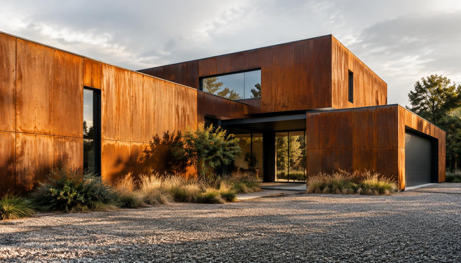 BREAKDOWN
Corten is a process, not a colour
Weathering steel earns its appearance over years of wetting and drying, and that history is exactly what most renderings leave out. The common failure is a uniform orange-brown diffuse with a noise map on top: the facade reads as painted MDF and the client wonders why the real thing costs more. Real corten is a layered surface. It has a base patina that varies from panel to panel, darker streaks where water runs, lighter patches where the sun dries the surface quickly, and a faint metallic character that survives under the oxide. A convincing shader reproduces that structure, not just the colour.
It also varies with age and exposure. A facade rendered for a planning application often shows the mature, stabilised patina, while the same building a year after completion would be patchier and brighter. Agree with the architect which stage the image should show, because a fully even chocolate-brown facade and a freshly weathered orange one are both defensible and completely different moods.
Build the patina in layers
Start with a base colour that sits in the rust range without going saturated: a deep orange-brown with the saturation pulled back. Over-saturated corten is the single most common giveaway of a fake. Layer a large-scale variation map across the whole elevation so neighbouring panels differ slightly in tone, then a mid-scale mottling for the patina texture itself. Each layer should be subtle on its own; the realism comes from their combination.
Keep a small amount of metallic response in the shader. Weathered steel is mostly oxide, but grazing angles still catch a harder, slightly metallic highlight that painted surfaces never produce. A fully dielectric material goes chalky in raking light. In V-Ray terms, a low metalness value with a roughness well above polished metal, modulated by the patina maps, gets you most of the way there.
Streaking follows water, not noise
Water is the author of the patina. Streaks run vertically from drip points: below window sills, under panel joints, from weep holes and from any horizontal ledge. They are darker and slightly glossier than the surrounding surface because the oxide is repeatedly re-wetted there. Place them deliberately, following the actual drainage logic of the facade you are rendering, rather than tiling a generic streak texture across every panel.
Runoff also stains what sits below. The base course, the gravel strip and the paving under a corten facade almost always carry rust staining in reality, and including a restrained version of it is one of the cheapest realism wins available. Leave it out entirely and the facade looks like it was lowered into place that morning.
Panel layout and joints carry the realism
Corten facades are panel systems, and the panel logic must be visible. Model the joints as real shadow gaps, not black lines drawn in a texture, and keep the joint width consistent with the panel size the architect has specified. Corner panels, returns and window surrounds are folded elements; give them the small bends and shadows that folded sheet metal actually has. A perfectly flat plane with a rust texture reads as wallpaper at the first corner.
Panel-to-panel variation matters more than within-panel detail. Real weathering steel weathers differently depending on orientation, shelter and batch, so a subtle per-panel hue and value shift, kept within a narrow range, breaks the CG uniformity instantly. Most scatter or material-ID workflows can drive this without hand-painting anything.
Edges, corners and fixings are where fakes fail
Zoom into any real corten building and the edges tell the story: cut edges weather differently from rolled faces, welds and fixings interrupt the patina, and folded corners catch the light on a slightly different angle. In a rendering, a tiny bevel on panel edges, a darker tone on horizontal ledges where water sits, and visible but restrained fixings at joints do more for credibility than any amount of surface noise.
Avoid the two classic over-details: heavy rivets on every joint, which most modern systems do not have, and deep physical pitting, which reads as damage rather than patina at architectural scale. Corten's surface texture is fine-grained; a strong bump map at facade scale makes it look like corroded ship plate.
Light it with a raking sun
Corten comes alive under a low, raking sun. Side light picks out the panel joints, the folded returns and the fine surface texture, and it is what separates the metallic highlight from the oxide. Flat midday sun or a fully overcast sky removes exactly the cues the material needs, so schedule the sun angle for the facade, not just for the massing. Golden hour against the warm rust tone can go monochrome; a slightly earlier, cooler sun often separates the building from the sky better.
Watch the reflections in the glazing. Dark-framed glass set into a rust facade will mirror the sky and the ground, and that cool reflection against the warm cladding is a large part of the material's appeal. A black void window next to a richly textured corten panel makes the whole elevation look unfinished.
Context and ground plane finish the illusion
The ground plane finishes the illusion. Gravel, grasses and restrained planting suit the material's character and give the rust tones something to sit against; a sterile white plaza fights them. Add the rust staining at the base, keep the sky from competing with the facade's warmth, and let one strong shadow anchor the building to its site. Done well, a corten rendering should make the viewer feel the material's weight and weather, not just recognise its colour.