Lighting · Corona 12 / V-Ray 7
Why we light every interior at 3599K and stopped arguing about it
Picking one colour temperature for artificial interior light killed half our revision cycles. Here is the reasoning, the exceptions, and how to keep skin tones and timber honest at 3599K.
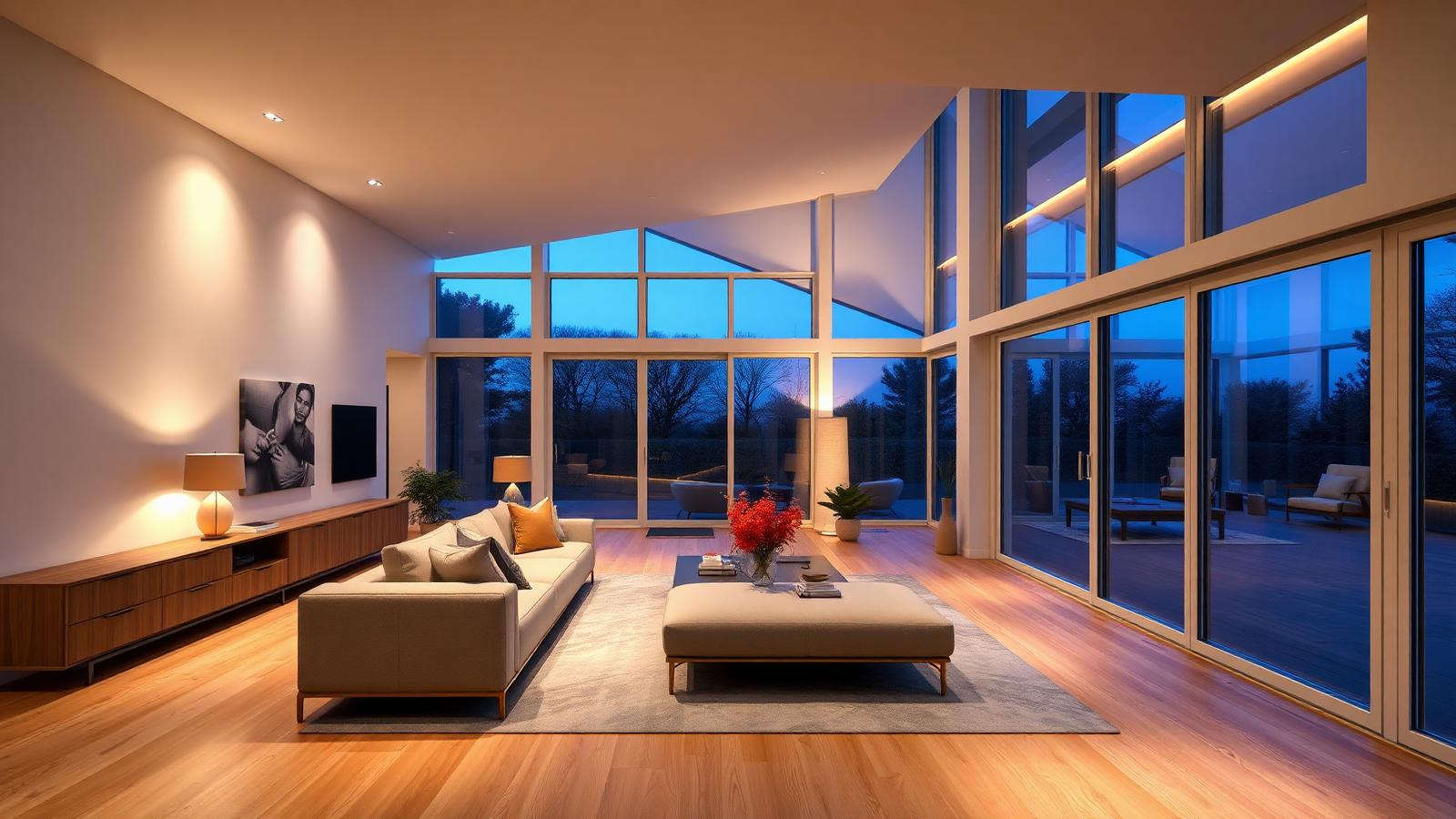 LIGHTING
For years our lighting artists each had their own favourite Kelvin value for interior practicals. One guy swore by 2700K because that is what a warm halogen looks like. Another used 4000K because the spec sheet on the project said 4000K. The result was that every render in a set of eight looked like it belonged to a different building, and the client noticed before we did.
So we standardised. Every artificial interior light in the studio starts at 3599K unless there is a documented reason to move it. That is not a magic number handed down from a physics textbook. It is the point we landed on after testing a dozen values against printed proofs and client feedback, and the important part is that it is written down and everyone uses it.
Here is the practical logic. Below about 3000K, white paint reads yellow and cool grey furniture goes muddy green. Above 4000K, timber loses its warmth and the whole room starts to feel like a dentist office. 3599K sits just warm enough that oak and walnut read rich, while whites stay believably white and the render still feels like an evening interior rather than a candlelit restaurant.
The second reason is contrast management. Most of our hero interiors are dusk shots, which means the exterior sky is somewhere between 8000K and 12000K depending on how blue we want the glazing to read. With interiors at 3599K you get roughly a 5000K to 8000K spread across the frame. That is enough separation to make the warm and cool read as two distinct light families without needing to push saturation in post.
A lot of artists try to solve this by cranking the interior lights to 2400K to fight a blue sky. It works in the sense that the contrast increases, but the render goes orange and every surface loses its material identity. Instead of warming the lights further, cool the sky. Pushing the environment up two thousand Kelvin costs nothing and leaves your interior surfaces intact.
The exceptions matter, and we do have them. Hospitality projects with a specified 2700K lamp schedule get 2700K, because the client is going to install those fittings and the render is a promise. Retail and clinical work usually gets 4000K for the same reason. Anything with a real lighting consultant on the team follows the consultant, always. The 3599K default only applies where nobody has specified anything, which honestly is most residential and most speculative marketing work.
Getting the number right in your renderer takes a small amount of care. In Corona, set the light colour mode to Kelvin and type the value directly. Do not use the RGB swatch and eyeball a warm tint, because you will drift between scenes. In V-Ray, the temperature mode on the light does the same job. In Blender Cycles you will need a Blackbody node feeding the emission colour, and Blender expects the temperature in Kelvin so 3599 goes straight in.
The trap is the white balance in your tone mapping. If you render at 3599K and then set your camera white balance to 3599K, the renderer neutralises the entire warmth you just built and you end up with a flat grey room. We white balance around 4900K to 5200K on most interior dusk shots, which keeps a visible warm bias in the practicals while stopping the highlights from going amber.
Skin tones are where a bad temperature choice shows up fastest. If you have entourage in the frame, render a quick region around a face before you commit. At 3599K with a 5000K white balance, skin should read healthy and slightly warm. If it looks sunburnt you are either too warm on the lights or too cool on the balance, and the fix is usually the white balance rather than the lights.
Timber is the second tell. Walnut at 3599K should still show its cooler purple undertone in the shadows. If the whole plank reads uniformly orange, you have lost the material and no amount of grading will bring it back, because the information is not in the render anymore.
One genuinely useful side effect of standardising is that our LUTs and post presets now work across every project. When every interior in the library shares a light temperature, a grade built for one bedroom applies cleanly to the next one. We keep three base grades, warm evening, neutral evening, and cool commercial, and they all assume 3599K interior practicals as the starting point.
If you take one thing from this, it is not the specific number. It is that having a written default beats having a debate on every project. Pick a value, test it against a printed proof, and make the whole team use it. The consistency is worth far more than whatever fifty Kelvin of personal preference you gave up.