Lighting · V-Ray
Blue hour exteriors: the twenty minutes that sell more houses than any other light
The dusk exterior is the highest-converting image in residential marketing, and the easiest to get wrong. How to balance sky against interior, keep the glass honest, and avoid the purple postcard look.
 LIGHTING
Why dusk outsells noon
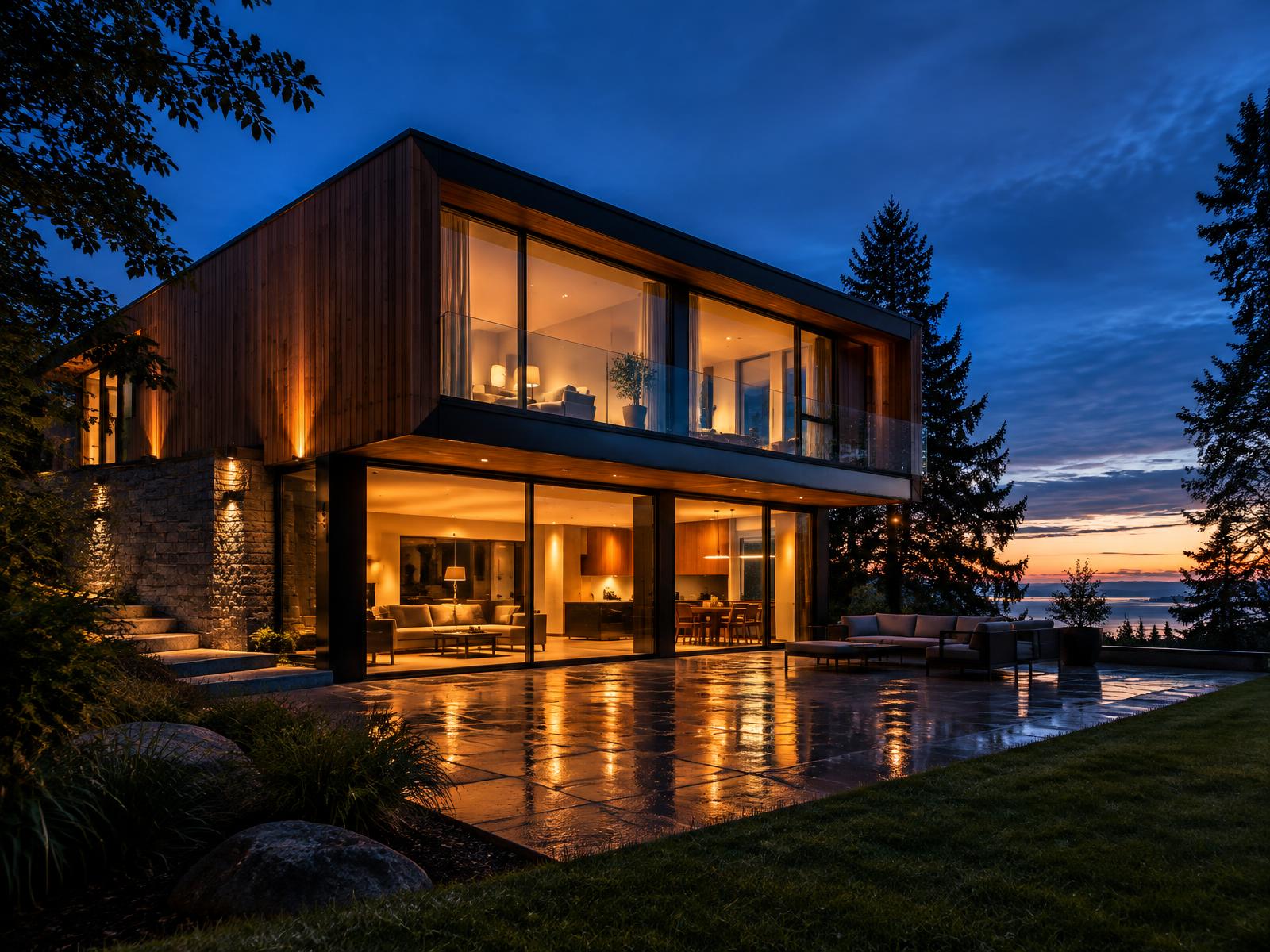
Every residential marketing package has one image that does the selling, and for the last decade that image has been the dusk exterior. There is a reason developers ask for it by name. A blue hour shot shows the building as shelter: warm light inside, cool world outside, the architecture reading as a lantern on its site. Noon shows you what a house is made of. Dusk shows you what it is for.
It is also the most formulaic image in the industry, which means the difference between a dusk render that converts and one that gets scrolled past is entirely in the execution. The formula is free. The balance is not.
What the light is actually doing
Blue hour is the window after sunset when the sun is below the horizon but the sky still scatters enough light to read as deep blue rather than black. In rendering terms it is a sky dome doing two jobs at once: it is the ambient light source for the whole scene, and it is the background of the image. That dual role is the whole challenge, because the exposure that makes the sky beautiful is not the exposure that makes the building readable, and you have to find the frame where both survive.
The window is short in reality and flexible in a render, which is one of the few honest cheats available to you. A real photographer gets perhaps twenty minutes. You can hold the sky at its best moment indefinitely, so the discipline is not catching the light, it is choosing which moment in the window tells the story. Early blue hour, with a warm band still on the horizon, reads as optimistic and suits family housing. Late blue hour, with a near-monochrome cobalt sky, reads as calm and suits high-end single-image hero shots.
The exposure balance: sky versus interior
The single exposure decision that defines the image is the ratio between sky brightness and interior brightness. Get it wrong in one direction and the windows blow to white rectangles, which reads as a house full of floodlights. Get it wrong in the other and the interior goes muddy and the building looks unoccupied, which defeats the entire point of the exercise.
A workable starting point is a sky that still holds visible cloud detail and colour, with interior light roughly two to three stops hotter than the ambient exterior. Then judge the result at thumbnail size, because the thumbnail is how the image will be seen on a listings page. At thumbnail, the windows should read as clearly warm rectangles against a clearly blue envelope. If either side of that contrast disappears, the ratio is wrong, and no amount of local adjustment will save it.
Interior light: warm, occupied, uneven
The interior behind the glass is a set, and it should be dressed like one. Not every room is lit. A house with every window glowing at the same intensity reads as a show home, because it is one. Real occupation is uneven: the kitchen and living room bright, a bedroom dim, one room dark. That variation is what makes a viewer read the building as lived in rather than as a product.
Keep the interior colour temperature warm and consistent, around 3599K for residential work, and let individual fittings, a floor lamp, a pendant, under-cabinet strips, read as distinct sources rather than as an even wash. The most persuasive detail in any dusk render is a visible lamp inside the room, because it gives the glow a cause. And mind the glass: at dusk the interior is brighter than the exterior, so glazing should transmit far more than it reflects. A dusk render with mirror glass is physically backwards.
Exterior fittings: less than you think
Exterior lighting at dusk should be sparse and purposeful. A wall washer on a stone base, a bollard along the path, a step light, maybe a pool light. Each one should have a visible source and a visible job, because exterior fittings at dusk are read as jewellery: a few good ones elevate the facade, and a dozen of them turn the house into a car dealership.
Colour temperature discipline applies outside too. Warm fittings against the cool sky is the palette that works, and mixing in cool white exterior floods breaks it instantly. If the design includes landscape lighting, keep it low and warm and let it graze planting rather than flood it, because a lit garden reads as depth and a flooded garden reads as a sports pitch.
The ground: reflections are free production value
The cheapest production value in a dusk exterior is a reflective ground. A wet terrace, a polished stone apron, a still pool: any of these doubles every light source in the frame and gives the foreground the interest that a dusk sky pulls out of the rest of the image. A light rain pass on the paving, with roughness varied enough that reflections stretch and break, is worth more than any amount of planting.
If the site has water, use it, but keep it honest. A pool at dusk should reflect the sky as much as the house, and its surface should have enough movement to read as water rather than as a mirror laid on the lawn. Stillness reads as luxury in a single hero frame and as a mistake in a set, so if you render the pool perfectly calm, do it once.
Sky selection and the purple trap
Sky selection is where the formula goes wrong most often. The temptation is the dramatic sunset, magenta clouds, god rays, the full postcard, and the result is an image about the sky rather than about the house. The building is the subject. The sky is the lighting. A sky with quiet structure, some cloud variation, a clean gradient from horizon to zenith, supports the architecture; a sky that shouts competes with it.
The purple trap deserves its name. Oversaturated violet skies with cyan window frames are the visual signature of low-end developer CGI, and they come from pushing saturation to compensate for a weak exposure balance. If the balance between sky and interior is right, the image does not need the saturation, and the restraint is what reads as high-end. Grade the sky towards a believable deep blue and let the warm windows supply all the colour contrast the image needs.
Composition and camera
Compose a dusk exterior the way you would compose any hero: one clear subject, a foreground that earns its place, and enough breathing room that the building sits in its site rather than filling the frame. A slightly low camera, around 1.4 to 1.6 metres, gives the building presence without distortion, and a two-point perspective with verticals held straight keeps the image in the language of architecture rather than the language of drama.
Foreground matters more at dusk than at noon because the light empties the middle ground. A terrace edge, a path, a pool coping, a grasses border catching the last ambient light: something has to lead the eye from the bottom of the frame to the door. Trees silhouetted against the sky do the same job at the edges, and they are one of the few places where a dark, under-detailed asset is an advantage rather than a compromise.
Common blue hour failures
The failure list is short. Windows blown to white. Every room lit identically. Mirror glass at dusk. A purple sky doing the selling. Exterior floods everywhere. A bone-dry foreground with nothing to reflect. And a camera so wide or so low that the house looks like it is launching.
The fix for all of them is the same discipline: decide the sky-to-interior ratio first, dress the interior as an occupied set, spend exterior fittings like jewellery, give the ground something to reflect, and keep the sky quiet. Do those five things and the formula stops looking like a formula, which is the whole craft of the most commercially important image in residential archviz.