Lighting · Corona
Dark, moody interior rendering: how to keep shadow detail without flattening the mood
Dark interiors fail in two directions: crushed black holes or a flat, over-lifted grey. A practical guide to exposure, local contrast, practical lights and post work that keeps a moody interior rich and readable.
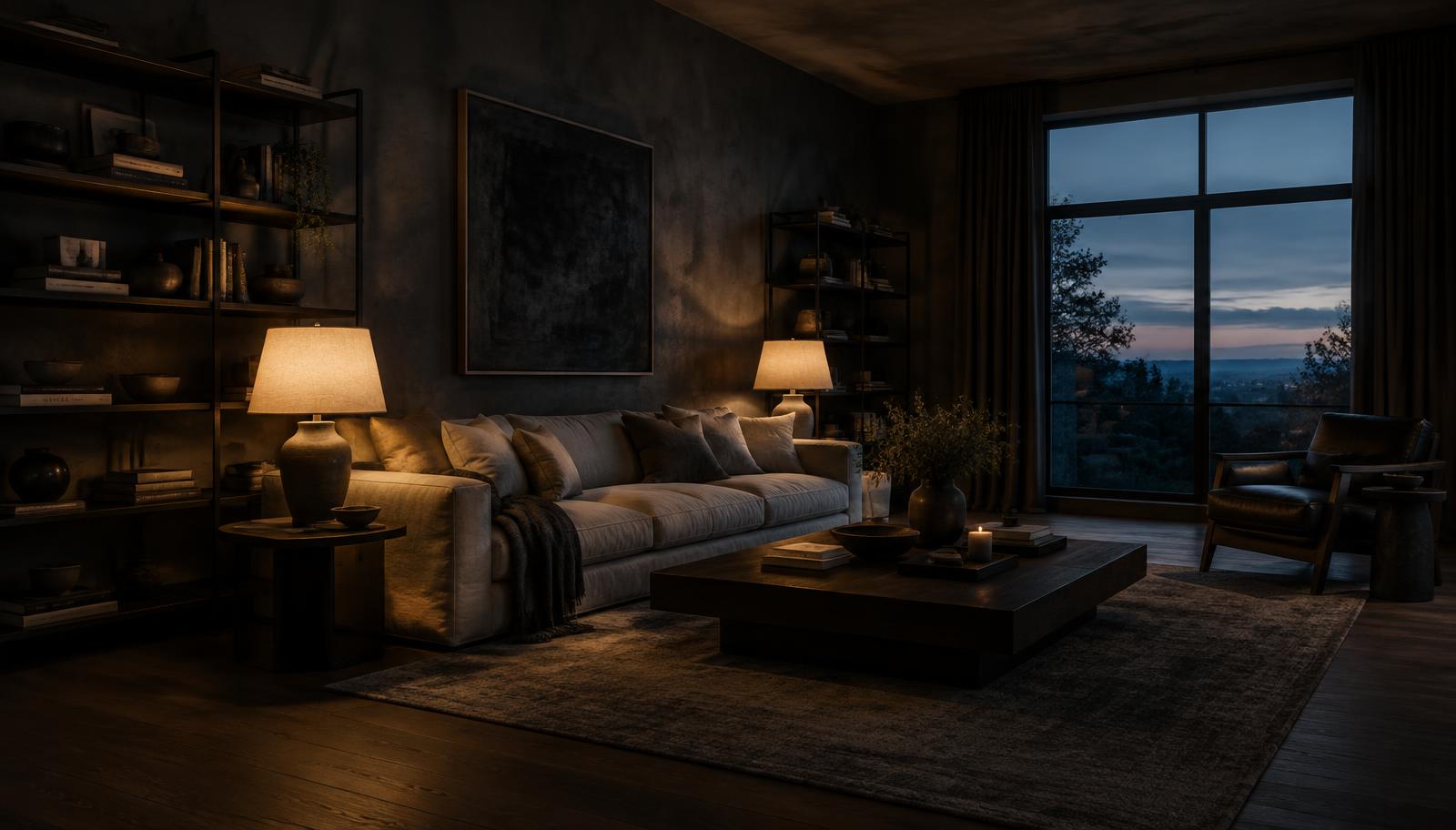 LIGHTING
Moody is an exposure decision, not a brightness decision
A dark interior rendering lives or dies on where the exposure sits, not on how dark the image is. The most common failure is a scene that was lit like a daytime interior and then darkened in post: every surface loses saturation together, the shadows go muddy and the result reads as underexposed rather than atmospheric. The opposite failure is just as common: an artist lifts the shadows until every corner is visible, and the room loses the very darkness that made the brief interesting. The goal is a image where the lit areas carry the story and the unlit areas stay deep but not dead.
Set the mood at render time. Decide which surfaces are allowed to go dark and which must hold detail, then expose for the lit subject, usually the seating group, the kitchen island or the fireplace wall. Let the far corners fall where they fall. If the composition depends on a corner reading clearly, that corner needs its own light, not a global lift. This is the same discipline as low-key photography: the darkness is designed, not rescued.
Build the lighting from practical sources
Moody interiors are lit by practicals: table lamps, wall washers, a fire, a shaded pendant over a table. Each source should have a plausible fixture, a plausible direction and a plausible falloff. A glow with no visible origin reads as a renderer cheat and breaks the spell immediately. Keep the colour temperature of interior practicals warm and consistent; a mixed scatter of 2700K and 5000K sources in one room looks like a wiring fault, not a design decision.
Resist the urge to add invisible fill lights everywhere. One soft, very low-intensity fill from the camera side can keep the nearest shadow readable, but every additional fill flattens the modelling of the room. If a sofa needs separating from a dark wall, a small rim or a lit object behind it usually works better than raising the ambient level. Darkness between lit pools is what gives the eye a place to rest.
Separate the twilight outside from the warmth inside
The window is the moody interior's best friend. A deep blue twilight exterior against warm interior lamps gives the frame a natural colour contrast that no grading pass can fake convincingly. Keep the exterior roughly one to two stops below the interior lit areas: bright enough to read as sky and landscape, dark enough that the window does not become the brightest rectangle in the room. A blown-out white window in a dark room pulls every eye to the wrong place.
Balance the two light families deliberately. Cool window light can be allowed to spill across the floor and the ceiling edges, where it models the room's volume without competing with the lamps. Warm sources should own the seating, the tabletop and the artwork. Where the two meet, on a curtain edge or a floorboard gradient, is where the image gets its depth. If the whole frame is warm, it goes monotonous; if the whole frame is cool, it reads as unoccupied.
Protect shadow detail at the material level
Dark materials need more texture work than pale ones, not less. A charcoal wall with a perfectly flat diffuse reads as a void; the same wall with a subtle limewash variation, a gentle roughness breakup and a raking light reads as a designed surface. The same applies to dark oak floors, blackened steel and deep upholstery. Bump and roughness variation are what carry information through the shadows, so check them with a raking test light before finalising the lighting.
Watch the reflectance values. Real charcoal paint still reflects a meaningful amount of light; a near-black diffuse albedo will eat light unnaturally and force you to over-light the room to compensate, which then flattens everything else. Keep dark materials within a physically plausible range and let the lighting, not the albedo, create the darkness. This single habit solves half of all muddy dark interiors.
Use local contrast, not global lifting
When shadows need more presence, reach for local contrast before global exposure. A soft, low-intensity ambient occlusion pass blended subtly, or a gentle clarity-style adjustment on the mid-tones, gives shadowed surfaces structure without lifting their brightness. Global shadow sliders are the enemy here: they lift everything equally and turn designed darkness into grey soup. Work with masks on the specific surfaces that need help.
Volumetric light and atmosphere can help a dark room, but only when motivated. A faint haze near a lamp or a window beam gives the air substance; a uniform fog across the whole frame just lowers contrast. Keep volumetrics subtle enough that the viewer feels them without seeing them, and make sure they agree with the visible sources.
Grade in post with a light touch
Do the final grade on a calibrated screen in a dim room, and keep it small. A slight S-curve for depth, a restrained pull toward teal in the shadows or warmth in the highlights, and a careful vignette are usually enough. Heavy LUTs designed for bright interiors will destroy a dark image. If the grade is doing more than ten percent of the work, the render was not finished.
Finally, judge the image at its delivery size and on an ordinary display, not only full-screen on a good monitor. Dark images suffer most from compression and from bright showroom screens. Check that the key surfaces still separate at thumbnail size, that the blacks hold without banding, and that the client's likely viewing conditions will not turn your designed darkness into a black rectangle. A moody interior that survives a phone screen in daylight is one that was lit correctly in the first place.